Colour is one of the main elements used in graphic design, if not the main element. All pieces of art use colour, to stand out, to catch attention, to get across a message, and more. However, colour also has to work together and has to be used expertly to be at its best.
Colour itself has existed for millennia, as every civilisation has used it in some form or way, whether intentionally or not.
Good Example
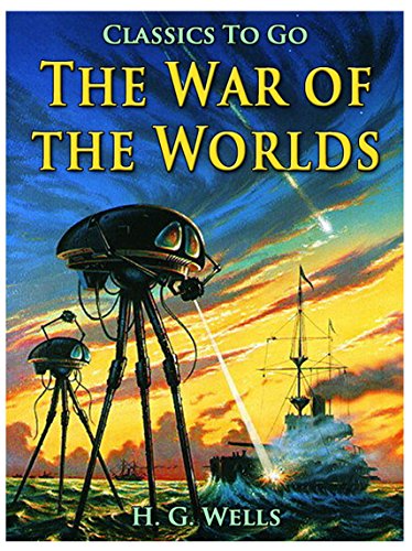
When it came to choosing good examples for colour, especially in the area I want to look into, I chose this cover of the famous book written by H.G Wells, The War of the Worlds. This one in particular is a cover to an audiobook version of The War of the Worlds on Kindle.
The colours are great, with the backgrounds having very bright colours near the bottom, with the sky being a dark blue. This causes the background only to blend with itself quite well and alone is able to stand out. The clouds as well help with the tone of the book and also the placement of everything.
Then the machinery itself stands out amongst it all thanks to it being the darkest thing on the book. The boat as well uses the same colouring as well, but things to it have more colours overlapping it, along with being smaller, an audience is most likely to see it second compared to the tripod’s themselves, as they also take up a lot more space, while having a more dynamic shape.
Another thing that helps is that most of the tripods take up space on the brighter background, so it stands out from the background itself. If the colours in the background were switched around, or it was all blue, then the ship and tripods wouldn’t stick out at all from the background, instead blending with it. This goes for the sea as well, with the yellow background helping it be recognisable, instead of just blending in. If it was all yellow though, the background wouldn’t stand out as much, and the tone wouldn’t be as effective.
Bad Example
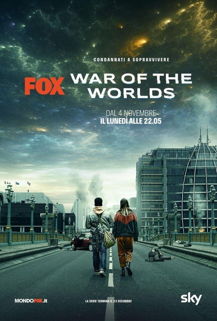
When it comes to picking a bad example for colour, I chose the poster for the 2019 tv show version of War of The Worlds. When it comes to colours, it is one of the dullest out there for an adaptation of the classic story. There are barely any colours that stand out, and the one attempt to with the space still feels incredibly toned down from there could be.
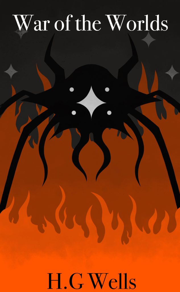
When designing my own version of this great story, I decided to use many tropes used in other book covers of War of the Worlds, as the tropes themselves are part of the catch and what draws people to them. When it came to my main colour, I chose orange as it gives that sense of danger, while being a warmer colour so it can stand out. Along with this, I added a darker orange in the background to add depth to the cover.
I then chose black as the cold colour as it adds a foreboding feeling to the cover, and works perfectly well with the orange. This also helped the white of the eyes stand out more, as it is a perfect opposite to black, helping that stand out as well.
The only other colour used in the cover is grey, for the very background, with a bit of tone work for clouds. I chose grey as it helps the setting feel very bleak, with the added benefit of it not blending with the black and helping the orange stand out.
I chose the title itself to be white at the top so it can stand out against the grey background, and be the first thing people see. Meanwhile, I made the authors name black at the bottom so it stands out against the orange, and it would be the second thing people see.
References
Wells, H.G (2015), The War of the Worlds Kindle Edition, Online Publisher (date accessed 24th October 2023)
Wells, H.G (2019), War of The Worlds, Online Publisher (date accessed 26th October 2023)