Composition is used in many different types of creative arts, such as music, writing, etc. However in the visual arts, composition is one of the key elements used, along with colour, typography, etc. It is necessary to know and master composition if someone wanted to get into art and graphic design.
Good Example
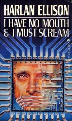
When it comes to a good example of composition, I decided I would focus on the horror classic, I Have No Mouth and I Must Scream, made by Harlan Ellison. This cover in particular was used for a video game instead of a book, however, I still picked it as it still is a great design and a wonderful piece of composition.
Firstly, The text is very well placed, with the author’s name at the very top with the title of the book right below it, and a line separating the two. This leaves the entire bottom of the cover to do anything it wants. Along with this, its placed at the point where the background is at it’s darkest, so nothing can distract from the title itself.
In the centre of the book is a picture of a morphed man, giving an idea of what awaits in the story itself. Around it is a more mechanical and digital design, with the image itself being designed like a motherboard. This being placed in the middle as well makes sure it’s the first thing that people see, making sure people see the horror element of the story before they even see what it is about.
Around the image itself, everything else is placed so all the patterns are perfectly symmetrical . This placement of everything makes everything feel robotic and man-made, showing the other theme of the story. The patterns themselves lend towards this feeling of it being mechanical in nature. However, they also make a good choice by having the patterns themselves fade off when getting to the title, making the sure the title is readable.
Bad Example
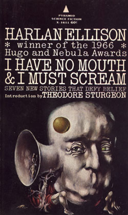
While I do like the picture in the cover, the multiple titles and how they are placed can lead to a lot of confusion and can overstimulate someone taking a casual look at it. There’s very little distinction between the author and title against everything else. I feel like all of the text could still be included, but everything needs better placement and a lot of the extra sentences don’t need to be as big as they are.
When deciding on how to fix the composition I decided to take some cues from the good example, while still putting my own twist on it along with combining the best of both. I decided to put both the author and title both at the top as I do think that is one of the best things from both. I also expanded by putting a border around the piece, giving a separation between author and title while keeping the good composition.
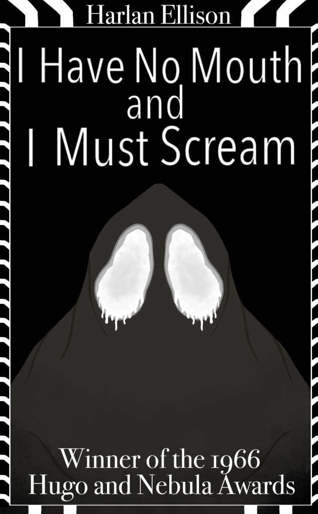
I decided to put the award text at the bottom as while it carries its own importance, it doesn’t blend well with the title or author, so I put it t the bottom so it’s still noticeable but still in a better place than the bad example, where it is hard to read everything.
I decided to put the creature in the middle, like the other two covers, as it is the best part of the covers and catches attention the most. It is the part that’s matters most so it’s placement needs to be in the middle, so it catches the most attention.
Lastly, I decided to give the border a more robotic and mechanical vibe. I did this by making it all be very systematic in the pattern and make it look like circuit, similar to the good example.
References
Ellison, H (1995), I Have No Mouth and I Must Scream, Online Publisher (Date accessed 2/11/23)
Ellison, H (1972), I Have No Mouth and I Must Scream, Leo and Diane Dillon (Date accessed 2/11/23)