Typography is a key component in graphic design. The word itself comes from the greek words “forms” and “impression”. Typography itself in concept has existed since The Ancient Egyptians and even before. However, it has evolved over time, becoming a main stay in modern culture and society.
Good Example
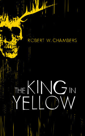
The cover of this book is a great example of good typography. The audience that would read this book would already be interested in horror stories, which is why the feel of the typography dwells on that sort of horror. The text itself is sans serif, but is also very thin and sharp, giving it that horror feel. The main text in the centre of the book is white, which stands out from the black background and also sticking out from the yellow which is plastered across the book. The spaces between each letter is both very well organised yet also have a few letters that stick out, causing it to have this unsure feeling. The letters themselves also are designed to look like they’ve been painted on, as a few letters have parts that are uneven, and parts that stick out, the edges of the ‘G’ for example are very jagged, and the letter ‘O’ has a piece of it of the actual letter.
Then the Author of the book is given a similar treatment when it comes to typography. It uses a very similar font, though minimised as to not take attention away from the title from the book. Along with this, the colour yellow is used instead of the colour white, so it doesn’t take attention away from the actual title of the book. Thanks to this, it blends slightly into the rest of the book, yet its placement in the darkest part of the cover makes sure you can’t miss it. While it uses a similar sans serif font, it is a lot more formal and proper than the title itself, as the text itself is smaller.
When combined together with the rest of the book cover, It creates a very great atmosphere and vibe from cover alone, capturing the horror of the book perfectly
Bad Example
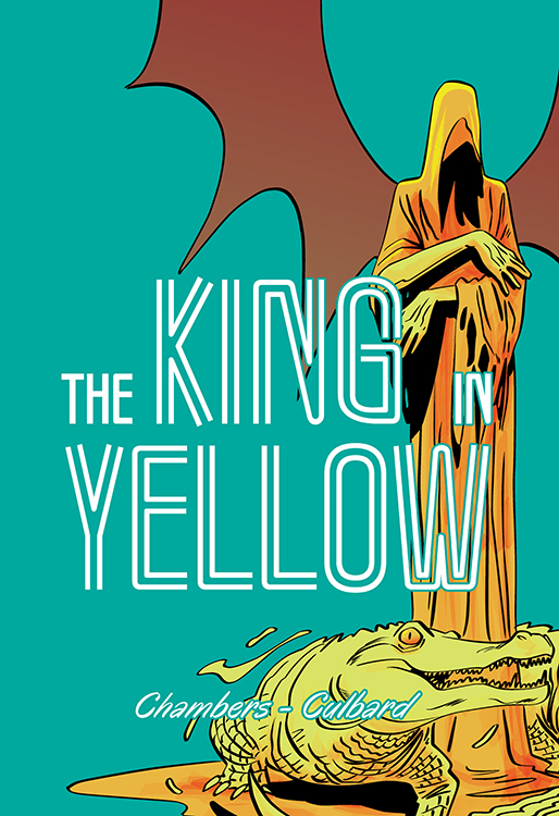
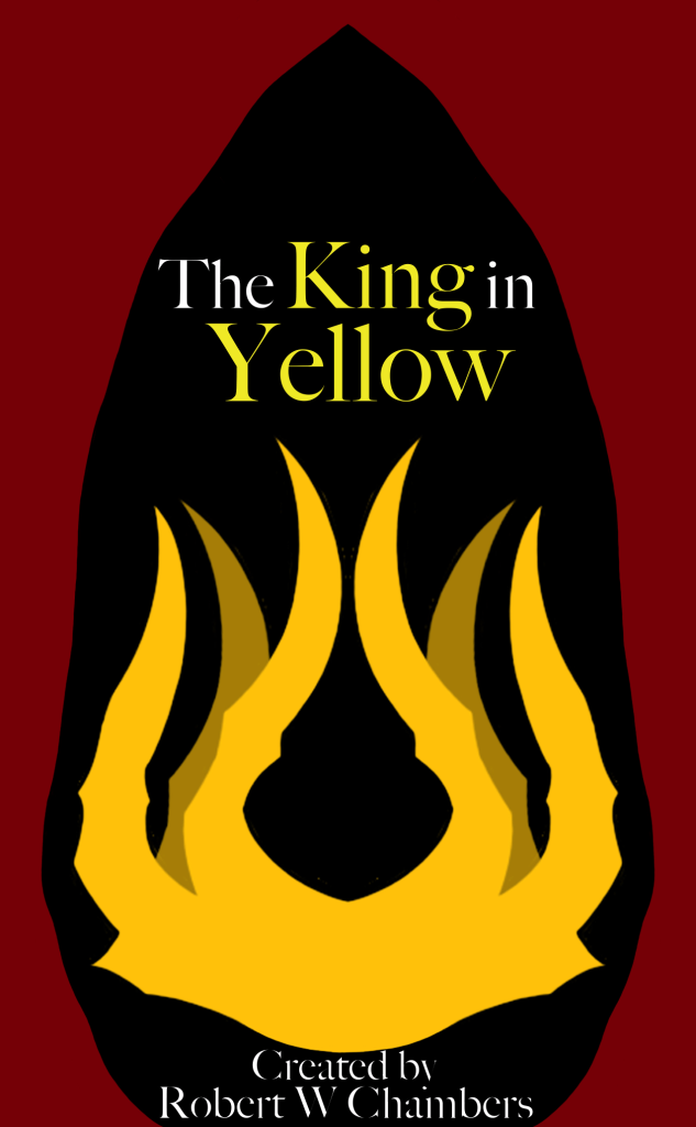
This cover of the same book, The King in Yellow, is the bad example that I have chosen to redesign. Firstly, the the font uses doesn’t suit the story and style of the book itself at all. If someone didn’t know the book, they wouldn’t know it was a horror from simply looking at it. Meanwhile, in my design, I gave it a more formal typefont (Big Caslon Medium), which gives it a more serious feel, along with the rest of the cover, both the design and the typography working together. This font also helps with attracting the audience of this book, as its more intriguing and closer to the horror that the book is, rather than making the cover too different so people are surprised when they start reading.
Along with that, The colour itself also doesn’t fit with the feeling the story is trying to convey, along with the fact that all the colours don’t work together, making it hard to read. When designing mine, i decided to give it two different colours to help it stand out and blend with the rest of the cover, instead of working against it. This also helps attract an audience as it’s easier to read and stands out more than the bad example, intriguing them.
Lastly, the name of the creator of the book is even harder to read and understand, the font is hard to read, the colour of the text doesn’t help and it doesn’t work well with the rest of the cover. In my design, I decided to fix all of these. This is important for whatever audience I would be going for, as crediting any creator and making sure their name can be read is always important.
Overall, I definitely feel like i’ve captured what the original book was trying to get better than the bad example.
References
W. Chambers, R (2019), The King in Yellow, Online Publisher (Date accessed 2/11/23)
Cupboard, I.N.J (2020), The King in Yellow, Online Publisher (Date accessed 2/11/23)