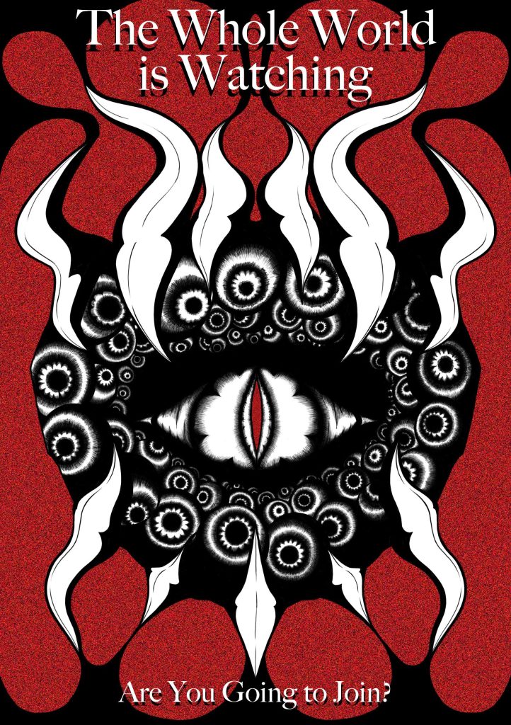
When coming up with a self promotional poster, I thought on what sort of stuff I’m interested in. For my first one, I picked my love for horror for the genre as its one of the best mediums to get across a message.
The image itself gets across the message of privacy and goes into the fear of being watched. I portrayed this by making a pattern/logo filled with eyeballs surrounding this lizards eye. Then I combined this imagery with teeth to make it look like a mouth. However, thanks to the shape, I was able to symbolize horns as well, combining the two. The teeth represent a creature, specifically a predator, showing the danger and brutality of it. While the horns represent status and power.
Lastly, I kept the colours very simple yet very eye-catching. The black and white are great opposing colours, with the red standing out amongst them. The red also helps symbolize danger, as it is the colour most associated with that colour. According to Kendra Cherry, an expert in psychology, “Its ability to instantly grab people’s attention is the reason why it’s often used to warn people of impending danger.”
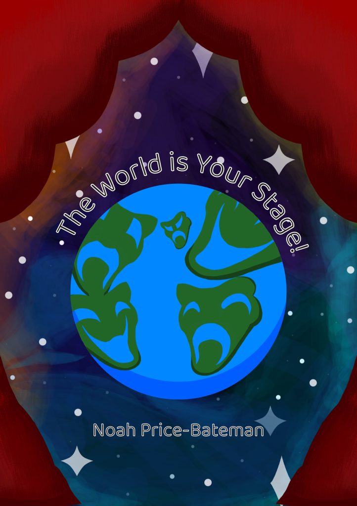
For my second poster, I chose to focus on my love for musical theatre and stage shows in general. I chose to design the planet Earth, yet replace each continent with a different emotion from a stage mask, as they are the things shown most when talking about theatre in any way.
The choice to add curtains was to get across a theatre even more, as they are just as iconic when it comes to shows as a theatre mask, if not more. Plus the colour red attracts more peoples attention.
Lastly, I chose a sans serif font as it fits more the casual and nice feel of the poster. It gets rid of any seriousness or tension from the poster, making it feel welcoming.
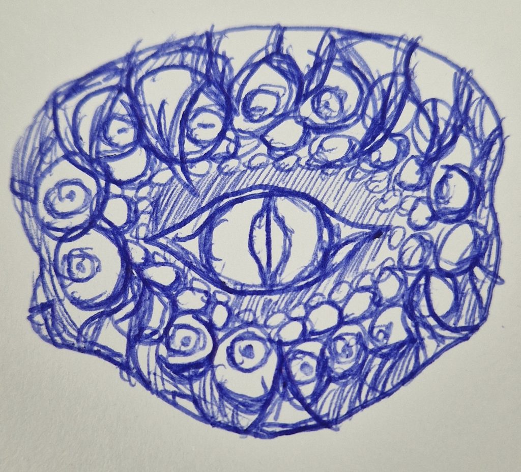
The Process of the First Self Promotional Poster
The Process of the Second Self Promotional Poster

References:
Cherry, K, Psychology of the Colour Red (2023), Available Online: https://www.verywellmind.com/the-color-psychology-of-red-2795821 (accessed on 6/12/23)