When first coming up with a logo based off my own name, I first decided on trying to come up with something from my own initials, as they blend quite well together.
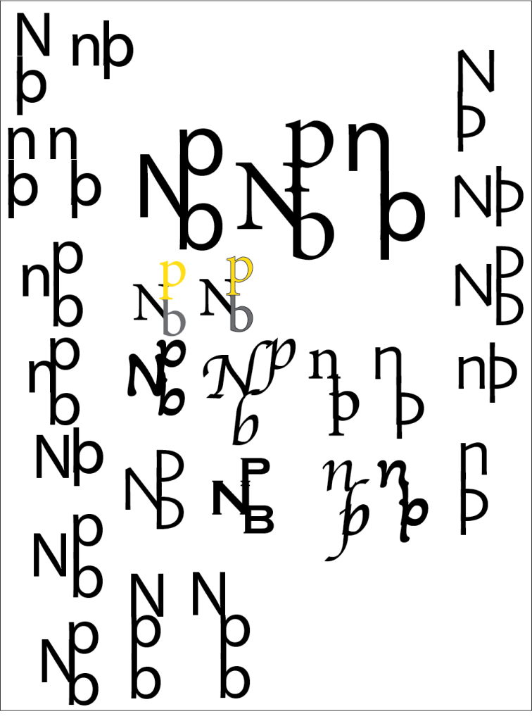
Like all Logos, I began by just placing them around each other in random places. I got a few that looked quite good but the meaning didn’t fit. I then also came up with one that looked like a musical note, which I was going to use.
However, I then stumbled upon the final combination, and the pattern finally worked. The P and B combined proceeded to look like a sword in a hilt, leaning into my love for myth and medieval history. Not only that, but it all flowed nicely into each part. This was mostly thanks to the font itself: Minion Variable Concept.
And this is how this ended up being my first name logo. I love the simplicity of it and it goes into my love for medieval things, a great combination!

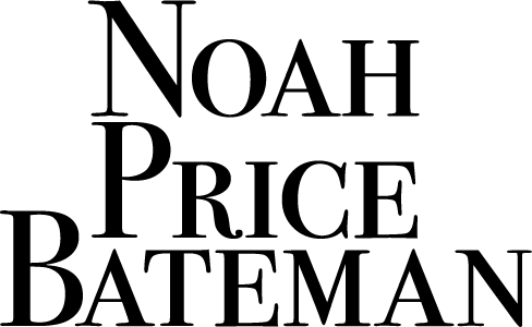
When coming up with a second Typographical Name Logo, I wanted to keep the fancy theming as it clearly worked in the first one. While I used initials for the very first logo, I thought I should at least attempt to create one with my full name.
My very first thought was to recreate the imagery of a top hat just from the placement of my name. Thanks to having 2 last names, it made it easier to get this imagery with not many problems. Of course, it took moving a few of the words around here and there, but I eventually found a placement that worked.
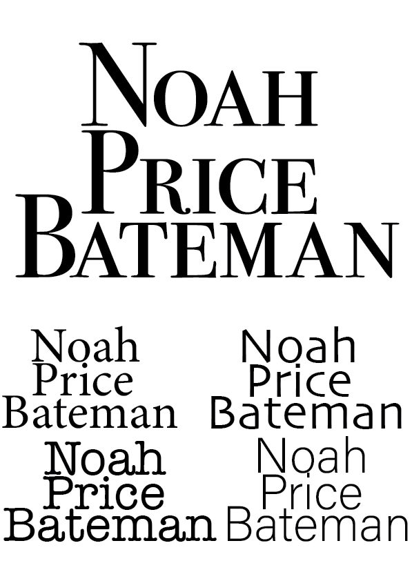
Lastly, I experimented with the fonts. After a couple tries, I landed on Bodoni, which not only helped the fancy theme, but was also placed the best out of them all. Not only that, but the space between the ‘Noah’ and the ‘Price’ creates something that looks like a stripe in a top hat.
Process of Creating First Name Logo

The Process of the Second Typographical Name Logo
