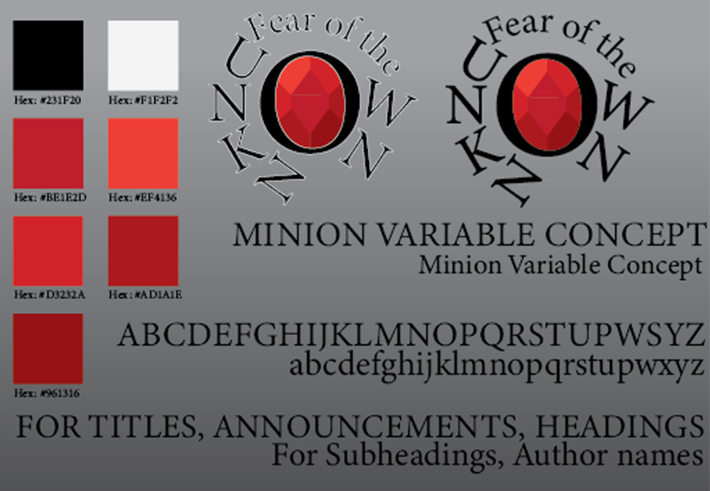

When coming up with typographical standards, I first started by thinking how I could keep it simple while still carrying the more formal and dark colours to give that sinister look to everything I make. This is because, most typographical standards I’ve seen, go for a very bright look, or just a simple white background. So I decided to go for a grey that goes from a lighter grey at the top to a much darker grey at the bottom. This way it doesn’t get in the way of what I want to get across, while still being somewhat interesting.
I decided to keep the font for everything I would come up with (titles, writing, subheadings, etc) as Minion Variable Concept. While this could change for a different font at different circumstances (book covers, authors, etc), I made it clear that Minion Variable Concept should be the base font to be used. This is because it gets across the formal feeling of the brand I want to make and isn’t too different so it distracts from other parts. Of course, similar fonts could be used if circumstances were to change or if needed. (Example replacement font: Palatino).
When it comes to colours, I made it specify what exact colours were to be used, including every different type of red used. I did this so no single part of the logo looked wrong in the future or so the Ruby in the middle never looked too bright or too dull. When it comes to specific colours, I kept to a simple Black, White and Red, as it fits my horror theme perfectly, while being eye-catching. As stated by the London Image Institute, “Red attracts the most attention and is associated with strong emotions, such as love, passion, and anger. It’s the universal color to signify strength, power, and danger. Red is vibrant, stimulating and exciting with a strong link to sexuality and increased appetites.” This simple psychology is why I used red, as it is a great colour to get a reaction out of people, and attract their attention.
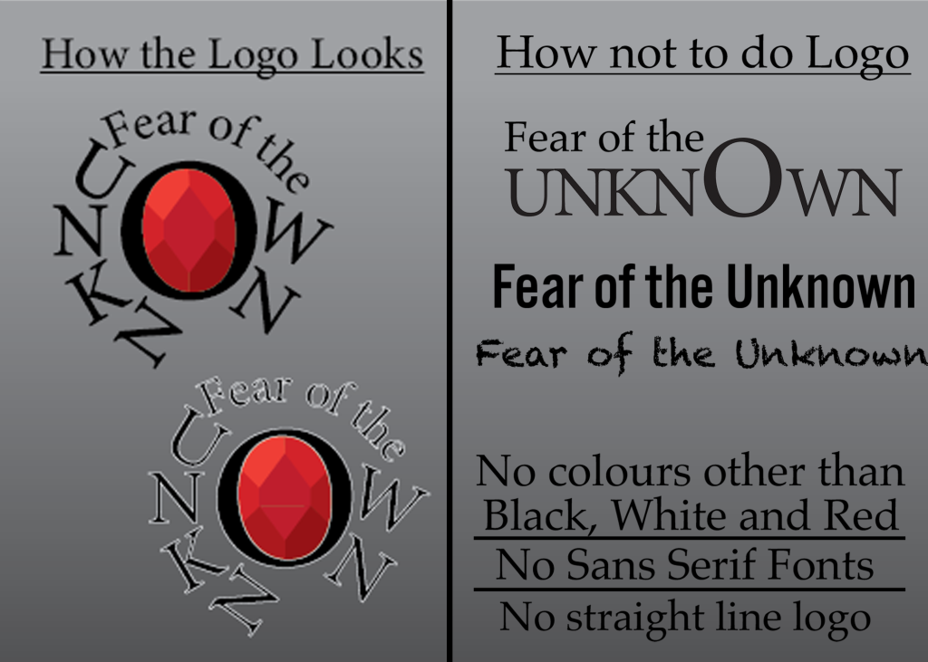
When showing how to do the logo right, I decided to just show the same way I’ve shown it, along with a version without white lines, if needed. The white lines are included if a black background is included, so it helps it stick out more. When showing how not to do it. I made sure to show that no version of the logo just written out is to be used, as it gets rid of all parts of the logo that stand out and every design decision made. Along with this, I made sure to specify that when it comes to the logo and branding , no sans-serif is to be used. This is so it keeps its formal appeal and look. Though I also made sure of showing an example of not using fonts that are incredibly unique and distracting. Lastly, I made sure to say that the logo should not have any other colours other than the base three. Any other colours would distract from what’s already there and wouldn’t blend as well.
References
Color Psychology: How Do Colors Affect Mood & Emotions? (2020), Available online: https://londonimageinstitute.com/how-to-empower-yourself-with-color-psychology/ (accessed on 7/1/2024)