When coming up with designs for a logo, a website and an app, its best to not only look at the competition, but also to create a mood board. All three mood boards were split from each other, as a way to get across specific designs better, but also to look at the differences between apps and websites all together. This also helps avoid any possible confusion in the future.
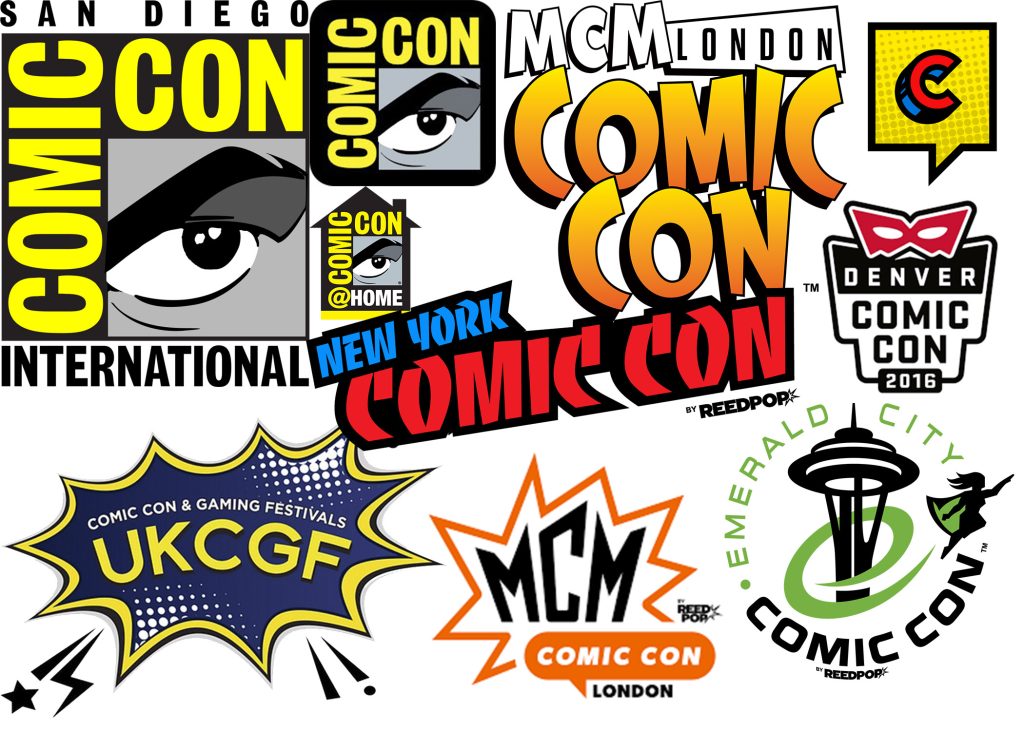
With logos, most stick to the same style of comic book panelling, with maybe one or two deviating. When looking at the more famous event logos, specifically San Diego comic con and mcm, they especially lean into a simple comic book style, yet in different ways. While the San Diego one focuses on an actual comic book panel, MCM focuses more on a comic con style font. Perhaps it is best to make a combination of the two.
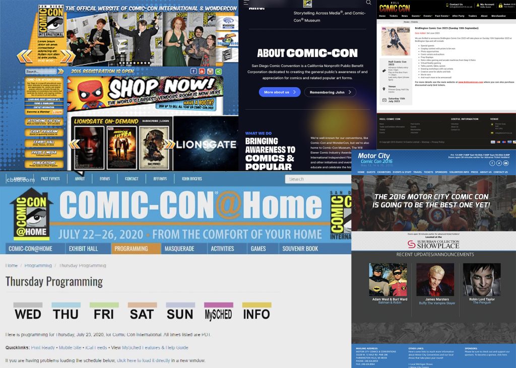
When looking at the websites, most of them very clearly stick to a simple layout, with a menu at the top and information as you scroll down. The San Diego one however deviates, having a lot more information and side bars. This is something to potentially try out but also avoid in the design that will be made, as it could cause information overload for some people, or confuse people on where to look first.
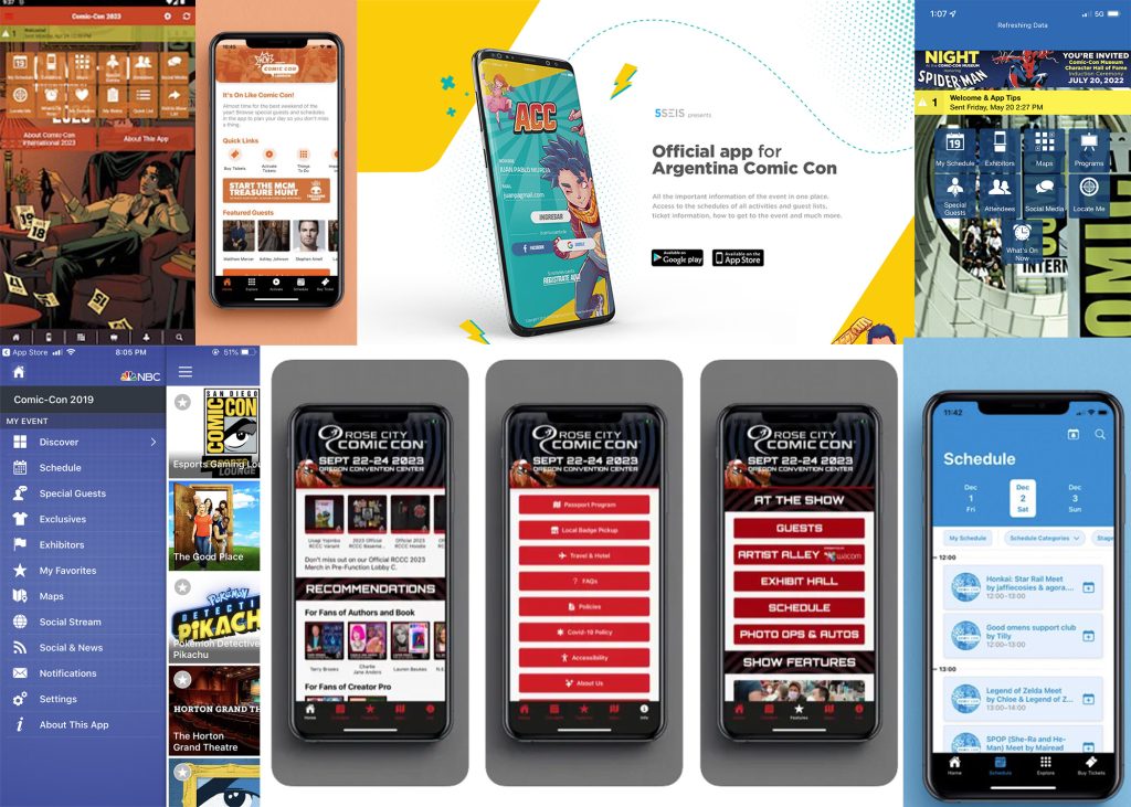
Lastly, the mobile phone layouts are a lot more simple, having the whole first screen be buttons to where to get information. This is most likely to provide people with a quick and effective way to get information. This is what should be done when designing an app.
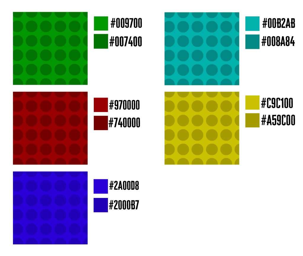
When colour planning, it was best to first rule out what would be the best colours use, and what type of colours. While there is a mix of both light and dark used, the bright colours have been toned down. This is so they aren’t too ‘loud’ and distract from actual information that will be present. According to Visual Arts Instructor, Debi Riley, the best thing to do is “Have a look at the calmness ratio to ‘busy’ ratio. I’ve deliberately eased off the busy, in order to calm the whole image down. So it shouts Less.”
While coming up with the colours, a pattern was also included. This is not only to help achieve the comic book look, but also to help make the colours stand out enough to get people’s attention, but also made in a way that it doesn’t take away people’s attention from any information.
With each colour next to each other, the decision to pick which one had to be made. When deciding this, it was best to consider not only what colour got the most attention, but also which ones would be too distracting. Along with this, it was also best to think about what is associated with each colour. In the end, the best 3 colours would be Green, Red and Cyan. Out of the three, Green would be the best of the three as a base start. This is thanks to Green having a link to creativity, a thing also commonly associated with comic con. While there are many articles and tests done on this, one by Stephanie Lichtenfeld, Andrew J. Elliot, and Reinhard Pekrun, three professors in psychology, states, “In four experiments, we demonstrated that a brief glimpse of green prior to a creativity task enhances creative performance” and “These findings indicate that green has implications beyond aesthetics and suggest the need for sustained empirical work on the functional meaning of green.”
While I have not received any feedback on colour so far, in the future, in may be best to experiment with using multiple if needed.
References
Riley, D (2015), Is Colour Distracting?, found at https://debiriley.com/2015/10/07/is-colour-distracting/ (accessed on 31/03/2024)
Lichtenfeld, S., Elliot, A. J., Maier, M. A., & Pekrun, R. (2012). Fertile Green: Green Facilitates Creative Performance. Personality and Social Psychology Bulletin, 38(6), 784-797. https://doi.org/10.1177/0146167212436611