When designing the logo on Illustrator, I begun with recreating the first few ideas I did on iPad along with creating a few different splatter effects to see which one works best with the writing.
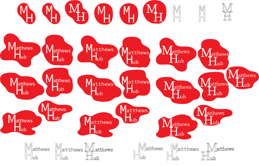
I did a pair in the original logos colour scheme to see if it benefitted, or if a more bold red was the better way to go forward. When it comes to the shapes themselves, most of them where created, with the letters being put in afterwards, with one of the shapes being made around the words to see if that works more. All of these ended up with very mixed results, none of which felt satisfying as a logo. While the idea had potential, the execution in this form felt poor and not fully realised.
When it comes to the Typography, The fonts I used seem to work to an extent. Sans-serif would definitely be the preferred choice in future attempts. While serif may look good, it doesn’t fit the feel that I want to get across to those I’m trying to attract. Matthews Hub is supposed to be a place for people to connect and find help and friends, so a sans-serif font will be a lot friendlier of a choice.
Once satisfied, I decided to take a step back to the current Matthews Hub logo and change things that already exist in the design, rather than jumping into the unknown first thing. This began with simply making the simple circle into an oval which is more moulded around the words in a sense. Once having done that, I decided to try putting circles around it like one of the interactable elements of their website, with the idea of it looking like a very simplified flower. This choice was made because flowers are a commonly used sign of peace.
The typography and colour was also experimented with once more. Between all the different sans-serif fonts and a more casual looking serif, I decided to use one of the sans-serif fonts as a placeholder that was subject to change if feedback was given. When it came to colour, past this point I decided that the bolder approach was a more appropriate choice.
After the last design, I decided to make more ideas based on the flower concept, this time connecting the circles to the middle itself. Past this point, I then decided to make them different sizes and put in fairly random places, to show the uniqueness of autism and adhd, along with other mental differences. This then went into two different ways to represent this same concept in the colour. The first was with multiple different colours, showcasing the variety of how many different types of people there are under the spectrum and beyond. This is then followed by the other design, which instead shows how everyone under the spectrum are different yet all fall under the same umbrella and should feel united. Despite this, I personally prefer the multi-coloured logo as I believe it showcases the message of uniqueness a lot more effectively more. Along with this, the multi-coloured design is more eye-catching to people who would scroll past it or see it at a glance.
However, I decided to go back to the idea that first spawned all these concepts, that being turning the original circle into a unique shape. This would combine both my original beginning concept, and the current idea of a flower, transforming both into a completely unique design. I believe this design is the best of the decisions as a base design, as it combines all the messages and ideas I would like to get across into something new and eye-catching.
At the end, I came to these logos, as the unique shape works a lot more and looks more satisfying than the normal oval in the middle. To expand upon the flower concept, I decided to add circles in the middle of the big ones, which also resulted in a very pleasing to look at pattern. Although the red is not to everyone’s liking, it is a good alternative to the use of bright multi colours. Depending on feedback, I am prepared to use the ones that are the most popular.
Another font was also considered thanks to it being a more playful and friendly font, however I think that, in combination with the colours and shapes, its too hard to read and see.