After making the mid-fidelity of the website, I started thinking on what to do for my marketing campaign. To start with, it would be best to get an idea of how to showcase this branding, along with what products could be made. From this point, I can start focusing more on the design and branding which would connect them all.
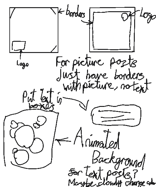
I started with coming up with a few base concepts for what to include in online posts which would connect them together. Obviously, one of these things could be borders, as they are something simple that, if small enough, shouldn’t get in the way of the actual content. This is determined entirely by execution and what the content actually is. However, this shows a base branding and not much beyond that. The next idea was to reuse the circle background used on my site. On some platforms, these could be animated and even switch hue, or perhaps be all the circle colours on one background. If executed well, this could give an easy way of simple branding. But, this all depends on execution, as simply imaging it does not give a full idea. These animated backgrounds would be most likely only on text posts, as if put with videos, they would be incredibly distracting.
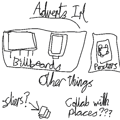
When thinking about stuff to make for in real life (irl) advertising, the first things that came to my mind where massive Billboard advertisements or on boards that you would see on the side of bus stops and in the streets of cities. These, if actually made, would be an incredibly pricey investment, which means my concepts need to be of the highest quality. All information must be clear while having a very eye catching look.
Of course, these would be the top of real life advertising and easily the most expensive. When coming up with more affordable advertising, the most obvious idea was posters. These would have a similar look and style to the board designs, but a lot smaller. Past this point, the last thing I could think of was fliers as they provide a quick and easy way to get your advertising out there. However, after past experience with fliers, I believe they are not as effective as posters. For very flier handed out, there is a chance that someone would either not accept them at all, or will bin them not long after. Therefore, I believe posters would be the better way to go compared to fliers.
When it comes to the note on ‘collaboration with places’, the thought came from asking places whether I could put posters in stores or fliers. In all honesty, it was a last minute note late at night, so didn’t have much thought behind it.
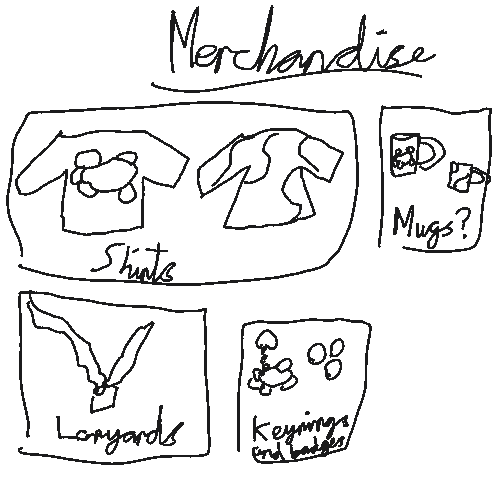
The last thing I decided to look at was merchandising the Matthews Hub brand. I am a bit against this idea, as I do not want the focus of this charity to become making stuff and giving stuff out. The point of Matthews Hub is to help others, not give people physical things. Nevertheless, It is an aspect that must be considered and looked upon.
Shirts were the first idea to show itself. Firstly, these could be simply the logo in the middle of a shirt or jumper, with the colour of the clothing itself being switch. The logo itself could also be much smaller and to the upper right or left. Then the next idea was to make the shirt itself the multiple colours of the logo, maybe with the logo still on it.
Next are mugs. I am not as confident with this idea as mugs would be more expensive than a shirt, and they wouldn’t serve much other purpose. At least with shirts, they could also be an idea for staff outfits. Still, it was an idea to consider. The designs for these mugs remains the same as the shirts, with the logo design and the colours alternate design.
Another idea was Lanyards. These could serve a purpose for staff as a way to identify them and to give them an easy thing to make them unique. Along with this, they are very simple to make, making it mass produceable. When it comes to colours, either I would use the red of the middle of the logo, or multi-coloured. The multi colour would make it harder to design but would also give it something special compared to other lanyards. While these could be sold, the main purpose would be for staff. However, in that case, it would be best to make different ones for staff and the public, so there wouldn’t be any confusion.
Lastly, I thought about Key-rings and Badges. Out of all ideas, I feel this one, along with shirts, are the best out of all the ideas. The Key-rings could easily just be the logo of the charity, which would be very simple to design. While the shape and words may be weird for a laser printer, this would be very easy to correct. Along with that, badges are also very simple to create and design. These could be handed out by staff in certain situations as something free.
After reflection, another thing that could be added to these ideas is stickers. Stickers are very easy to make and, once again, could be the logo of the charity. These could be handed out at events or during sessions. Either way, these would be handed out instead of bought.