After most of the design work and feedback taken when making mid-fidelity, the last thing to do was include the text and images, then followed up with making sure all the programming worked across all the different types.
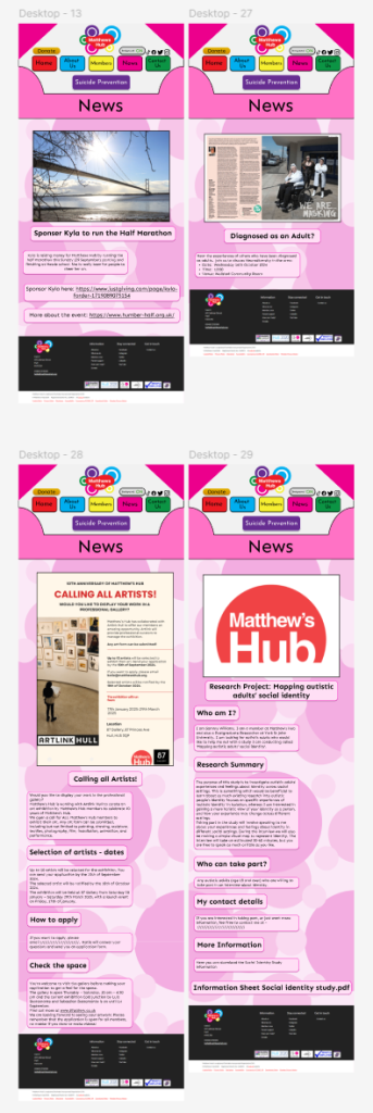
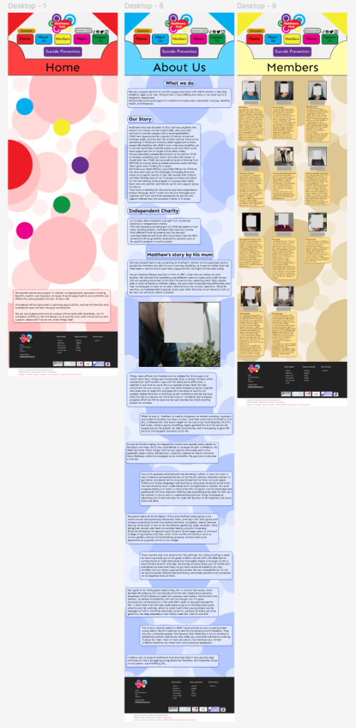
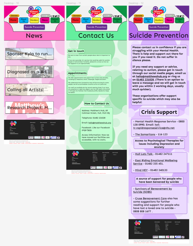
All the text and images on the website have been took from the original website, as I believe it is very informative and I personally believe that I don’t have the right knowledge to add anything or change any of the information. I do believe I have provided a good basis for more stuff to be added however, and the overall theming of the website has been improved compared to the old design.
In terms of placement, most of the composition has stayed relatively the same, with a few changes in approach. The biggest change is the Suicidal Prevention page. I decided to make the font bold along with being larger than all other pages. This is because the information presented is incredibly important so needs to be on better display. This also means once we go to iPad and phone, the text is guaranteed to be seen.
When it came to the case of faces and names, I deliberated on it a lot over time. I have had many talks with my tutor to get his opinion on it, in which he stated the pictures and names where in the public domain. However, I also ended up having a discussion with chief manager of Matthews Hub, and they’re stance while similar, was also that some people may not like or be a fan of their faces being used. Considering my overall stance on the morality of all this, I decided that for this presentation, their faces have been censored and so have their names. While they are in the public domain, I personally believe that I have no permission to use their faces without consent, as I am not a staff at Matthews Hub, and they do not know that I am making this. This, above all else, is a personal choice, but I believe that explaining my stance is important to explaining why I have made choices I have.
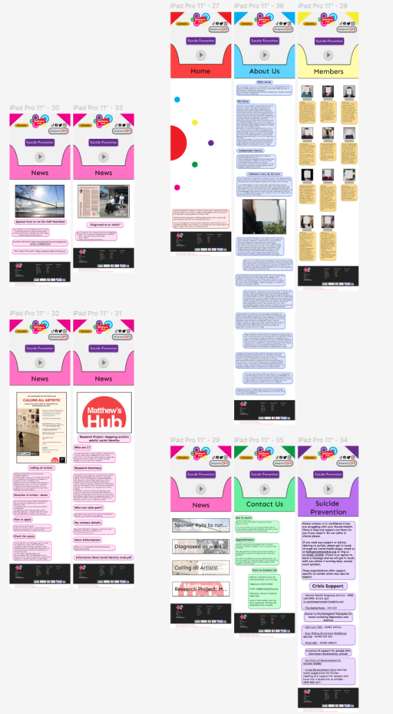
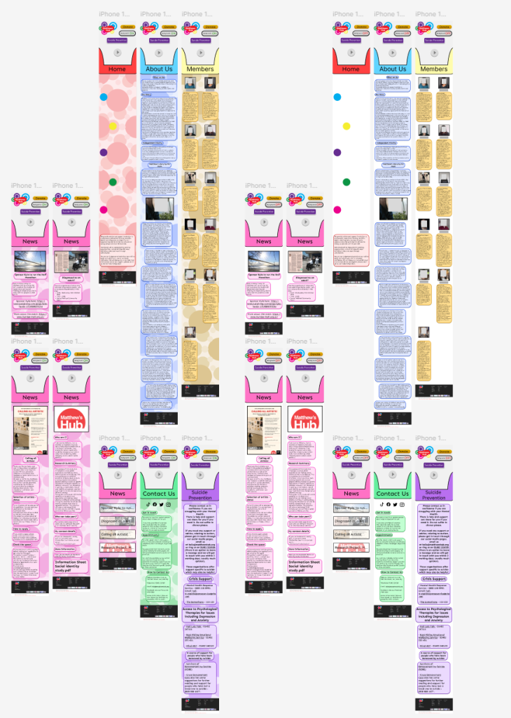
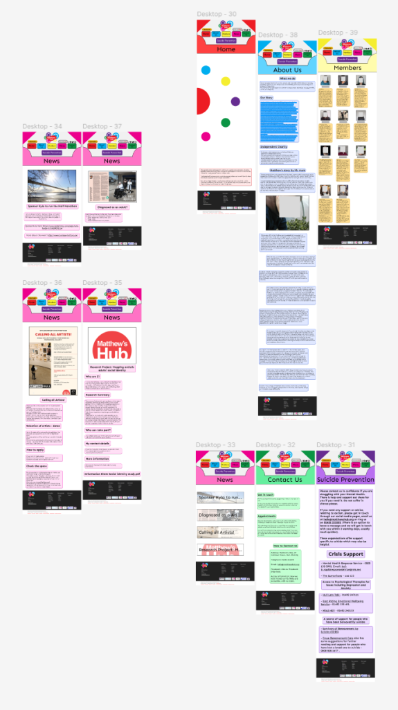
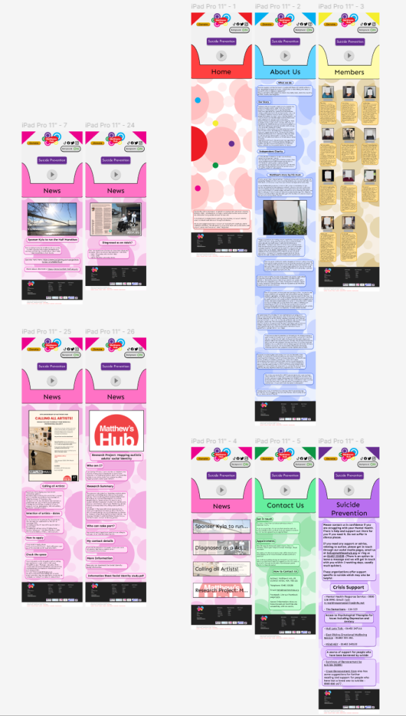
Most of the composition and design stays the same as the desktop when translated over to the iPad and phone. The biggest difference is the size of the text and images. If made too small, then it would become very hard for people to read on their own phones. The only downside is how long the pages become to make space. However, that is nowhere near as important as the readability. This also resulted in the members page remaining as 2 pictures next to each other instead of the 3 of the iPad and desktop.
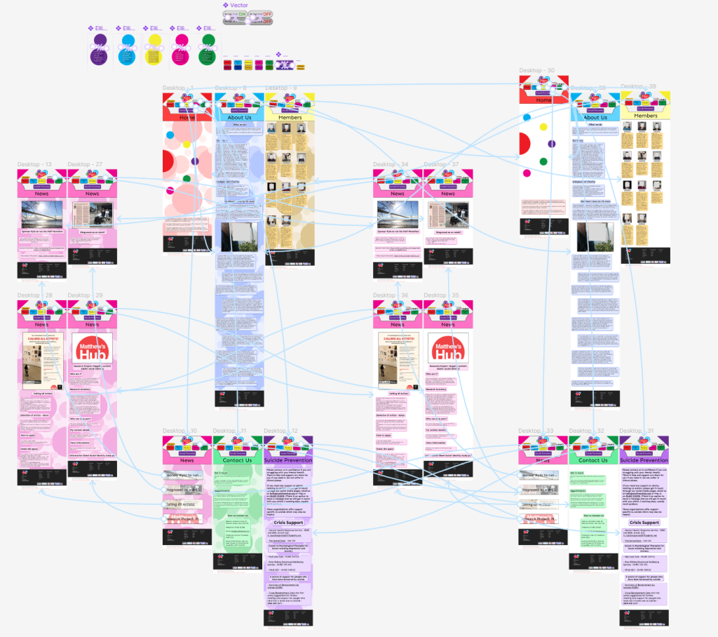
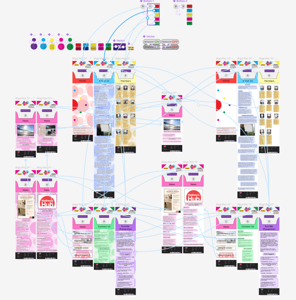
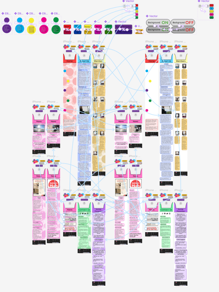
Finishing of the prototyping on each site was not too difficult. Each versions prototyping remains exactly the same, ensuring no confusion. The only difference is the drop down menu for phone and tablet, which has been checked multiple times over as to make sure it works.
References
Matthews Hub, 2024, Matthews Hub, Accessed on 17/12/2024, https://matthewshub.org