When beginning the design concepts for my physical rebranding/merchandise in my marketing campaign, I believed that shirts would be the best place to start.
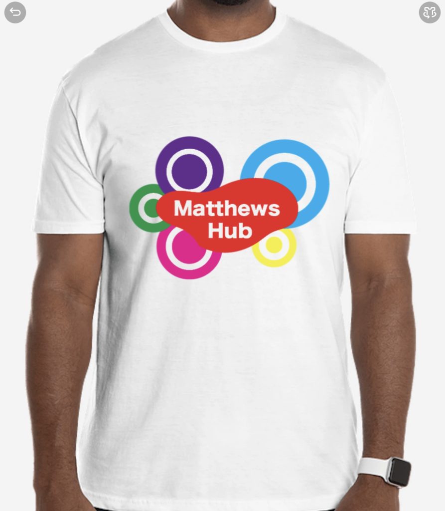

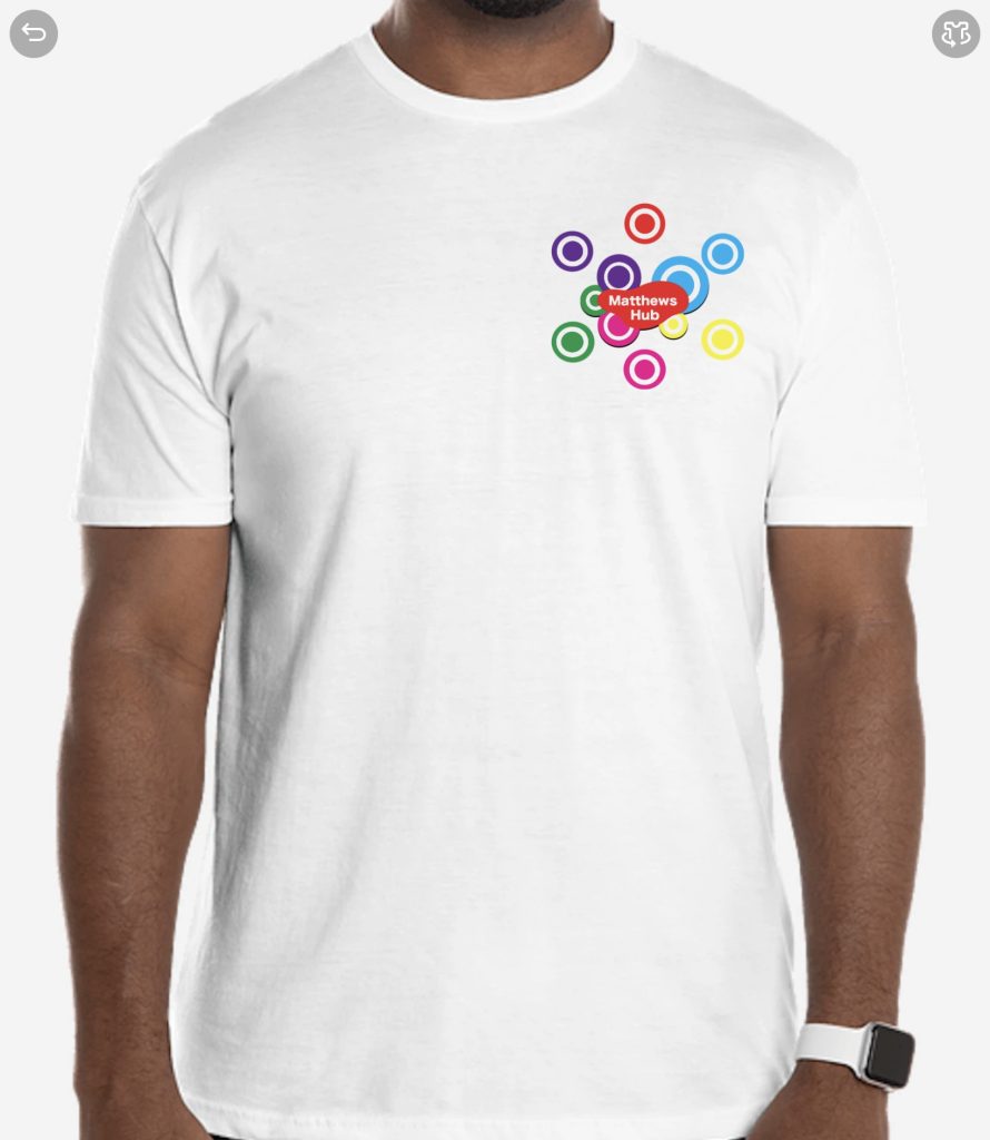
First, I found the website Cutsomink, which then provided a way to upload the designs onto a shirt being worn by a guy. Because of this, I was able to see how the shirt would look with the logo upon it. After deliberation, I decided to add a backdrop to the logo to make it stand out more. I much prefer this design to the first purely due to it standing out
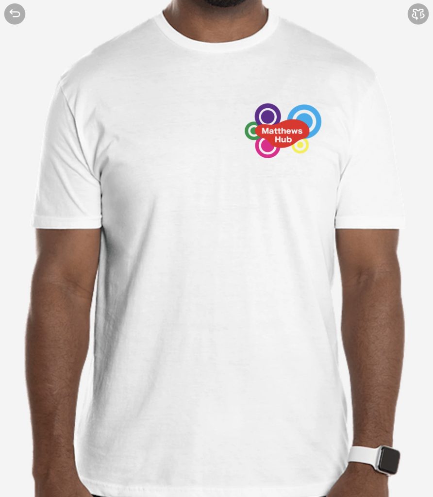
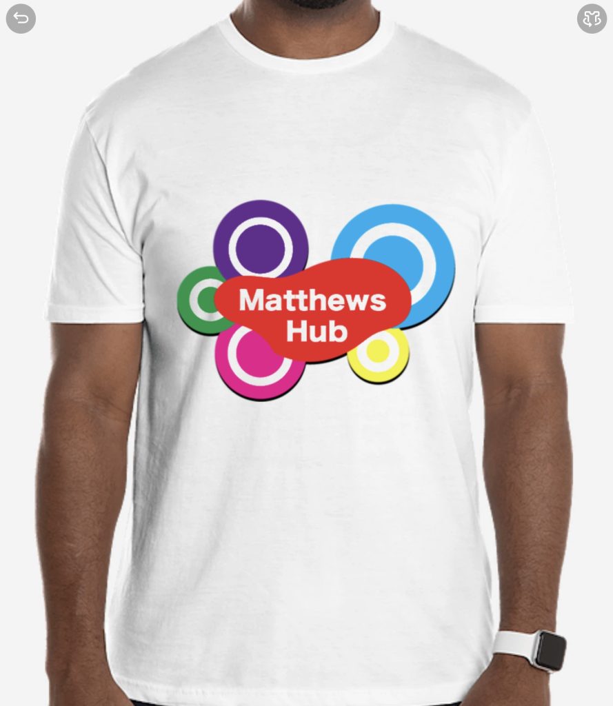
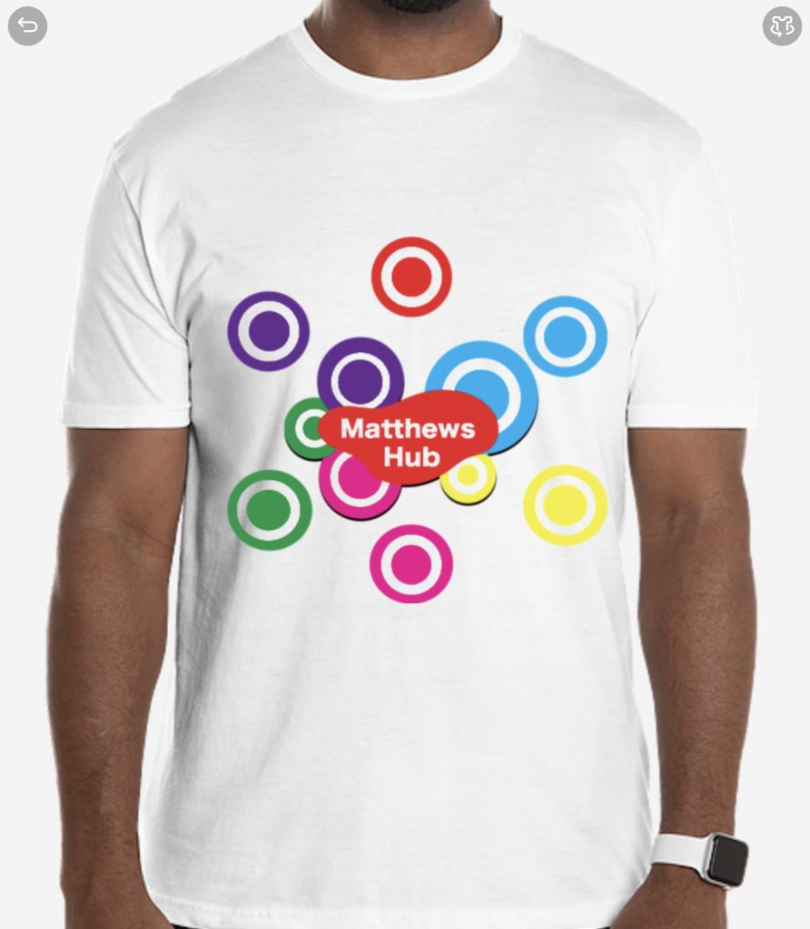
I still believed the shirt could have more of a design however. So I added a few circles around the logo to expand upon it. When it comes to covering a full shirt, I believe this one is the best. When it comes to being in the upper right corner (left chest) of the shirt, it suffers compared to its past counterparts. Overall, the third design fits the larger concept better, however the second design is better for a smaller logo.
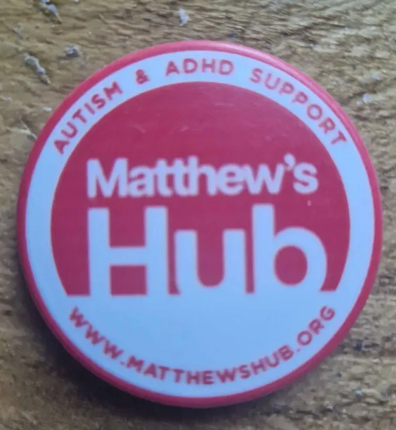
When it comes to badge designs, I have an official Matthews Hub badge design to go off and compare against with my own designs. I believe this will help with some inspiration. However, I don’t want my design to be based too much from it, as I believe my own skills as a graphic designer must be tested and shown, instead on relying on a lot of design elements from the actual company. After all, the goal of the rebranding is too change stuff into something better or more suited to the current identity.
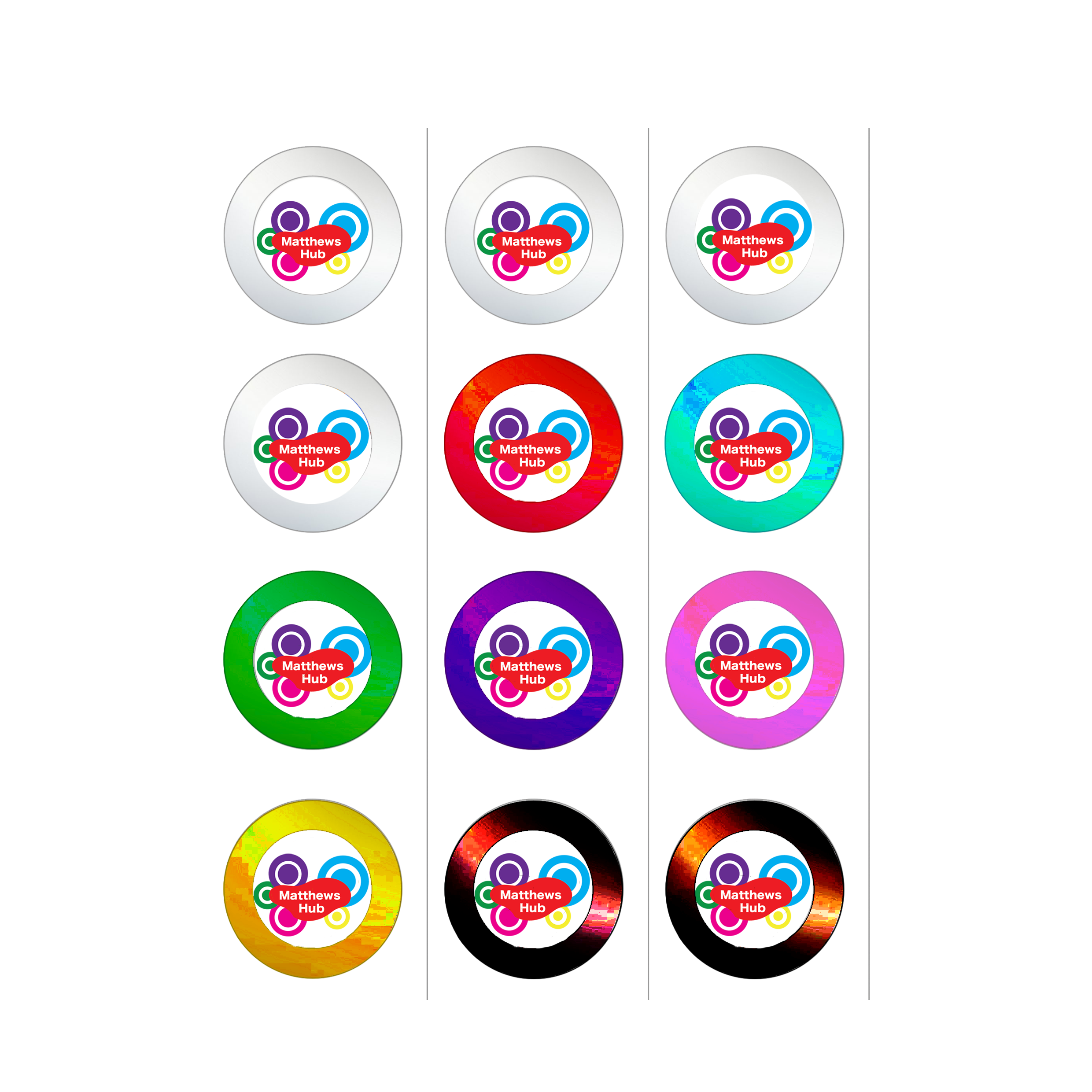
Next was Button designs. These were fairly simple to make concepts for. Simply the Matthews Hub logo in the middle would do the job. Of course, to make them unique, I made it so there are a bunch of coloured options. this would help as everyone would have a choice when picking and people would be more drawn to a certain colour, giving them more reason to take a badge in the first place. I then also added two different black options as there are a few people on the autistic spectrum who prefer designs like that. Plus, it adds another colour option for people to choose between.
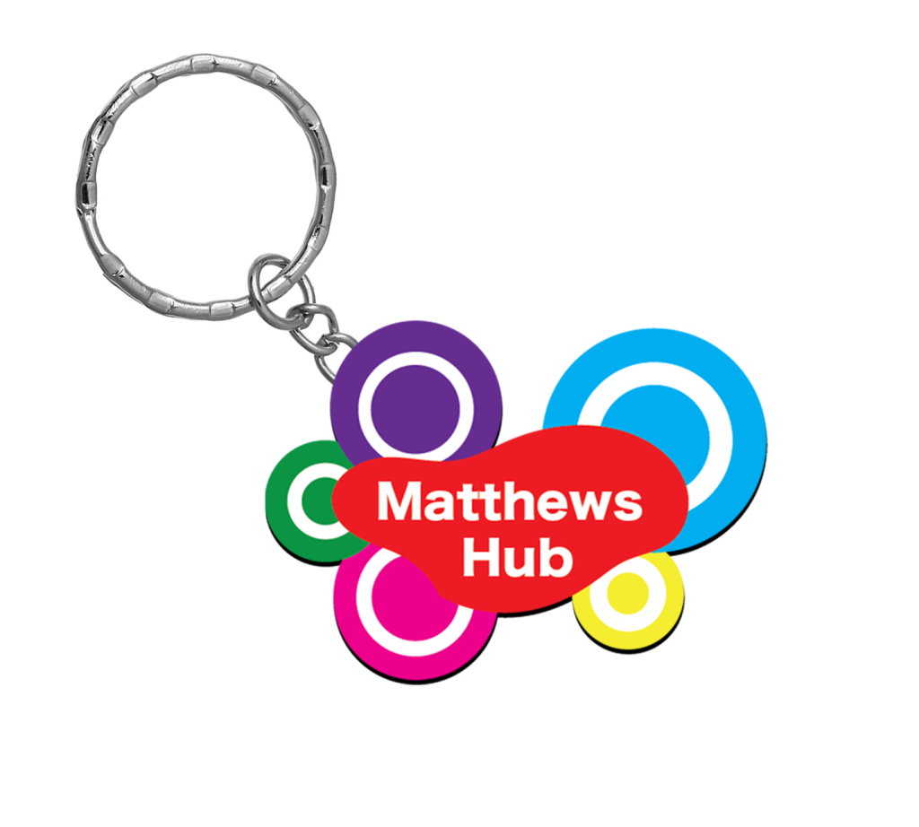
This keychain concept was a very easy decision. The design of the logo in the first place is unique enough, and interesting enough in shape to be turned into a keychain. Now when it comes to what kind of keychain I could make. Whether this be the usual metal type, or a picture put in the middle of a see through material. Both of these would have the same effect, however one would definitely provide a cheaper alternative when produced. Out of all the merchandise I made concepts for, this one has the most potential.
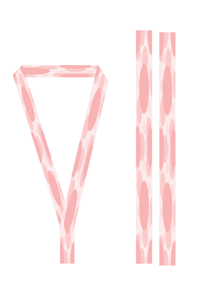
Lastly, I decided to come up with a lanyard design as it would be a waste not to. Obviously, the design used in the background of most of my work would provide the best look for the design. This would make it stand out from most other lanyards that are a few lines, or the name of the place on it. of course, most lanyards would not be purchasable and would be used by staff as a way to identify them.
I personally think Matthews Hub having their own lanyards would help when they go to other events or places with other charities/companies, as a way to differentiate between them. When it comes to the concept of purchasable lanyards, I do not believe that is something that should be made. This is simply because with them, people would be able to impersonate as staff. Even if I was to make a different design, not everyone may be clued in on which is a staff or not, so its best to keep lanyards as a staff only thing.
References
Customink, 2024, T-Shirt Design Lab, Accessed on 27/12/2024, https://www.customink.com/ndx/#/