When coming up with real life advertising, it would be best to first create a poster design. This would then become the basis for how most of my other, much larger, designs would look, of course with a few changes.
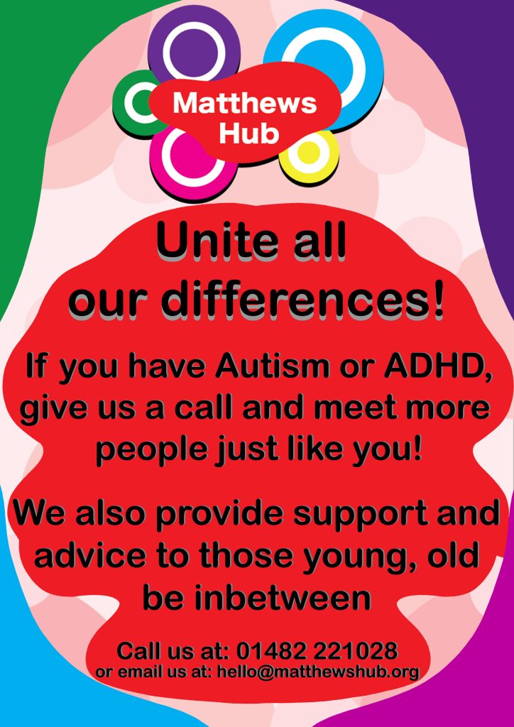
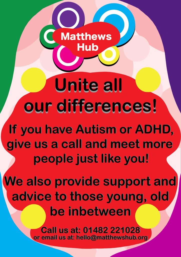
When making a poster for Matthews Hub, I began with continuing with the theme of including every single colour in the design. In the first few attempts, yellow was the one that wasn’t included thanks to all borders being filled. However, after a few ideas, I found a good combination of all my ideas into one design. Out of the two borders, the more curved one was decided upon, as it is more dynamic and displays a sense of uniqueness. When it comes to the red backdrop, I thought of dropping it. However, it seemed a good choice and another display of uniqueness. But it is probably best to remove it when making bigger adverts, as it may be too distracting. Plus the removal of it would not leave out red, as the background itself is the same red background used in lots of other adverts.
The font choice was a quick choice. Sans serif displays the easy going idea perfectly, much more than a serif font. The sizing as well was a deliberate choice, with the number being over the email as it is more commonly used, and then the biggest thing being a potential catchphrase.
Before making what would be put on Billboards and signs, I first looked up the general size specifications. This is very important as I don’t want my image to be too stretched or thin as then the font and logo would be ruined and look wrong, destroying the design and effect, along with making it look very unprofessional.
Once again, the design of the billboards keeps the same design as the site and online advertisements, keeping that interlinked identity. Thus, when seen, people will recognise the brand and over time people will become familiar with it. The reason I have decided to keep the bubble background through many places is thanks to the feedback when first made. The background elicited a nice happy feeling, the precise idea I was trying to get across. Therefore, it should be used in other places to make it part of the identity.
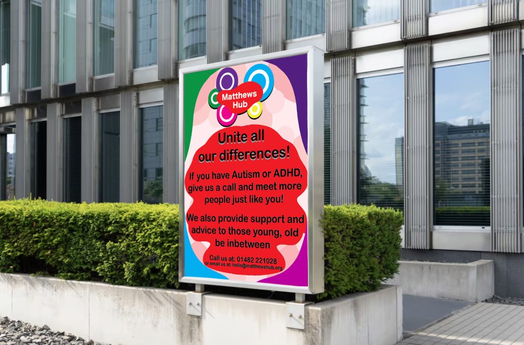
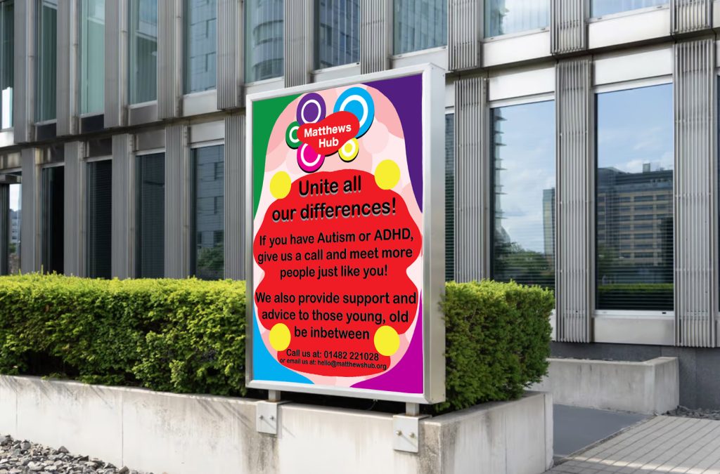
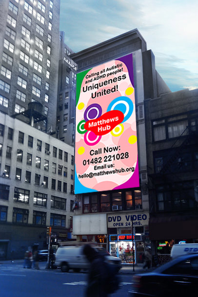
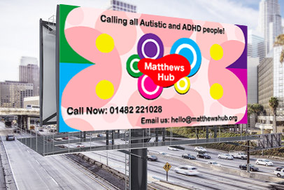
When finding some placeholders to imagine the idea, I found some free downloadable designs. Both big billboard placeholders come from the site, Placeit, while the poster placeholder is from Mr Mockup. While I have designed what they would look like, it is best to get an idea of what my creation would look like and if it successfully works or needs improvements.
Overall, all the designs are pleasing to look at and all information is shown clearly. Despite some text being smaller, the size of the billboards help make them readable. I believe my choice in colours and imagery has paid off, as they stick out amongst the more monotone colours of a city.
References
Placeit, 2024, Mockup Generator, Accessed on 22/12/2024, https://placeit.net/c/mockups?f_devices=Billboard
Mr Mockup, 2024, Free Poster Billboard Mockup, Accessed on 22/12/2024, https://mrmockup.com/free-poster-billboard-mockup/