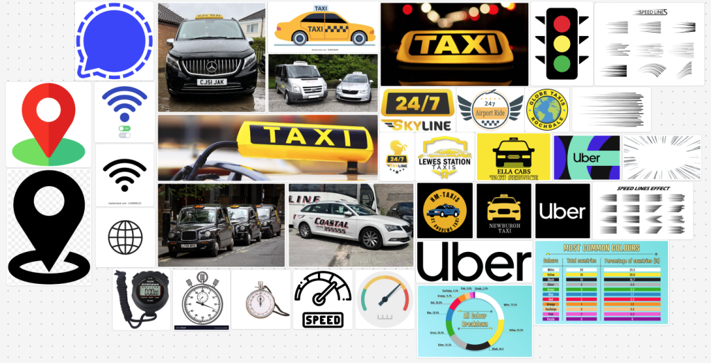
Upon looking at all 3 companies and designing the mood boards, I decided that the most ideas I had overall where for the taxi company, as shown by it being much larger than the other two. Along with that, I believe that taxis have the most potential as the advertising and style can be experimented with more.
My general thought process started with looking at taxis themselves, along with their colour scheme. This resulted in looking at the analytics for what the most famous taxis are. This would then give an idea of what type of taxis would be used in imagery, or an idea of what colours would work best.
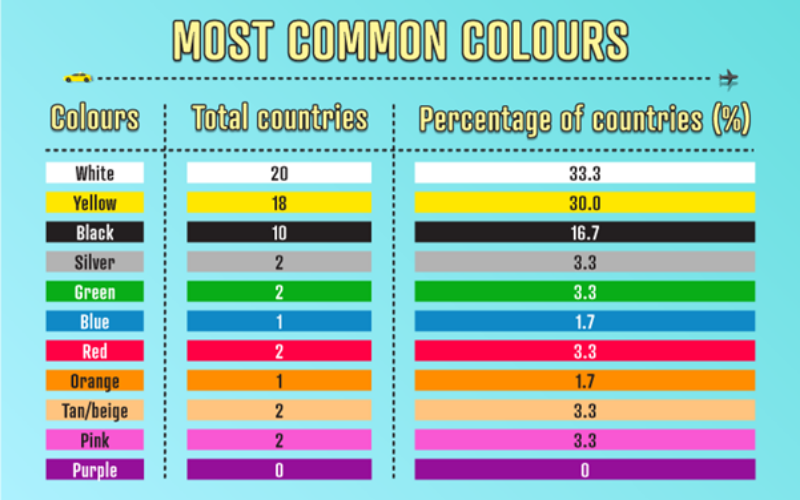
Overall, white seems to be the most commonly used colour for taxis. However, it wouldn’t be the best idea to throw aside the recognisability of yellow and black taxis, specifically the combination of those colours. So while creating the logo, those will be the main 3 colours I will use.
Past that point, I looked up other taxi company logos from around the world as to see what some people came up with as an idea. After looking across the web, most of them have the same sort of concept. The most common design elements are a taxi itself, wings and a circle. Taxis being included is an obvious choice for a logo. Wings can represent speed, or something going quick, so it could be something I use. However, I also believe speed lines could represent this much better. Lastly, a circle is an easy shape to put a logo or imagery on to. I would like to avoid this but it would not be an issue including a few concepts.
The inclusion of the company uber in the mood board is because they are one of the leading businesses for travel and delivery in the world currently. However, unlike taxis, Uber is across multiple different countries, hence its marketing is very simple. Taxis however have the chance to have a more local or more varied design thanks to being contained to the cities and towns they originate from. Yet the existence of Uber’s advertising and style cannot be ignored, and may provide some insights for future ideas.
Lastly I included a few bits of imagery that fairly relate to traffic, speed and travel. This is why I included a stopwatch, a speedometer, a traffic light, etc. And then the message and internet icons represent messaging a taxi. These images are more optional ideas which maybe could be added onto a more primary idea, being a secondary factor. But it still may be good to see what they would look like as the main catch, as it would stand out from other taxi identities.
When getting to the logo creation process past this point, the style of the logo itself could be a factor in what works and what doesn’t, along for most of the marketing in general. Most logos in my mood board are fairly simplistic and have a clean style. However, when making them, it may be best to use some more experimental styles and approaches, as to stand out from the crowd.
References
The Taxi Centre, 2024, Taxi Colours From Around The World, Accessed on 19/12/24, https://www.thetaxicentre.com/news/taxi-colours-from-around-the-world/