After thinking about how to incorporate Edward Tufte’s theories into my ideas, I tried to incorporate my ideas where I could. This resulted in a product that achieves its objective and message; corporations and its management watching over as its workers go along to a perfect rhythm.
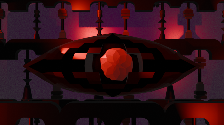
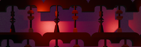
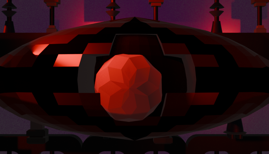
With Use of Colour, the ideas I discussed last time where successfully integrated. A new development that needed to be considered now was the use of colour in the lighting. I decided to go with red as it complimented the models themselves. With the addition of a sinister mood, the piece itself stayed to its original goal. The eye and the subsequent colour chosen was heavily inspired by 1984, adding to the lighting choice as the red adds to the danger of it.
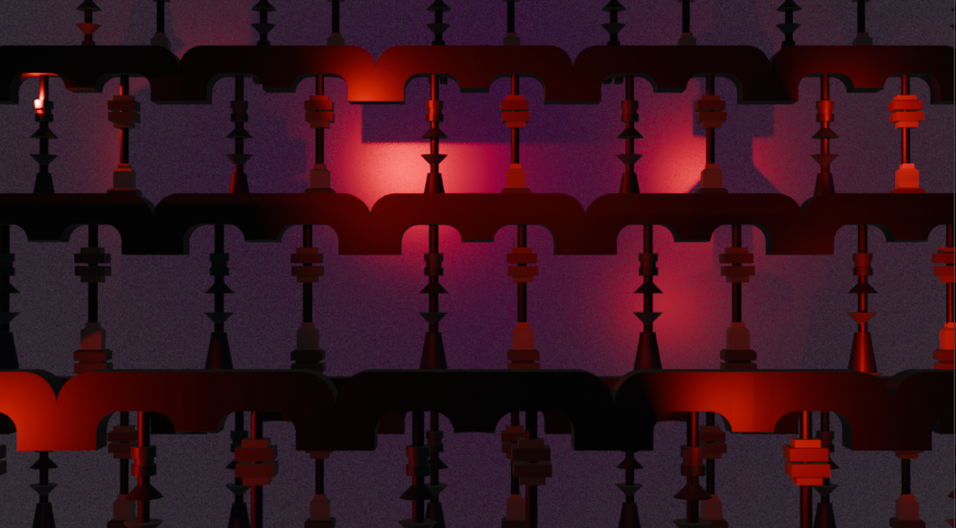
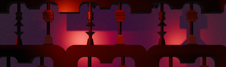
Next was Small Multiples Encourage Comparison. I stayed true to my storyboard idea in which all the pistons are in the background, with more showing up over time. Along with this, every other piston is a different one, not only in looks but also in when they move. While this would be hard to notice on first watch, I believe that adds something rewatchable to the animation.
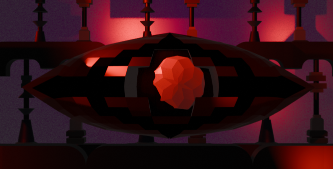
Afterwards was Narratives of Space and Time. As mentioned in the previous post, the camera itself does not move as much as other animations, simply being a pan outwards and back inwards at the end. However, the panning itself slowly reveals more pistons, eventually showing a full picture of how truly overshadowing the main eye is, which would be the narrative. The pistons themselves move to a perfect rhythm, while the eye itself slowly moves its eye, also showing a second narrative of perfection.
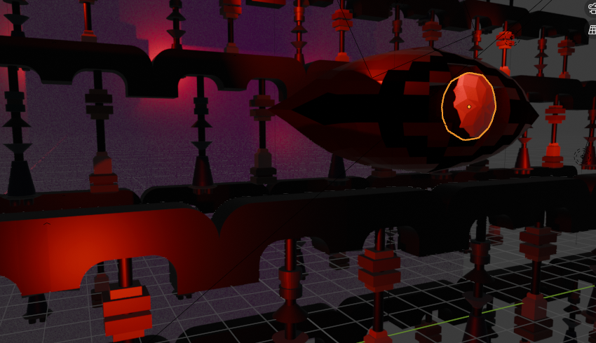
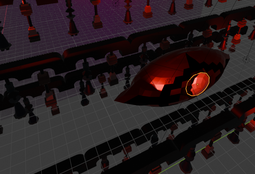
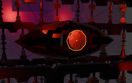
When doing Layering and Separation, I first made it so all pistons are on a different plane. Some would be behind, while others up front. But when viewed from a camera, all of them would look as if they existed together. The depth created would then make it an interesting watching experience, being something that would be noticed on concurrent viewings. Along with the placement of the pistons, I made sure that the eyeball was directly in the centre, in the video and in the layers. This is done to, as Edward Tufte put, “direct attention to the information at hand.” While the pistons add to the story and overall effect, the eye is the main centrepiece to it, so ensuring its viewability was necessary.

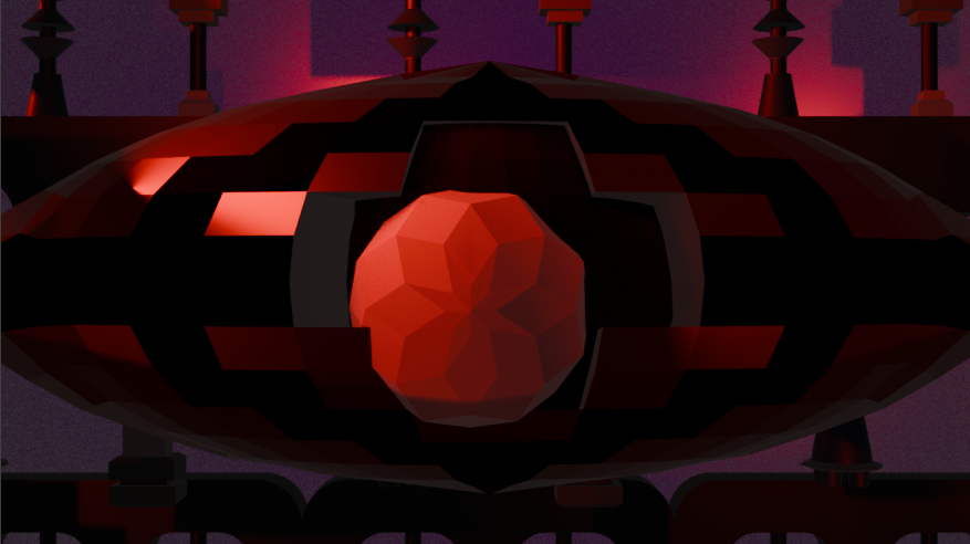
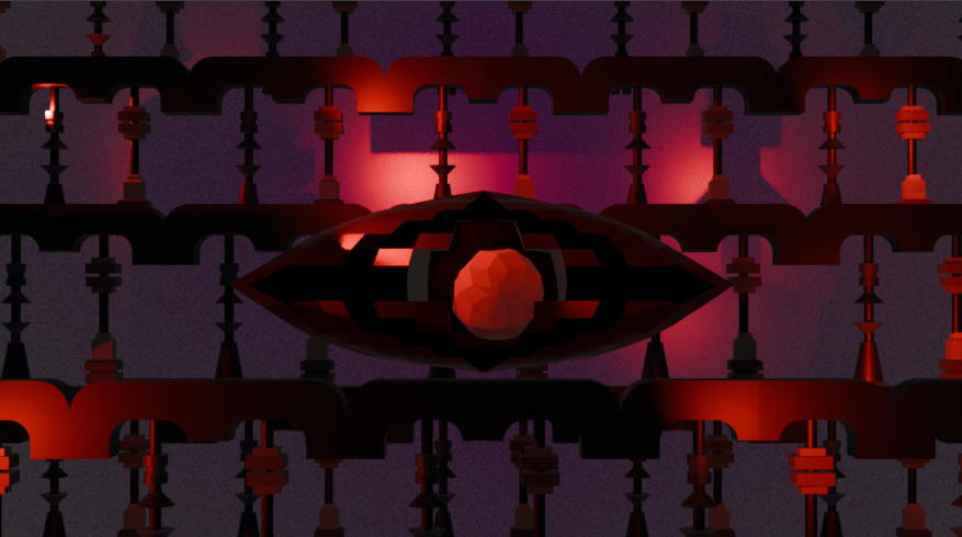
The last and most important factor to my message was Micro/Macro readings. The journey of the camera is to showcase the size and scale of everything at hand, showing how truly dominating the eye is over all the pistons at work. The theme of how truly massive corporate management is in comparison to its workers is showcased through this simple move of the camera. Along with this, the animation begins with the sight of the ruby, before zooming out to show the rest of the eye. This successfully gets across the metamorphosis by simply moving the camera and relying on an audiences lack of knowledge on a first viewing.
References
Orwell, G. (1949). 1984. United Kingdom: Secker & Warburg. p.328.
Orwell, G, White J.. (2024). George Orwell’s 1984 Audiobook. [Audible]. Audiblr Original. Available at: https://www.audible.co.uk/pd/George-Orwells-1984-Audiobook/B0CRS2YMLQ [Accessed 6 March 2025].
(1984). [Film]. Southwest London: Virgin Films.
Tufte, E. (1990). Envisioning Information. Cheshire, Conneticut: Graphics Press USA. p.126.