Upon looking at Edward Tufte’s five theories, I wondered how I could get across the message I wanted to convey while also sticking as close to his theories as possible. While some where able to slot in quite nicely, others needed me to take a new approach with my plans.
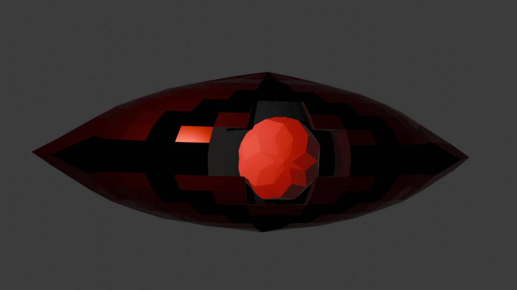
When it came to incorporating Edward Tufte’s Use of Colour, the decision was that colour will help get across the meaning of my animation. With this piece, I want the animation to represent the rich watching over the poor, or more accurately, corporate management watching over its workers. This, I believe, would encapsulate the industrial setting. To do this, the eye itself had to have one of the only bright bits of colour, while the pistons themselves that represent the workers are dulled out, representing their tired and overworked state. This is a different way of viewing Tufte’s sentence “colour brings to information more than just codes naming visual nouns.”
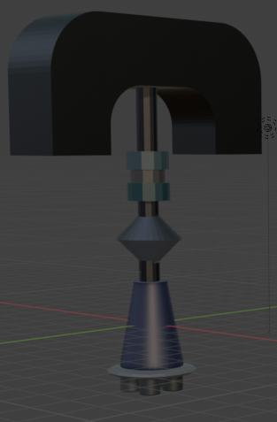
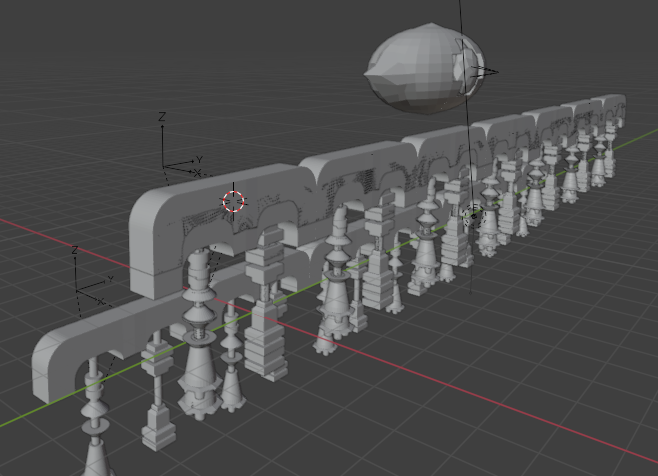
Next was looking at Small Multiples Encourage Comparison. While the pistons themselves do not move differently, there will be multiple of each, with every other one being a different design to the last. Those that take notice of the background will note the difference between the pistons, yet the similarity in how they all move.
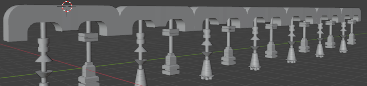
After that was Narratives of Space and Time, the animation won’t have much movement compared to Edward Tufte’s example, being a dance illustrated and shown on page. However, the rhythmic movement of the pistons in the back will give of an idea of perfection, revealing a narrative of no failure in industry. Combined with the slowness will tell a story with a tiring atmosphere. Plus, the journey of the camera, revealing more and more pistons, would itself be a very satisfying narrative.
Layering and Separation was the one afterwards, which plays an important part with what I plan on making. All the pistons will be at different distances from the eye, yet from the view of the camera, they will all look as if they are all on the same layer and equal. The only thing separating them would be the massive eye in the middle. Thanks to the placement of the eye, it will “direct attention toward the information at hand.” This in itself could also tell its own story of how the rich separates everyone, while the pistons shows that despite the placement and situation, they are all similar.
Lastly is Micro/Macro Readings. This will be conveyed best with the camera when animating. As the camera zooms out it slowly reveals more and more in the background, along with how big what we started on is, in comparison to everything else. This also adds to the story I want to craft. By zooming out and showing the whole picture, not only does the metamorphosis from ruby to pupil happen, but the message is shown simply through a camera moving backwards.
References
Tufte, E. (1990). Envisioning Information. Cheshire, Conneticut: Graphics Press USA. p.126.