While I have an idea of the design of certain elements, it is best to sketch down the storyboard and initial ideas for the character before making more detailed and digital drawings. This would help in my decision process and if anything needs to be improved.
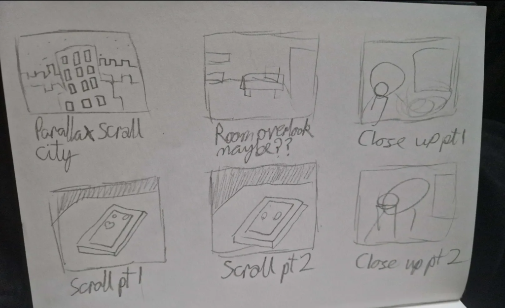
When coming up with the storyboard, I knew I wanted to start with an establishing shot, as they add context to stories, along with being fairly simple to animate. Beyond that, I also decided to have an overhead shot of the room before zooming in on the character as to get an idea of their living area, which on rewatches could show what kind of person the character is. After that, it would go into a close up to finally reveal the character, looking fairly depressed. Any questions on why will be immediately answered upon switching to a shot of the phone, with the character scrolling on a social media app. The scrolling will first show their post performing poorly, and as they scroll down, they see another post which has performed better overall. Lastly, it would cut back to the close up, showing more of their reaction before fading to black.
Some of this is very hastily sketched down on paper, as to get it down. A lot of it will be expanded upon when made digital, along with the other sketches.
When designing the protagonist of the animation, I based a lot of their design on another character of my own creation. The clothing and style is based on 2000s design choices and drawings. The main style used as reference was the scene art style, as I personally believe it captures what I want. Specifically, it’s a very experimental and internet based style which lends itself to the theme. However, I would be remiss to not mention that I favour the style and like it, which is a main reason why it was used. Another style considered was Frutiger Aero, which is a style heavily routed in the 2000s and early 2010s.
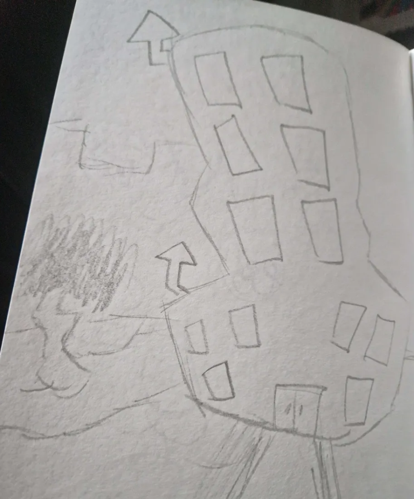
Lastly, I decided to do a quick sketch of the building itself and the surrounding area just so it had a unique design that made it stick out. This was a very quick sketch as it is a small portion of the animation, and its only purpose is to stand out.
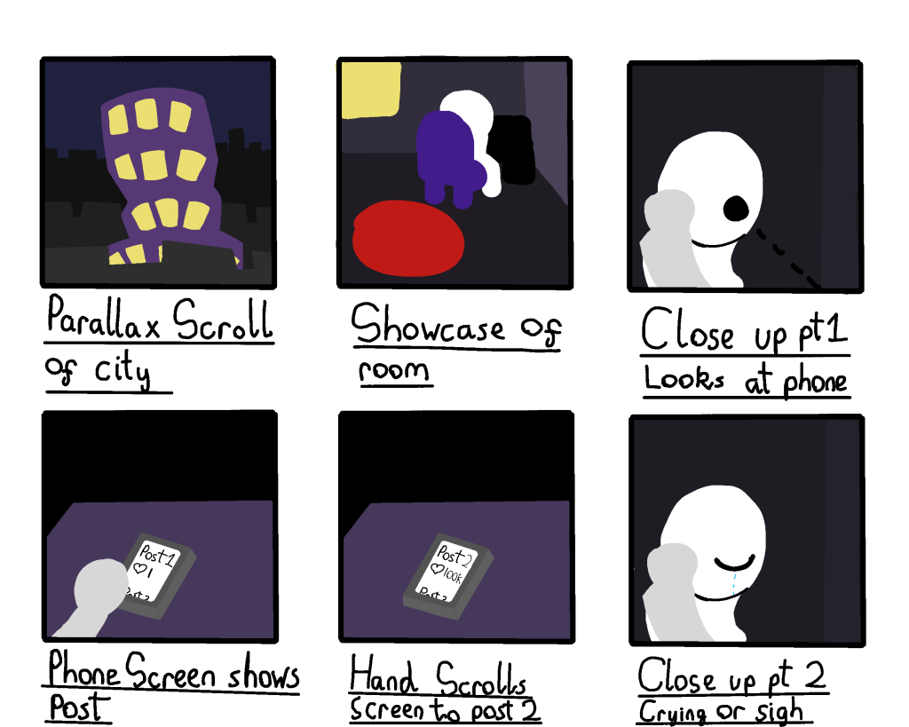
When making a digital version of the storyboard, I chose to add colour to make the events a lot more clear. This was to ensure that the path forward during the creation process was obvious and what would be made was set in stone. However, once drawing and animating begins, many scenes are subject to change and even be removed depending on circumstances. This is because I feel I may not be skilled enough in certain areas to draw certain scenes and animate them.
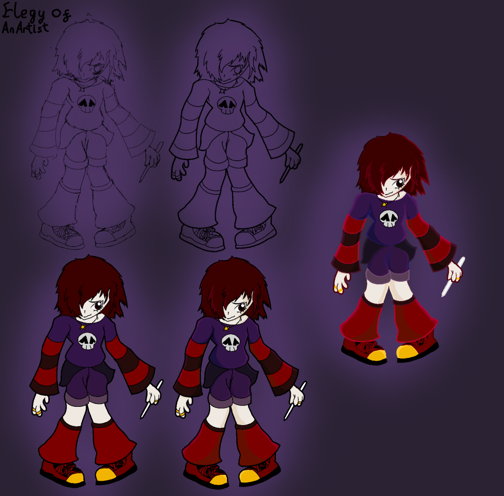
Digitally drawing the character was straight to the point. I left in each phase of the character design to show the process of making it. The design still heavily leans on the scene art style with a few changes. Most of the character won’t be shown but I felt it necessary to add to make animating the body easier to imagine.
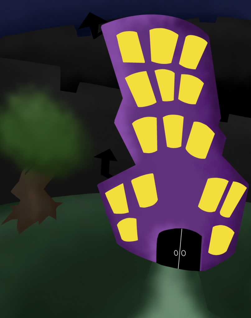
Lastly, the building was given a detailed sketch as to understand what the city would look like. It is not as elaborate as the character however as it lacks the importance of the character. Despite this, the drawing helps with imaging the city and how it should be drawn in the animation.