The last of all the animations left to create was the animated advert that would appear on mobile phones. Like previous times, I returned to a sketch book to draft a quick storyboard. Unlike before, I did not return to the Figma board, as I believed that I had a good grasp on the stylings used. Along with this, I could now look back at the other animations for styling, as to remain consistent and on brand.
The storyboard made was very simplistic thanks to the nature of phone advertisements. Despite the simplicity, it was necessary to create, as a simple visual of where everything would be and the general events that would play out. Unlike both animations before though, this one would be adapted to the ratio of a phone screen.

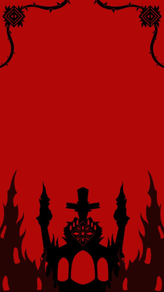
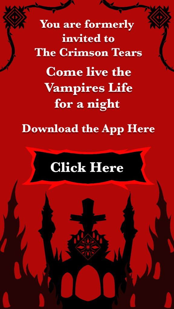
When creating the design, I decided upon reusing the gothic inspired building from the first animation. This would interconnect them all, ensuring the style remains the same throughout. The towers in front of the building and border at top where made to give the advert its own unique touches to make it stand out amongst the three animations. The font chosen was once again Baskerville, as to keep on theme with styling. However, thanks to the nature and size of phones, the font was made bold, to increase the readability.
Old Video
Finished Video
Overall, I believe I simulated the nature of phone advertisements to a commendable standard, keeping it simple and to the point, while also incorporating previous elements and themes from the 2 animations that came before it. Along with this, I also believe I made something that could capture the attention of my 13-25 target audience. This would be especially true amongst the older members of the audience.