Continuing on from the last animation, I returned to the Figma board to look back at my inspirations, and see if there was anything more I could examine. From there I could then begin designing the storyboard and animation.
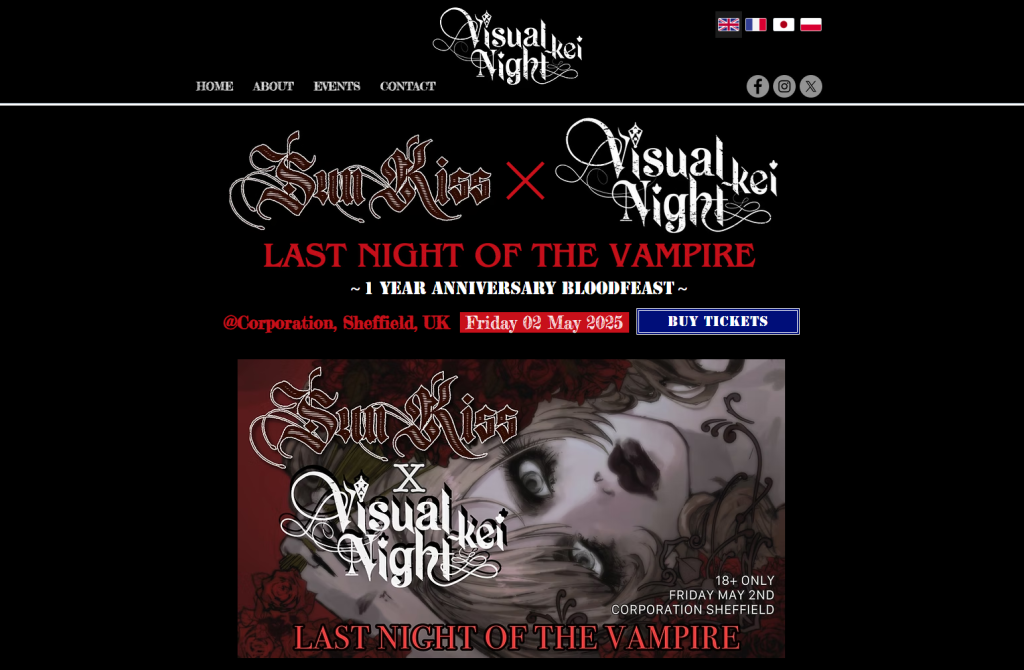
Going back to the Visual Kei Night, I realised their own website could give me a good basis on which to base some of the layout and ideas on. The site itself sticks to the same black red and white colour style that I had leaned into. Along with this, their home page seems to be a collection of information from the other pages, though with more focus on a base introduction.
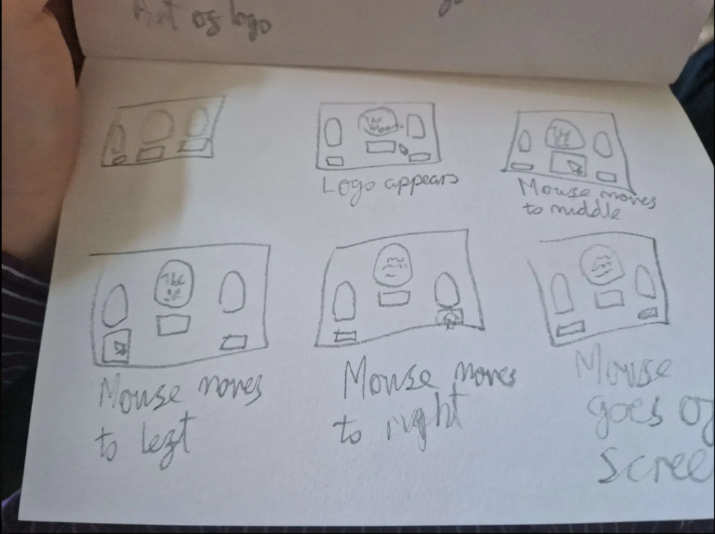
Once analysing the Visual Kei Night website, I then moved on to creating the next storyboard and how to create the illusion of an actual functioning homepage/webpage in an animation. I kept the descriptions of each panel simplistic as to not over complicate what to animate.

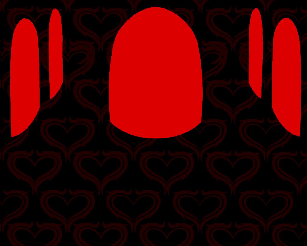
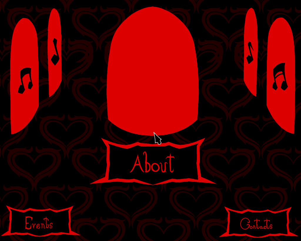
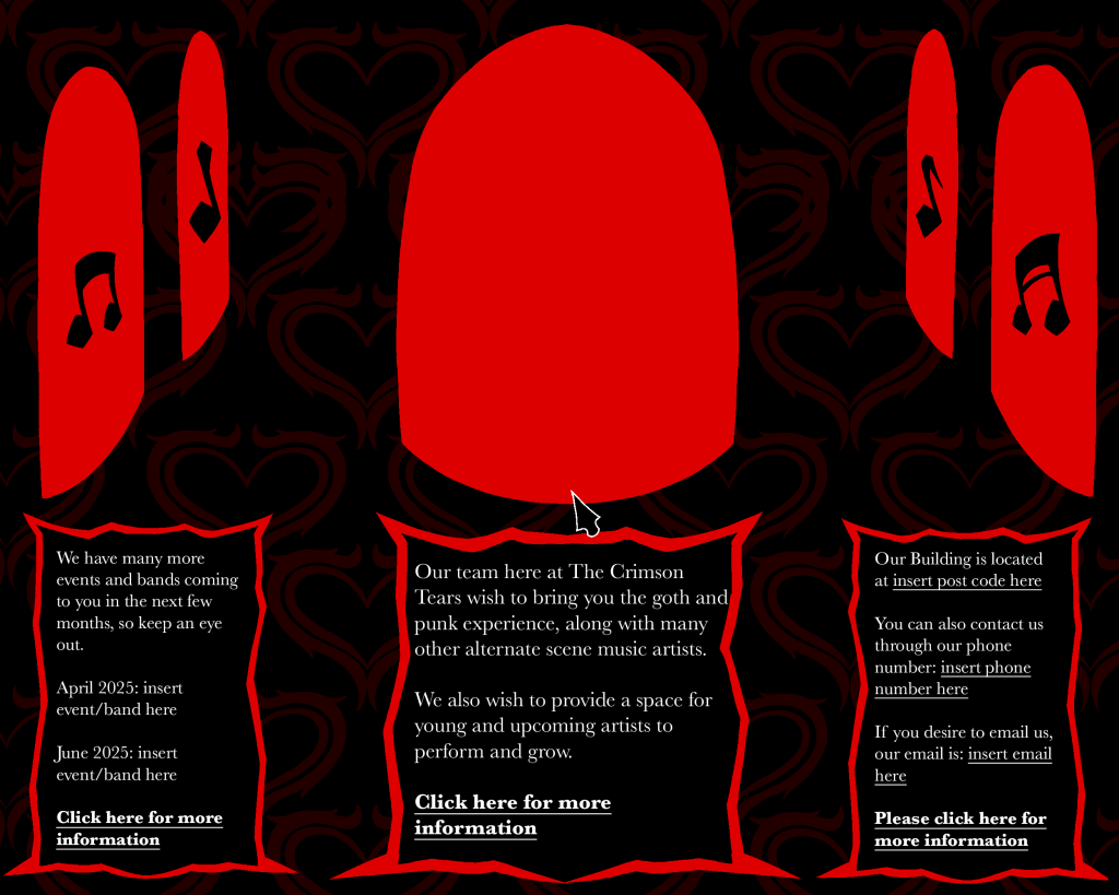
When designing the webpage, I desired to connect it to the other animation in a sense, making it feel more interconnected than simply being the same style. Therefore, the design of the webpage was loosely based on the inside of a cathedral, which was the main centrepiece of the last animation. Along with this, the background was given a faint but recognisable design, making it stick out more than the simple black background. Lastly, the font chosen for the text was Baskerville, as I believed it fit the elegance of the style, yet retained the readability, unlike other serif fonts.
Old Video
Finished Video
Overall, I am fairly content with this animation. While it took two attempts to get what I wanted, I still believe the old animation showcases my skills and intent well, which then helped in the designing of the final animation.
References
Nagata, K (2019) Visual Kei Night. Available at: https://www.vkeinight.com/ (Accessed on 28/4/2025).