When the creation process had begun, we had meetings with the marketing students as to get an idea of what their plans where, along with showcasing our own work to make sure they were happy with it, we traded images and messages often enough to keep updated.
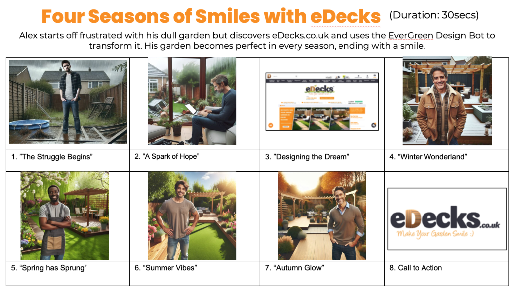
The marketing students made a PowerPoint as to get across most of their ideas and plans. The piece given the most detail however was this storyboard. While the storyboard gets across what it needs to, the images are very obviously ai created. This is a fair start, as the marketing team admitted that drawing or sketching is not their specialty. However, perhaps it would’ve benefitted if they asked for one of us Graphic Design students to create a more detailed storyboard, especially since this was a main piece to show to the client.
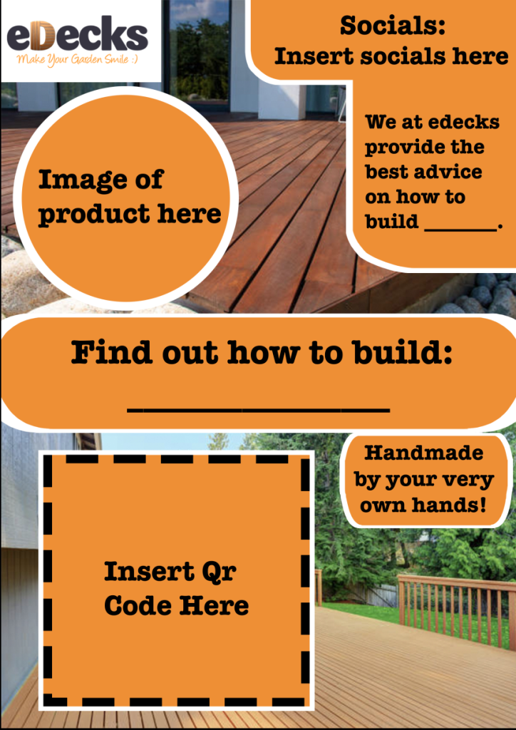
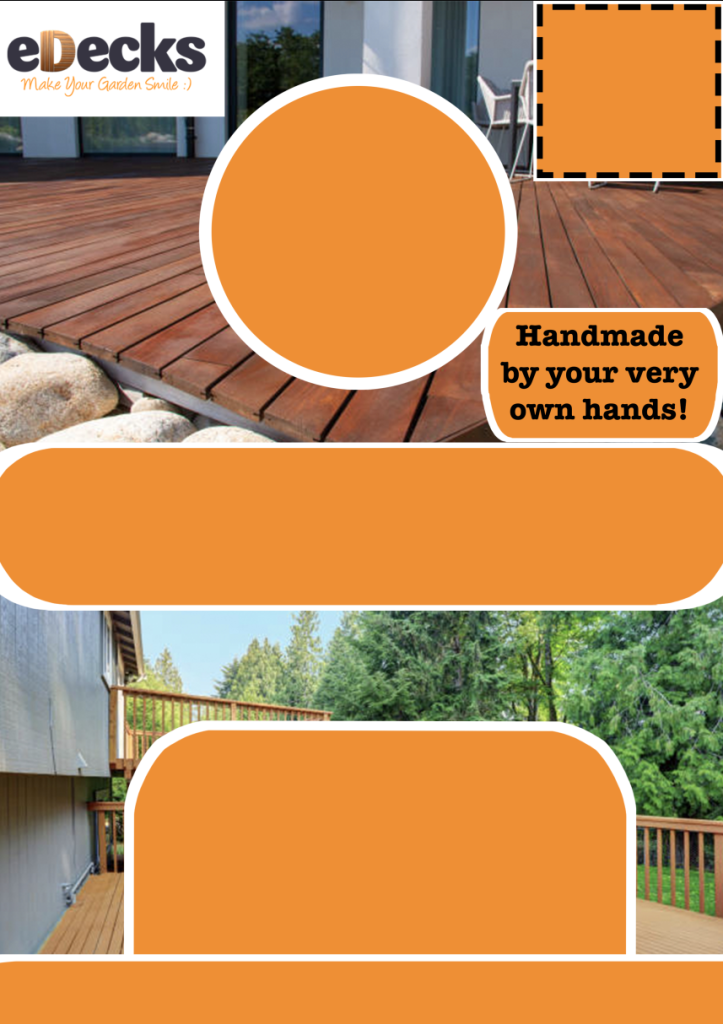
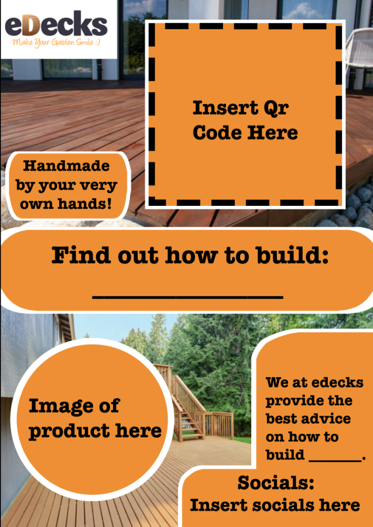
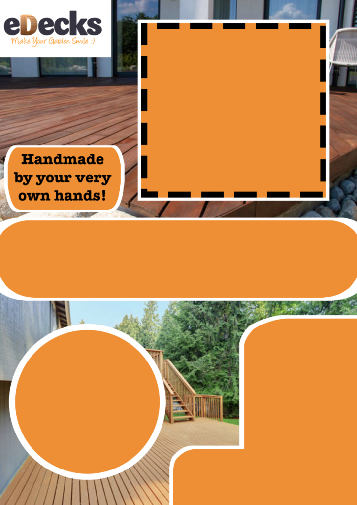
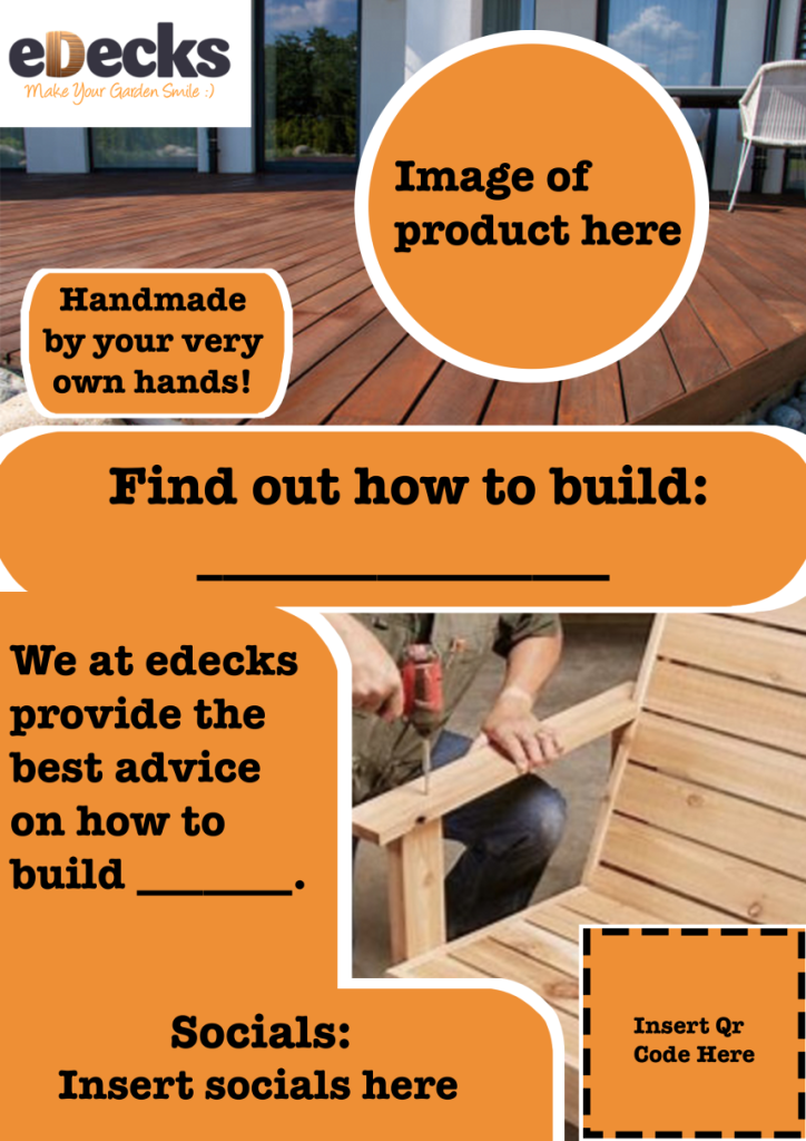
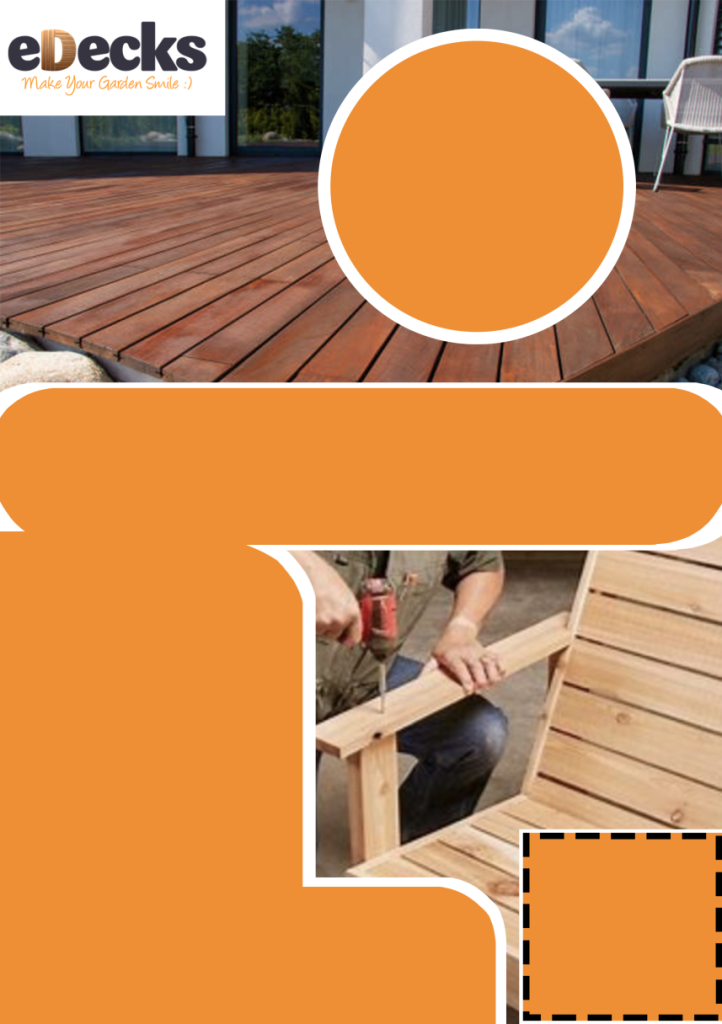
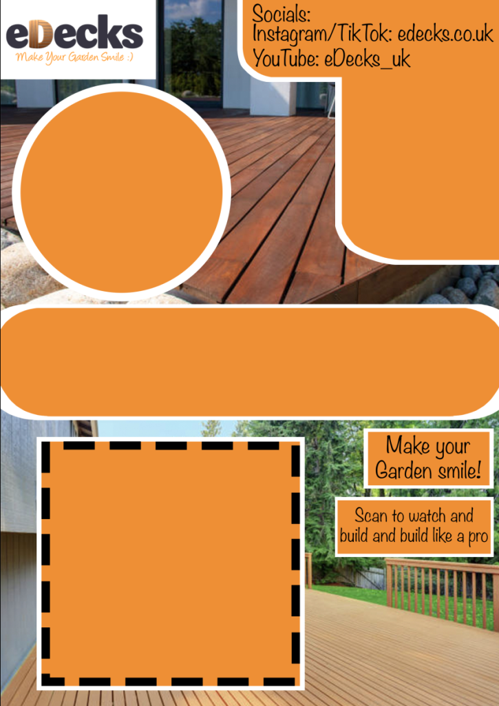
When it came to my own contributions, I took the job of creating some poster/flier designs for the marketing students. This choice was made as I specialise in poster making and feel most comfortable in that area. While creating these pictures, I acquired some stock pictures of decking, as I didn’t have any of my own to use. To our benefit, we also had permission to use the eDecks logo for our work. The logo itself however was not an important element in the piece, yet still needed to be included.
Using the knowledge of the styling I had gained from research, I made 4 posters/fliers with two variants, one with text and one without. These are simple enough to not be distracting yet dynamic enough to be intriguing. The decision to make two variants was if the marketing students wanted to include their own text, yet still kept the layout.
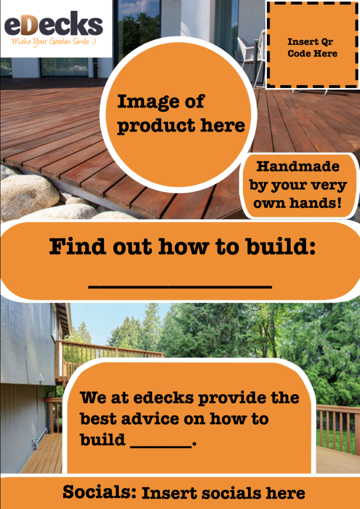
Once sent to the marketing students, they came back to me with both compliments and critiques about the design. The biggest changes asked for was the inclusion of the social media links, the inclusion of the old tagline, and changing the font to the same as the logos tagline.
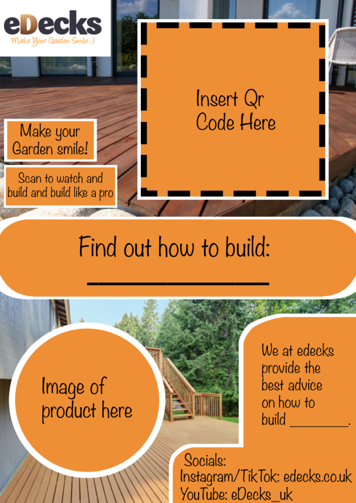
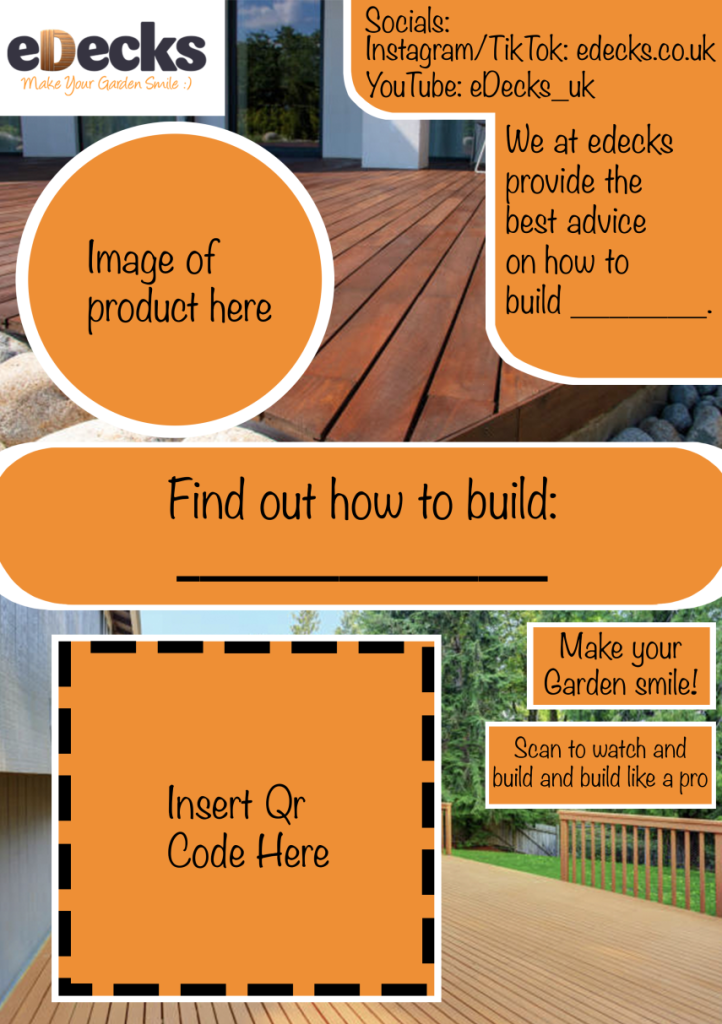
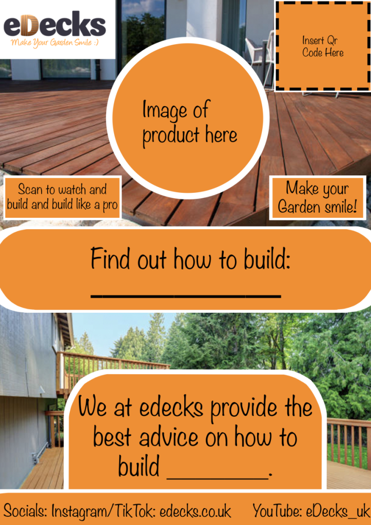
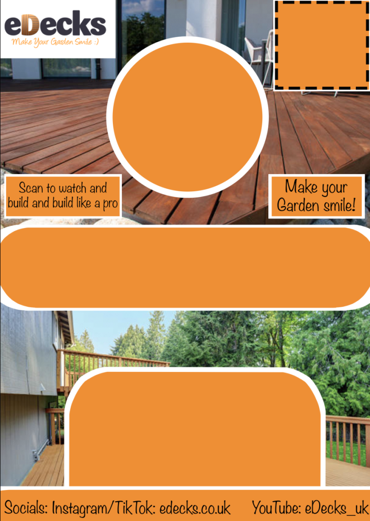
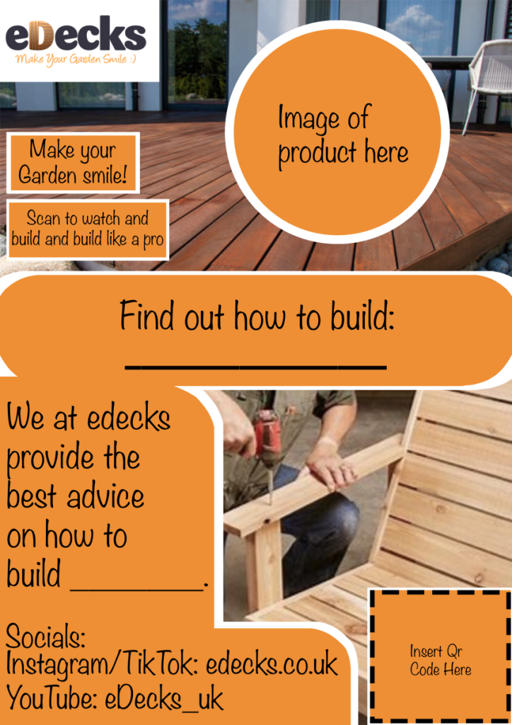
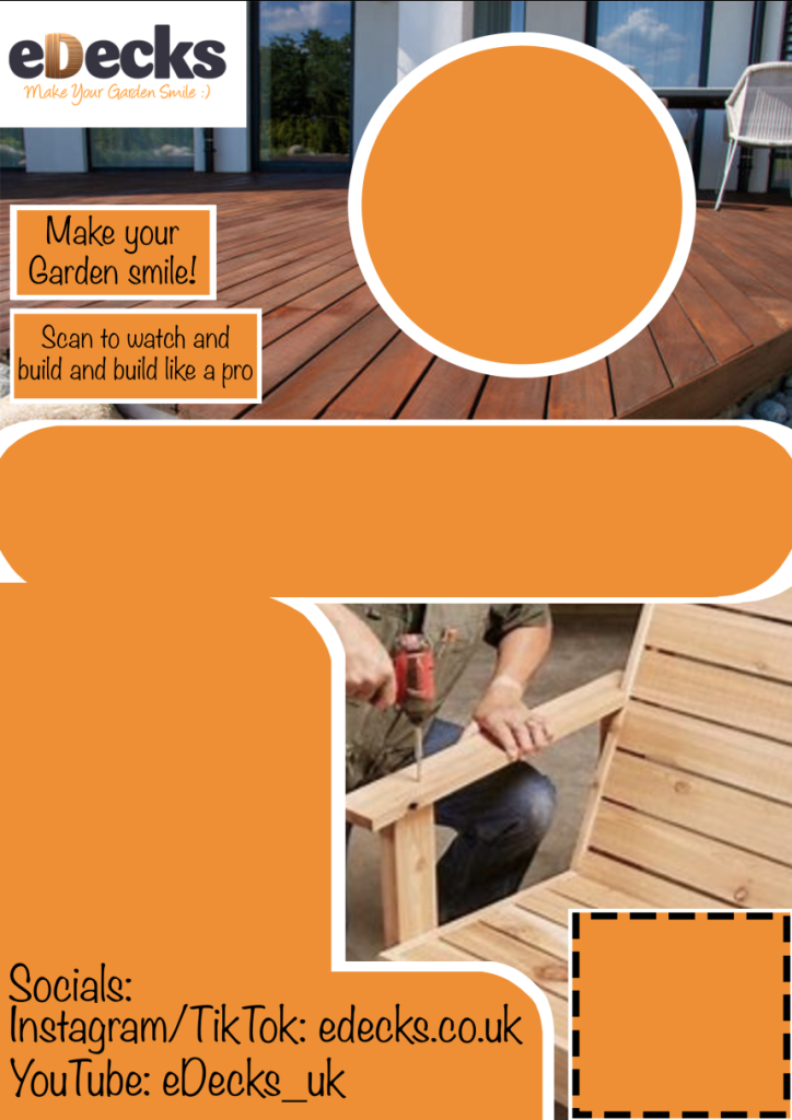
After being given the critiques, I went back and found the font used in the logo tagline. After some searching, I found out the font was Noteworthy, and changed all the text. Once that was finished, I quickly went back and added in the old tagline, replacing the new one that was made. Lastly, I looked up each social media link and typed them out in my program. I decided to keep them visible on the textless versions as well as to save time for the marketing students.
Overall, I was very proud of what I’d made, but after reflecting, I was also happy to get critiques of my work as it helped make the piece more suitable.