When deciding what exactly to create for the marketing and how to go about it, I believed it would be good to look at competitors in the field as to get an idea of what a more successful/well known company would be designing. This would help the decision process on what to create or how to attract the older target audience. Along with this, it would help me and my team decide what pieces of work we should create.
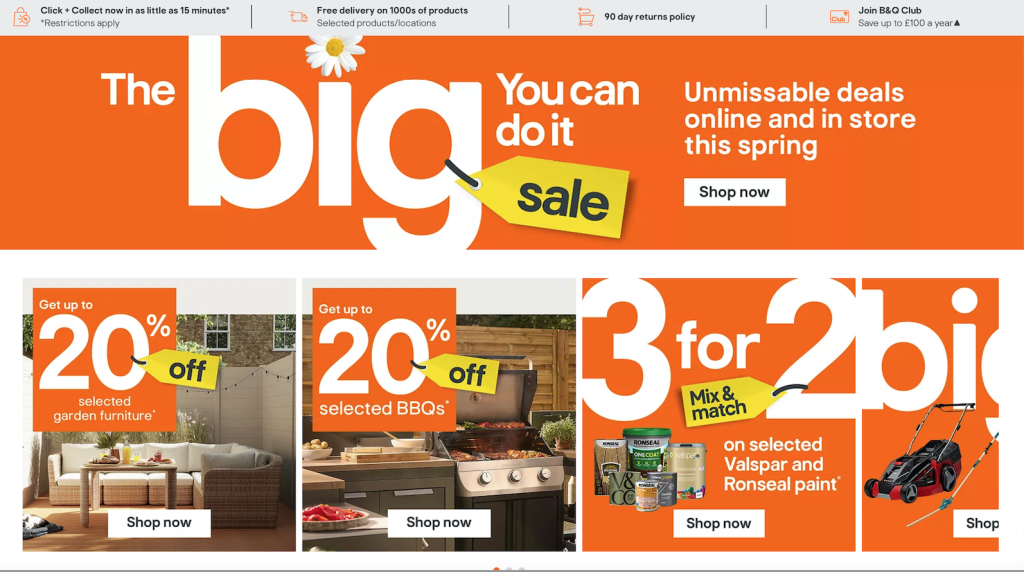
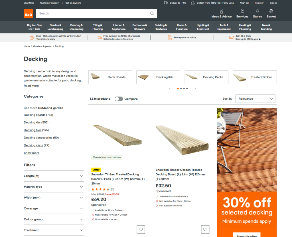
The first website I looked at was one of the UK’s biggest DIY and material shops, B&Q. While their website has a few composition issues similar to eDecks, the overall layout and branding is noticeably thought out and, generally, better executed. To go along with this, their layout of gardening and decking is more expertly laid out. While gardening isn’t their main market, it shows that a more lax approach is more effective.
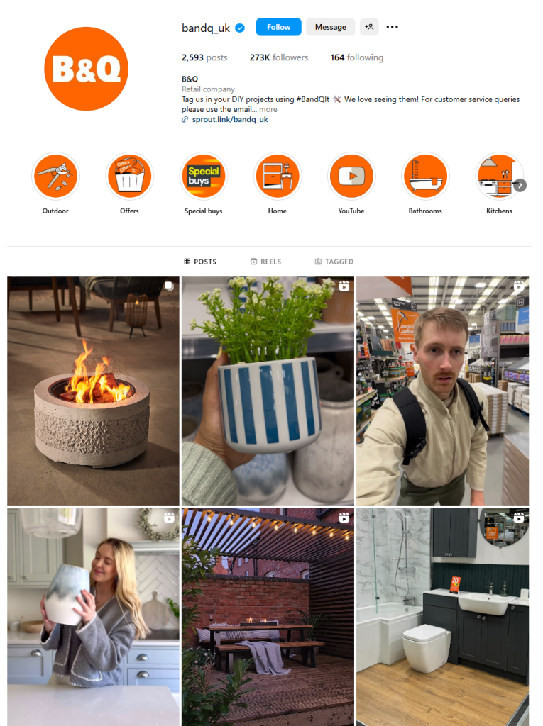
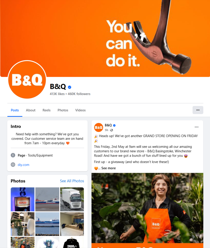
After finishing with the website, I decided to check over their social media. Overall, the content produced is much more in line with the audience they wish to attract and more focused than eDecks. They don’t seem to chase trends and prefer to stick to the more corporate angle of posting.
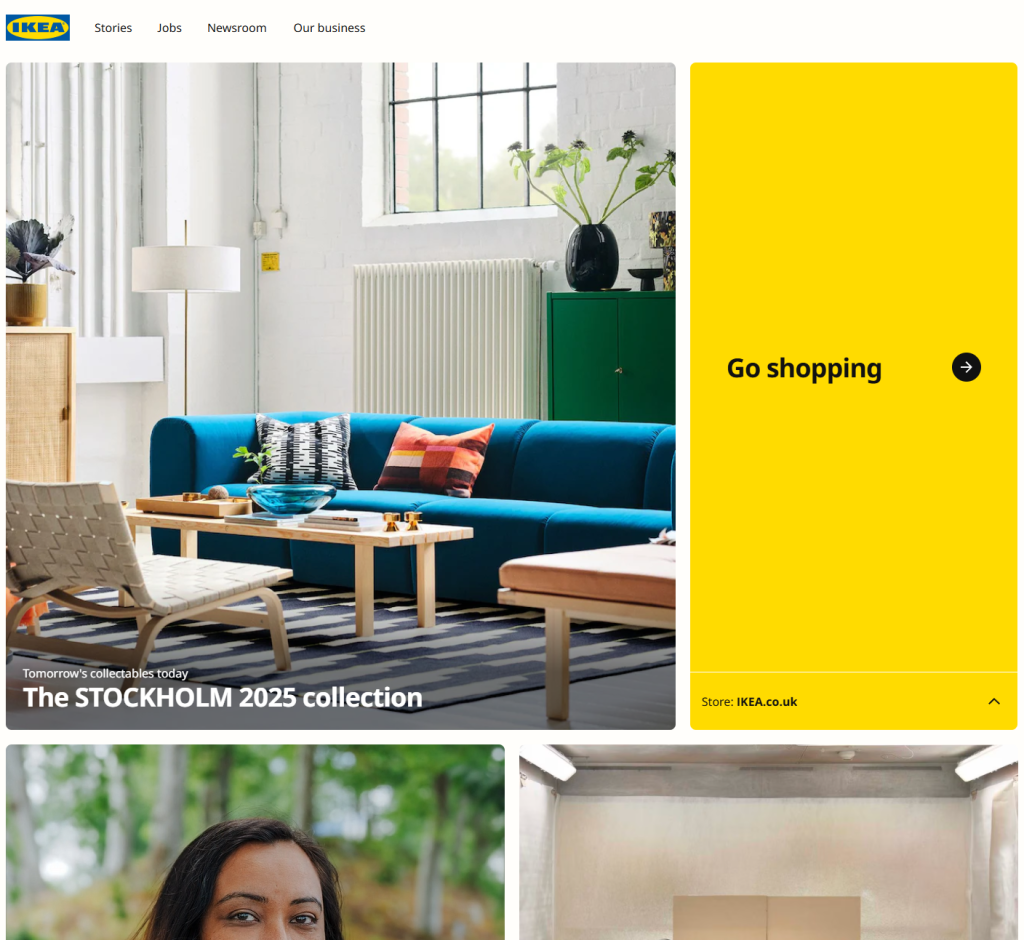
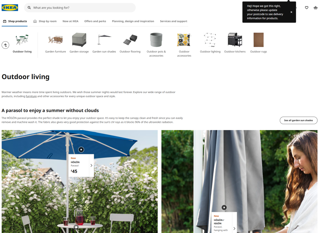
Next, I thought it best to look at an international company, as they would be dealing with multiple different countries, leading to a more broad style. Ikea was the first to come to mind. While their main products are furniture, they do have a section dedicated to outdoor based furniture. Overall, Ikea’s site provided the best composition, being unique to itself, yet also being incredibly simple to look for what you need. This clear styling gave me a good example of what should be done in the industry.
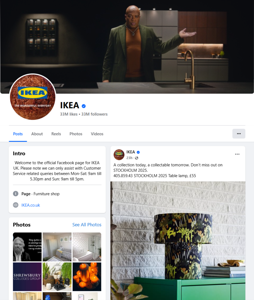
Their social media keeps this up, showcasing a great understanding of their audience. The content produced seems to attract a more mature, older audience, but also contains posts leaning towards a younger audience who may be purchasing a new house or simply looking to buy furniture. But unlike eDecks where it is very inconsistent, Ikea keep to their stylings and post format.
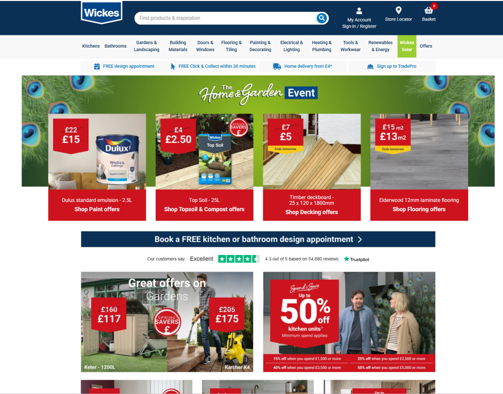
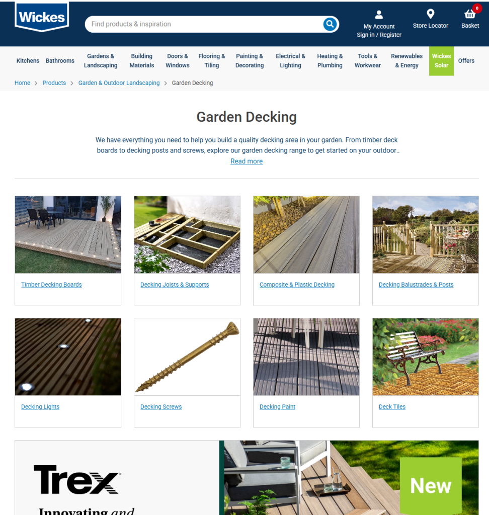
Lastly, I took a step back and looked into a smaller company, compared to both B&Q and Ikea. The company chosen was Wickes. While their presentation and composition may not be as well made as Ikea’s, it is still fairly good, showcasing what eDecks should be doing. Instead of creating a pop-up ad about offers, they’re instead at the top of the home page. This showcases it straight away, yet doesn’t intrude on the user. Along with this, their garden section is very expertly separated into sections, making it a simpler experience to find items they need.
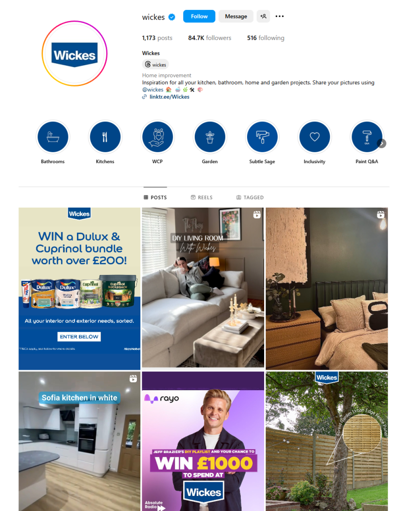
Their social media reflects this. While the posts are not as stylised as bigger companies, they have a tighter grasp on their identity and audience than eDecks, making sure not to drift too far from the audience they’ve chosen to attract.
References
B&Q (2025) B&Q Available at: https://www.diy.com/ (Accessed on 29/4/2025).
Ikea (2025) Ikea Available at: https://www.ikea.com/ (Accessed on 29/4/2025).
Wickes (2025) Wickes Available at: https://www.wickes.co.uk/ (Accessed on 29/4/2025).