When looking back on Edward Tufte’s theories, I thought about how I could incorporate them into a 2D animation, along with how to change up what I did during my 3D animation project. I’d also have to consider if anything would need changing in my plans, as to include Edward Tufte’s theories.
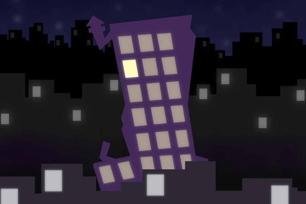
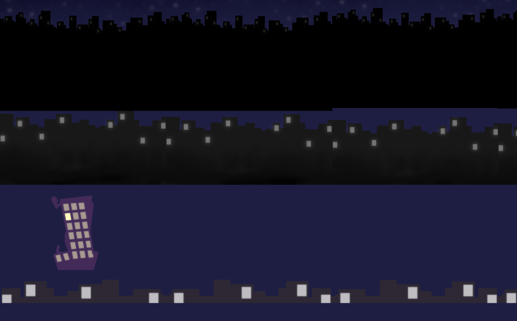
When considering the use of colour, the best example in my work is what I plan to do for the very beginning. While all buildings will be a monotone colour with white windows, the important building will be a purple, with bright yellow buildings, showcasing that it is the key subject of that scene. The only other colour in at the start is the blue sky, meaning there are very few other colours to take away attention.
Then, when discussing the theory of Small Multiples Encourage Compassion, the beginning serves as a good example, similar to the colour theory, as all the buildings have very similar designs, even when put at further distances. Yet the main building in question has an orthodox design. After people look across the entire screen, they’ll notice the one building that stands out and know it is the key subject. As Edward Tufte stated in his book, Envisioning Information, small multiples “answer directly by visually enforcing comparisons of changes, of the differences between objects, of the scope of alternatives.”
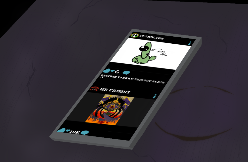
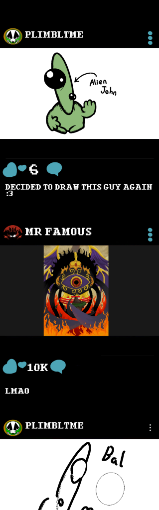
When it comes to Narratives of Space and Time, there were very few areas where I could make the most out of the theory. One of the areas it could be used was during the phone screen section. After scrolling down to see the second post, the scrolling stops and either becomes more erratic or will scroll back upwards to it. This showcases that the character themselves are either hyper focused on the piece or have been shocked.
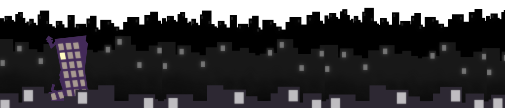
Next was Layering and Separation. The place this was most shown was in the beginning during the scroll. The use of Parallax scrolling with the different layers of buildings gives a sense of scale for this looming city and also gets across an idea that it is never ending. This, combined with previous themes, showcases a story in of itself before telling the main one.
Lastly is Micro/Macro Readings. In terms of sizing, the building at the beginning was chosen. In the animation, I decided to make the building around the same size as every other building. This makes it so that despite its multiple traits and how it sticks out amongst the crowd, its size still makes it stick with everything around it. Then when it came to the actual main part of the animation, the artist is very front and centre, being the biggest thing in the entire animation. When compared to all other main components, the artist takes up the most overall screen space, showing how their reaction and presence is the key component.
References
Tufte, E. (1990). Envisioning Information. Cheshire, Conneticut: Graphics Press USA. p.126.