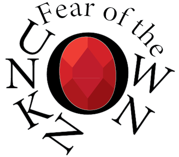
When first making a Masthead (Logo) Design, I started off with thinking of names that would fit the horror brand I was going for. The first title I ever thought of was ‘Cosmic Horror and The Fear of The Unknown’. This was too long for a simple logo, and worked more as the title of just one blog or a book. So I decided to shorten it to ‘Fear of the Unknown’, which works better as an overall name and logo.
I decided to ditch the idea of cosmic horror as I thought it made my options and choices a lot more limited. While Cosmic Horror and the fear of the unknown work hand in hand very well, it also plays a big part in most horrors outside of cosmic horror. Along with this, the title ‘the fear of the unknown’ gives it a better look as it’s not exactly pointing out anything specific and is being intentionally vague.
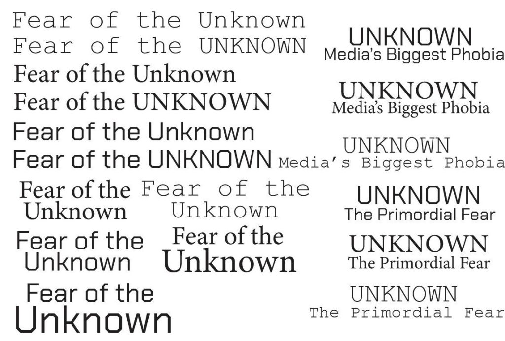
Before going with just Fear of the Unknown, I experimented with a few other sub-titles for just the word ‘Unknown’. These two titles were ‘The Primordial Fear’ and ‘Media’s Biggest Phobia’. I ended up not going with either and they didn’t work as well as the original ‘Fear of the Unknown’ title. However, these also didn’t work well as they went off semi factual facts. It’s impossible to know if the unknown has been feared since the beginning of man, and it’s unfair to categorise one fear as ‘the biggest’.
Once this was decided, I started experimenting with the fonts. I first ruled out sans-serif fonts, as they didn’t fit the more formal feel I was going for. As said by Basit Zain (2023), a Lead UX/UI designer, “These serifs give the typeface an elegant and classic look, setting them apart from the clean, sans serif counterparts.” I eventually narrowed my choices down to Minion Variable Concept, as I thought it fit the design I was going for.
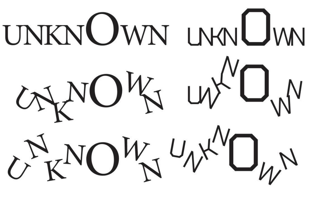
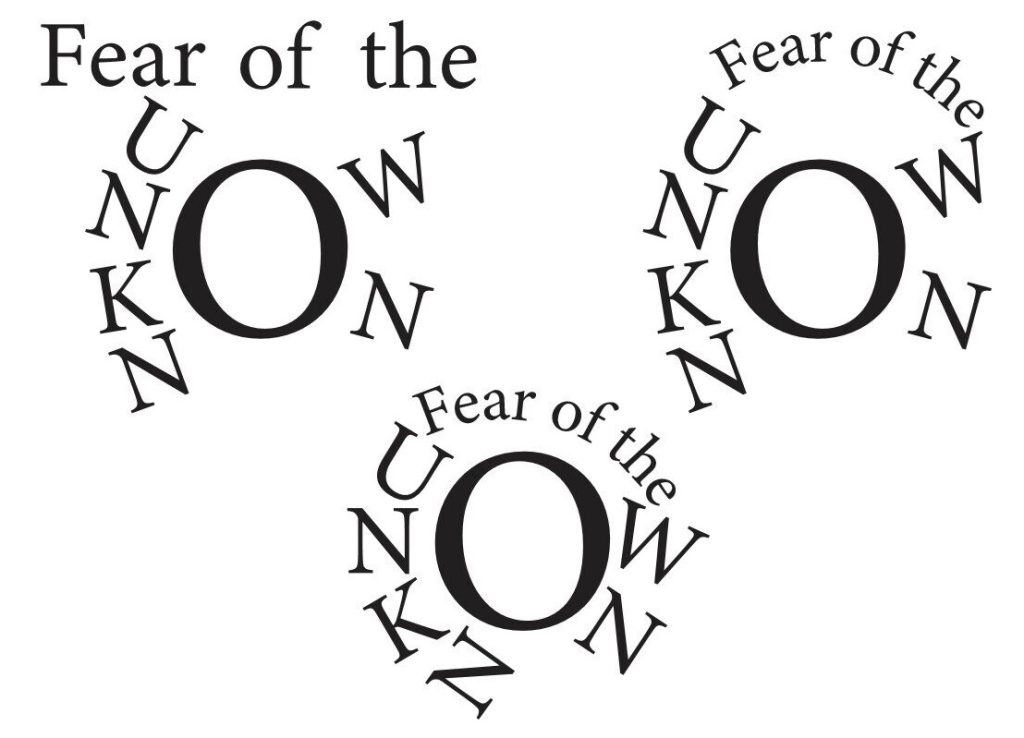
I then started thinking of what best represents something that’s unknown yet scary. I immediately thought of space, and started thinking what was the most unknown. Eventually, the answer I chose was a black hole. So I then started experimenting with making the letters more unstable, like they were being sucked in, until I gave them orbit around the letter O in Unknown.
Lastly, I tried combining something with the O to also give it a formal touch, other than the serif font. I proceeded to think on what is most associated with high class society. And I put it down to jewellery. As stated by the Victoria and Albert Museum website, “The jewellery worn in medieval Europe reflected an intensely hierarchical and status-conscious society. Royalty and the nobility wore gold, silver and precious gems. Lower ranks of society wore base metals, such as copper or pewter.” Not only did it fit with the O, but also gave it the finishing touch needed.
The Creation Process of The Masthead (Logo) Design
References
Zain, B, The Timeless Charm of Serif Fonts (2023), Available online: https://www.linkedin.com/pulse/timeless-charm-serif-fonts-basit-zain-amxuc (accessed on 7/1/2024)
A History of Jewellery (N/A), Available online: https://www.vam.ac.uk/articles/a-history-of-jewellery (accessed on 7/1/24)