Defining the UX for your Festival (Defining problem space, Usability Goals etc)
After putting in quite a lot of thought, the festival I have decided to focus on and base all my work around is Comic Con, specifically the MCM Birmingham Comic Con, one of the biggest in the country, only second to the MCM London Comic Con. With this in mind, I intend on creating a website and app that helps people figure out what is at Comic Con, where to find stuff, along with answers to some common questions about Comic Con.
This is because people need to know what is at Comic Con, as that can be a deterrent to some people, when they don’t know who’s gonna be there or what company will have a slot there, etc. Along with this, it’s common for people to get lost at Comic Con, as there is usually no map for them to follow. It is this reason why I am creating a comprehensive map of where everything will be set so people don’t have to worry. Lastly, the question answers will be there to ease newcomers into the Comic Con experience.
When it comes to the problem space, one thing to consider is the arena where Comic Con takes place in question. This would help with problems with placement of stuff and where everything will be. Another thing to consider is what people would show up, what would be announced and sponsors, etc. Lastly, there needs to be a way to convey this information to the target audience and design it in a way they would be intrigued. Of course, these might change, or more might come about, when feedback from people is gathered.
This would translate over to an app, relatively the same. However, the layout would be a lot easier to follow and find, as people would need a quicker way to get information, along with a bigger focus on being fast and effective.
Requirements Gathering and Analysis
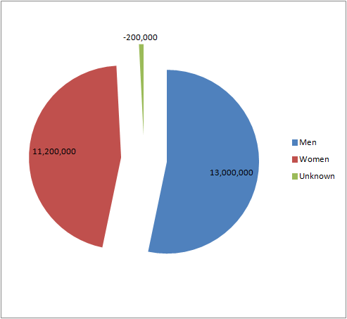
The people that the website will help are fans of series and people who take passion in showing their love for a piece of fiction, whether it be book, tv series, film, game, etc. This passion can also come across in cosplayers, people who dress up as fictional characters for Comic Con. The “key demographic is 17-34”. This estimate has been provided by David Glanzer, a director of marketing and publicity, in a web page interview by Megan Sheraton. When it comes to gender in my target audience, there is a fairly equal amount of both men and woman. This is especially in the field of comic books. A graph provided by website comicsbeat, shows this.
To help with an idea of what sort of people would go to a comic con, and their own needs from both a convention and a website, I have crafted 6 personas. These personas are based on a general overlook of people, along with the type of audience that is attracted to comic con. This is to show the wide variety of what needs to be considered when making a website.
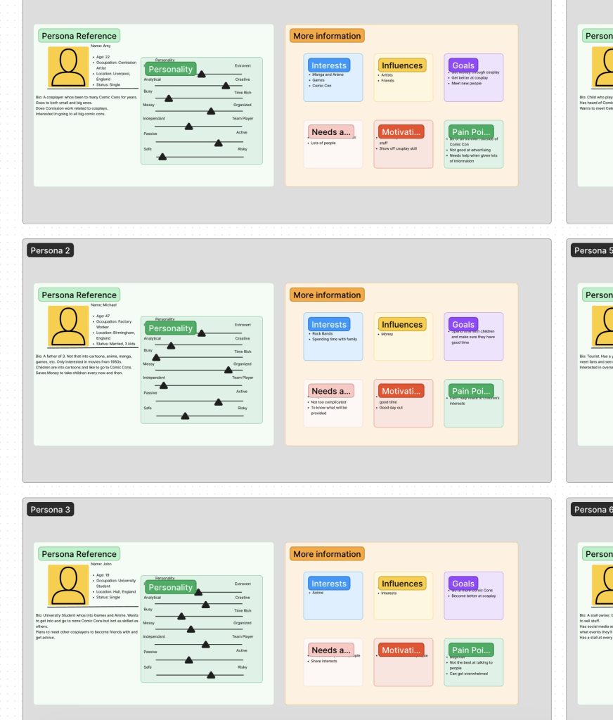
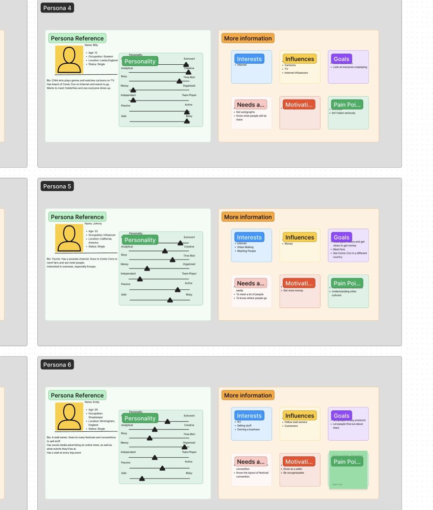
With these 6 personas, it should become simpler to see what information is necessary, along with showing stakeholders what sort of audience should be prioritised. While it’s best to appeal to as many people as possible, it would be impossible to please everyone. This is why it’s important to pick out the most dedicated audience and make sure they are satisfied.
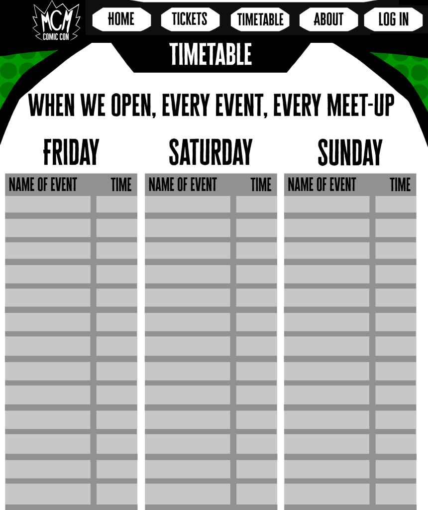
When it comes to their needs with a website, I have asked on reddit for what they think would be preferred. The general consensus is an easy to see timetable, along with a a schedule, so they can then plan their day around a timetable. A few other things listed are location and dates on the home page, links to social media and resources for vendors. This is thanks to multiple users having issues with clunky website designs that work against them (usually through unneeded internet requirements and captchas.)
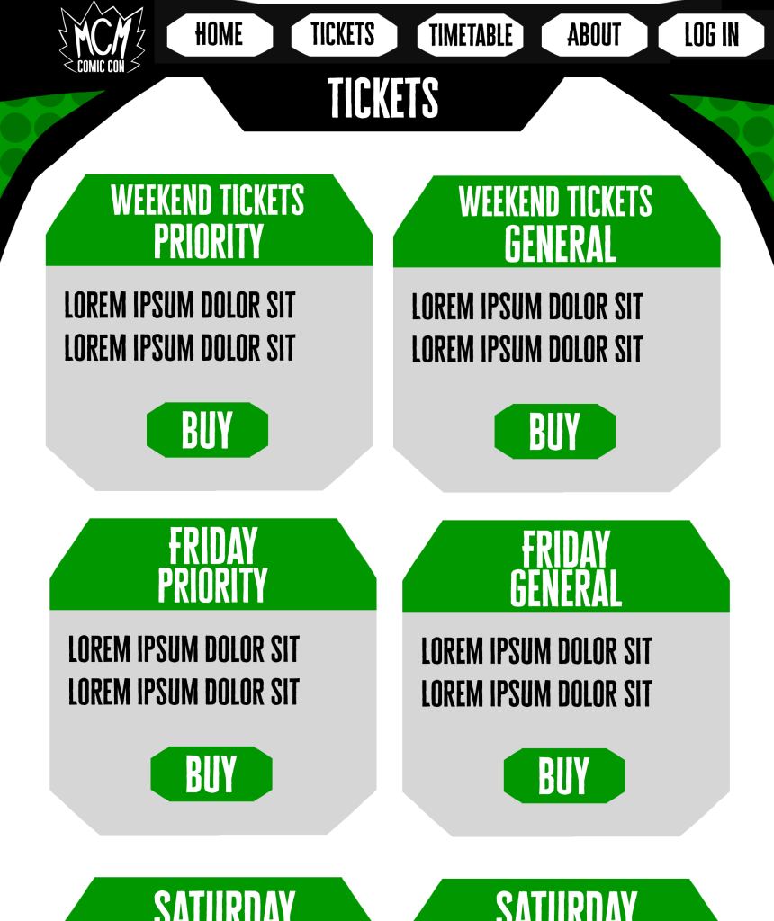
I then have to consider stakeholders, the two biggest ones are the place where it would take place and the sponsors. I am deciding to focus my work specifically on MCM Birmingham Comic Con, so the place that will be used is the NEC (National Exhibition Centre). When it comes to what they would consider success, they’re biggest goal is to get as many people in as possible, as that is how they would make the most money. So when it comes to design, I have to showcase where it is and a way to buy tickets online, along with providing people with information on how to pay for tickets in person.
With sponsors, these can range from food and drink companies wanting to get some marketing, to actual companies marketing new books, films and games. Because of this, these sponsors will need to be featured on a website. If its just a food or drink company, they can be an ad of to the side with some information on what is provided. However, companies introducing stuff will need a spotlight on them and a lot more information, specifically where would they be and what times.
UI principles to be applied to your design
When coming up with a design for my website, there are many important factors when it comes to coming up with UI and UX for both a website and an app. Thanks to feedback from people who have problems with already existing websites, along with actual websites to look at and analyse, I have a good idea of how to come up with a working design. Of course, the design laws need to be considered when designing.
When making both website and app, all important information such as dates, events, location and time should be on the home page, front and centre. This advice was provided by a user on Reddit, as they have found that many websites don’t provide this information in an easy format. A good suggestion by a reddit user, is to work with the event itself, as to help with events and scheduling.
Providing feedback is one thing that will be focused on a fair amount. Everything will be made in a way that it is properly labelled and animate. This is so people will know clearly where to get more information, along with a way to know what they’ve clicked does actually show a response. Along with this, The design will be made so that stuff that is interactive is noticeable, specifically for those who might be colour blind or need more guidance.
To make sure both app and website have a very similar design, as to not cause confusion. However, when it comes to the functions, the app will be more focused on information on events, a map to keep track of where everything is, and most importantly, a schedule so people can check what they plan on doing and what they can plan around everything else. To help this, it would be best that the app doesn’t rely on an internet connection, as that would cause issues with opening the schedule and checking the map. This problem specifically was one brought up by another Reddit user, saying that they couldn’t check their schedule, as the internet caused it to infinitely load.
Rejected Designs
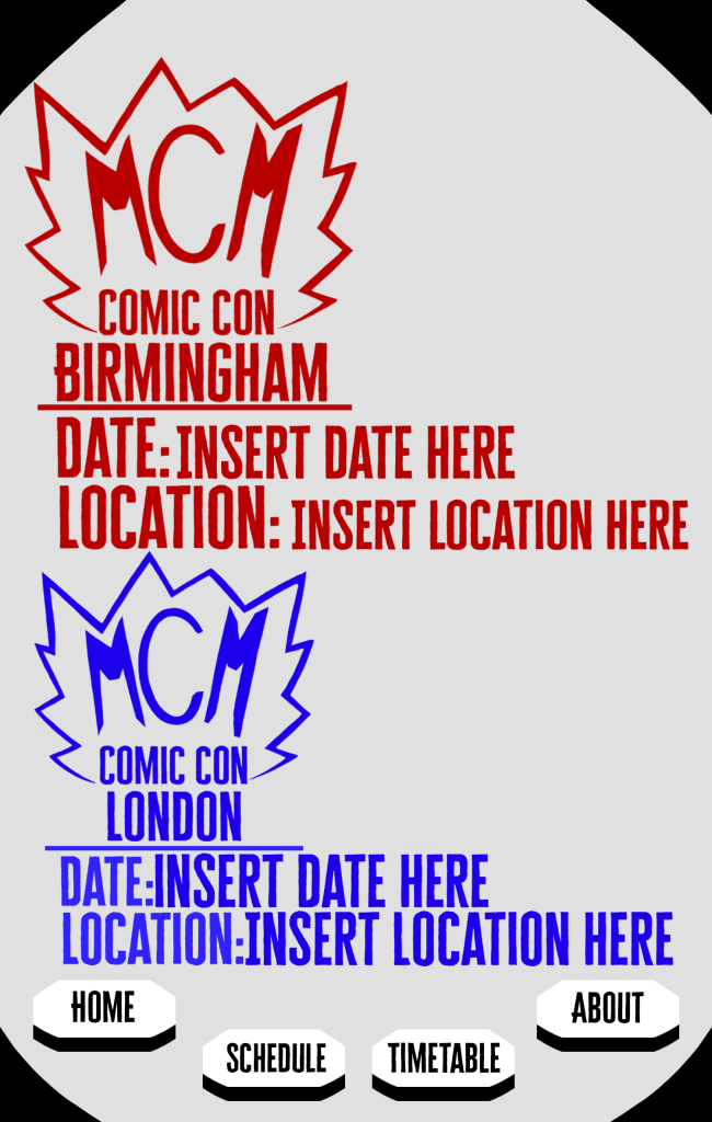
These designs are the first attempts at trying to create an app design for Comic Con. The first 3 designs take a more simplistic approach, as that would be the easiest way to convey information. The first design started with the most simple design, with the Birmingham and London event being the only things there, with the text being left to right. When designing the buttons, a more 3D look was chosen as it helped indicate they can be clicked. All of this was scrapped as it was too simple for a home page, or was compared to the others.
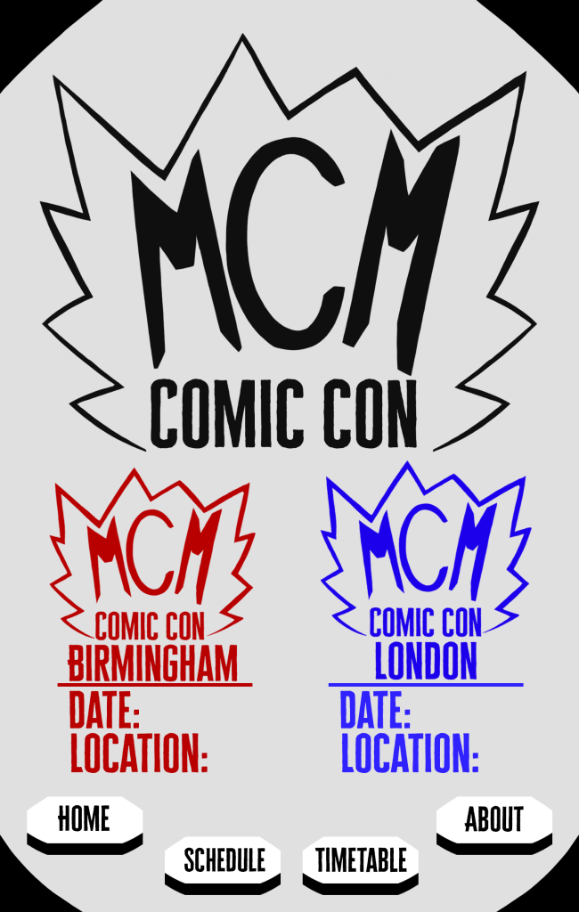
The second design is more entered than the second, making it more in your face and straightforward. Along with that, it added more style than the original. Other than that, everything else was left the same. It was in the next design that a bit more was changed, but not too dramatically.
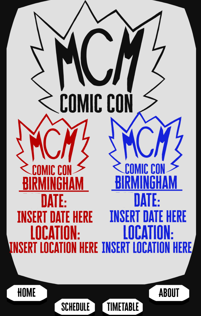
For the third design, a border was the next big addition, as I thought that while the first designs worked, they were too simple for Comic Con. However, the simplicity wasn’t going to be thrown away now, as it was best to see if it worked before trying more crazy designs. Other than that, the text was centred more, along with a place for the date and location to be put without it taking up space. The 3D button design was changed, as it didn’t suit the rest of the design. Instead of being 3D, they would instead use tone work in a final product in showcase they have been clicked.
After finishing these designs, I decided to get some feedback on them. After getting peoples opinions, the main consensus was that it needed to look more like a comic and be more colourful, as that was what people liked about Comic Con. So, in the fourth design, a lot more dynamic angles and designed were used. Along with this, the information was angled along with the panels. The colour red was chosen as it is a good base colour, and attracts people’s attention. This design was scrapped as well, as it was too chaotic and there was too much wasted space.
Low fidelity UI prototype
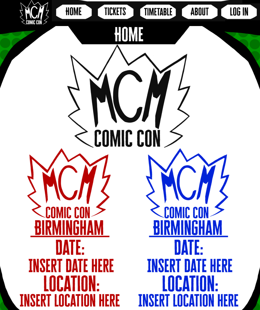
After going through all of the previous designs, the prototype design was completed. The combination of simple layout along with colour and a more comic book layout makes it a great combination of all the previous prototype designs. Once that was made, the design was translated over to a website. This design was decided through feedback. Upon showing the current prototype, people seemed to be happy with the use of colour and layout, along with agreeing that it suited comic con. This includes people more experienced with comic con and have been to many before.
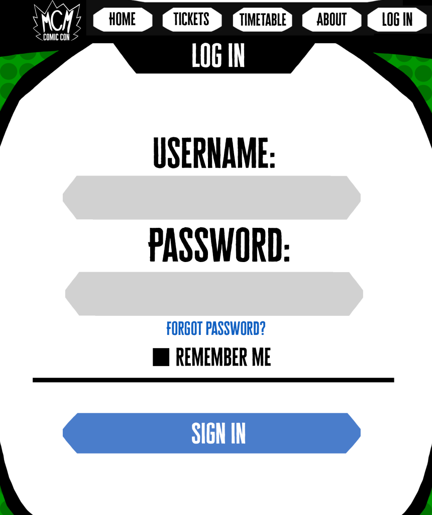
Once the home page was made, along with adding in pages more related to what a website would need, the general look and layout of each page was made and laid out. Each have a very central theme so all information is in your face. When it comes to pages with more important information, the comic book aesthetic is eased down to make place for more easy to understand information. This is most clear with the log in and tickets page, as they include very important information.
All information has been organised so stakeholders and customers would be able to understand where everything goes, what page is which and what all the information is. If this where to be an actual website, there would be spots on the home page for ad placement of certain stakeholders, along with more information on events and what is provided.
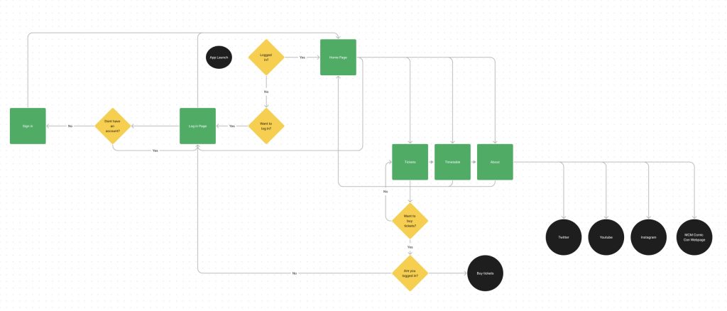
The user journey lays out how everything leads to each other and how the general flow of the website would be. This is so stakeholders can see how it all works and the simplicity of it all. This is also so it can all be organised for future use of the website.
References
Sheraton, M, Comic Con: 5 Tips for Brands, n.d, found at https://www.influencerintelligence.com/blog/BJ/comic-con-5-tips-for-brands (accessed on 26/2/2024)
Long Beach Comic Con, found at https://longbeachcomiccon.com/ (accessed on 26/2/2024)
Schenker, Brett, Market Research Says 46.67% of Comic Fans are Female, 2014, found athttps://www.comicsbeat.com/market-research-says-46-female-comic-fans/ (accessed on 26/2/2024)