Conceptual Design, also known as a Visual Metaphor, is where a design can be two things at the same time, and can represent two things in a design. A common example of this practise is when a letter in a design is replaced with an object with a similar shape. However, there are multiple ways to achieve this in design.
Good Example
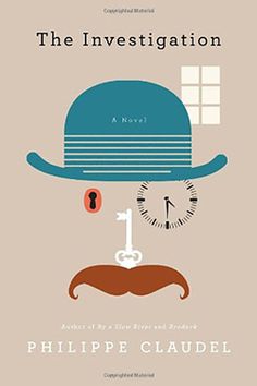
While I couldn’t find many books around the topic I’m covering, a book cover with conceptual design still counts as it helps give me ideas. This is definitely one of the better examples of a story based book having conceptual design. Plus, it could still help me understand more bout conceptual design and how to implement it in my own designs myself.
The design of the book itself takes inspiration from an inspector/detective, as the title of the book is “The Investigation”. This is mostly shown in the parts of the cover that are unaltered, such as the hat and moustache. The rest of the face however, uses other objects to show the mystery and puzzle solving side of an investigation. This is shown mostly with the key and lock. The key itself takes the place of the nose, with the moustache itself acting like an attachment to the key itself. While the eye has been replaced with the key’s lock.
Lastly, the right eye has been replaced with a clock. This is most likely in reference to the fact that investigation’s usually take a long amount of time. Alternatively, it could also symbolise a time limit. The fact that it sticks out from the lock and key helps it stand out as a cover in general as well.
Overall, the design itself is very simplistic, with not much else besides the main catch in the middle of the cover. However, this is all it needs to work, and it does what it needs to do affectively. While this is not the genre of book cover I want to make, it will certainly help guide my choices and what I should do.
Bad Example
While the cover itself is not actually bad in nearly all aspects, there is no conceptual design whatsoever, which I believe is a missed opportunity, as you can do a lot with the concepts themselves. Out of all of Lovecraft’s stories, I chose The Call Of Cthulhu as it is by far his most popular story out of all of the ones he ever wrote, inspiring multiple adaptations of it throughout the years.
I decided to focus on the sea part of the story, as the story itself involves Cthulhu coming out of the ocean. When it comes to conceptual design, I decided that to create the feeling of a creature coming out of the sea, I combined it with the imagery, of a rising sun/sunrise. The beams of light that shoot off the sun are replaced with tentacles, and the main body of the sun now looks like the eye of a creature.
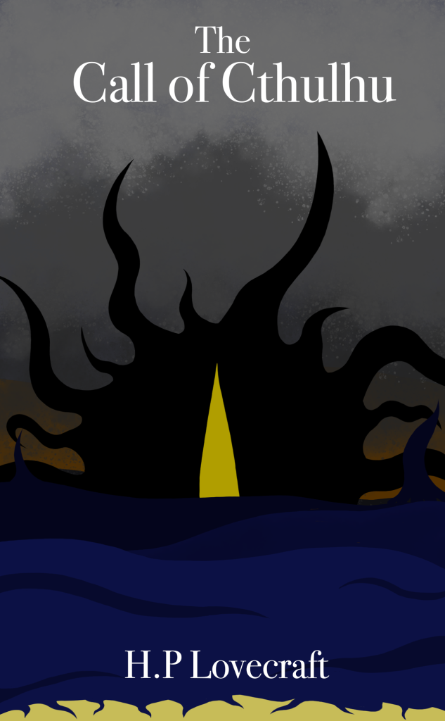
However this is not all I’ve done to get this creature conceptual design. I have also done it in the waves of the ocean itself, making them also look like tentacles. This is most noticeable on the beach area, as it looks like the waves themselves are the creature coming onto land.
Lastly, I added clouds to give this idea of a coming terror/coming storm. This also adds to my rising sun idea, as instead of the sky getting brighter with the sun showing, instead it is getting much darker, adding to the opposite feeling.
Overall, I’m quite proud of this piece and feel like I showed off the terror of the Call of Cthulhu while combining it with conceptual design.
References
Claudel, P (2013), The Investigation, Online Publisher (Date accessed 2/11/23)
Lovecraft, H.P (2022), The Call of Cthulhu, Online Publisher (Date accessed 2/11/23)