When presenting the old designs and mid fidelity prototypes to people, both friends, family and strangers, I was able to collect enough advice and feedback to develop the work and the design to the next level, specifically towards a more high fidelity prototype.
Some people said that the line work in the old designs needed some improving, which was kept in mind when designing the new look. Along with this, a lot of people preferred the green patterned background of the mobile version, which was originally absent in the website design. While originally the two designs were gonna be separate, it’s better to have them be somewhat similar, as to help with branding and a general feel. Not only that, but once showing the new design, the people who first gave the advice seemed to like the improvements made.
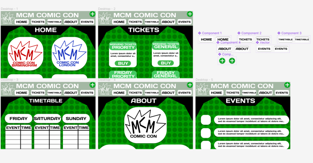
Along with this, the ratio of the website has been given a more accurate size/dimensions. While necessary, it also does help in perfecting the layout, especially in giving everything more breathing room.
Another piece of advice was that the log in button should be smaller, rather than be it’s one full out section. So I decided to add in a small plus button in the corner, to fill in for that purpose. While smaller and more out the way, it leaves way for other important news to get its own full section. In this case, the event section was chosen as a replacement. While the timetable and home page would tell people what events are happening and give a short synopsis, it’s best if people get more in-depth explanations on what’s happening. This would also be good at giving people who haven’t been to comic cons, an idea of what will happen and what to expect.
The event page itself was designed similar to a news feed, as not only would that make it stand out against the other pages in terms of layout, but it also maximises how much information and events can be fit. Not only that, but it helps people pick out what news they want, without any others taking up too much space, making it equal for everyone.
When designing most of the boxes used to present information or logos, it was first decided to use them at all so they could help information be seen against the patterned background. When it came to the style, it was decided they should be more rounded, as that is easier on the eyes, and doesn’t take too much attention away.
Lastly, a brighter green colour was decided as a header. This firstly helps the buttons stand out and help them look more like a button, helping people realise they can press them. While obvious to some people, it’s best to consider every problem as to attract the largest possible audience. Along with this, the brighter colour sticks out with the dark background, especially compared to the old header being pitch black.