After presenting the app design, along with all the mid fidelity and low fidelity designs to those around me, such as friends, family, and strangers, the advice given, along with people’s preferences, was enough to start working towards a high fidelity design, and a final product.
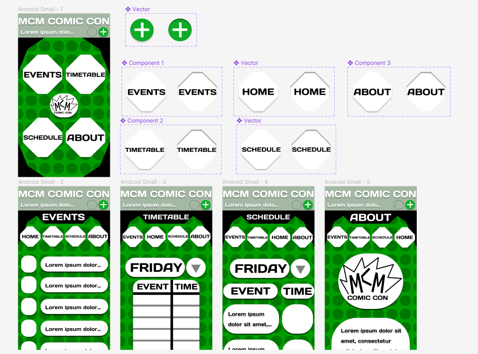
The first big change compared to old app designs, is the return of a simpler design. While the more in your face and comic book like design was eye catching and interesting, it also was too confusing for people. Not only that, but it didn’t utilise the fact that it is on a mobile screen. When comparing it to the mid fidelity, the buttons have been made the same and more minimalistic. While the old designs had a charm to them, they didn’t make sense as a whole and would confuse people more. Not only that, but the new designs are a lot more versatile in comparison.
Along with this, the overall design of every page is very similar to its website equivalent. While originally I considered making them both very different, both in design and function. However, I’m the end, this only confused people more than help them. So I decided to make most pages be a smaller version of their website opposite. This way they can be just as effective, while still fitting a mobile format. Along with this, the function of the mobile app still serves its different purpose of being used during comic con, while still being recognisable and easy to use, especially for people who have already used the website. And the opposite is also true, so those who have used the app can easily adjust to the website.
The schedule page is completely original to the phone, replacing the tickets page. This is because the websites main function is to sell tickets, which would be harder on a phone, especially with it having confidential information. Along with this, as the app will be used at the convention itself, a schedule is more important, so people can keep track of events they want to go to while there. In terms of the design, it borrows many elements from the timetable page, yet has been made different so there is no confusion. The reason why there is a different page for both timetable and schedule, despite the similar designs, is so people can keep track of specific events they want to go to, instead of scrolling through an entire timetable constantly.
On the timetable, the design has been changed to fit only one day, as trying to fit all three on a phone screen would make it impossible to see and efficient. To solve this problem, the date at the topic can now switch days, switching between all three days, making sure people can see all information. Along with that, the arrow itself was separated to avoid confusion.
While a home page is not entirely necessary for the website, it was best to have a button exist for it as well, to avoid confusion when people wonder why they can’t get back. This is subject to change however, depending on people’s future criticisms and problems.