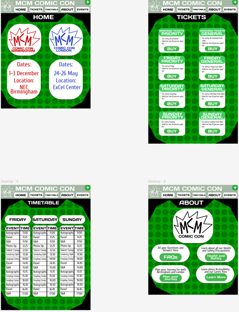
When it comes to current Web Design approaches, there are many different things that come into play if you want to get recognised and gain a lot of attention. Two of the most important things to master and use are accessibility and responsive designs. This can go from having a website that is responsive to any size of pc or window, to having it work on phones and iPad. But accessibility isn’t just about size, but also making sure that people, who may have issues or problems, can also read and look at what your site offers. This can go from something simple like having colours that work and blend together, having very easy and readable fonts, to providing the option of site readers. The website I have created aims to give the users a pleasant experience while reading it. The colours have been chosen so as to make it easier for readers. For example, I have used bold on warm colours as they blend better than warm on warm or cold on cold. If I wanted to improve the site, the option of site readers could help get to more people. Along with this, the website has a pretty responsive design. The placement of text and pictures make sure nothing is lost when transitioning from website to phone or iPad.
One of the other important steps in making a successful modern web design is grid systems. Grid systems are a layout of grids that wouldn’t normally be seen on an actual website, but are important in the development of one. Grid systems enable orderly designs to take shape whilst keeping all of the aspects simplistic; they are easy to read and to process. Along with this, grid systems can also help websites adhere to accepted conventions regarding size. My website, and the concepts made, are compatible with the workings of grid systems. In the past, I’ve realised that the websites I have created would have benefitted from using a grid system. While they all had the idea and look of an authentic website, using a grid system, the existence of areas spots suggested the grid system was not utilised. When it comes to this site, I believe it sticks to a grid that increases ease of readability to a professional level.
Here is one of the websites I made for a previous project in the first year of my university course, which did not use a grid system. While the layout of everything seems to be in line and very easy to see, there are a few things that could’ve benefitted from the use of a grid to help it be laid out. Along with this, the website itself is not responsive in any way, with it only having an alternative mobile app version, but this still secludes people on phones from accessing the website itself, something which will be improved upon in future websites.
Overall, the websites I’ve made use a wide variety of current Web Design approaches. However, in retrospect, I think the use of a grid system could have improved their appearance, usability, and overall effectiveness. Responsiveness would also have been improved. In general, accessibility, responsive design and the use of grid systems are among the chief features that will make a user’s experience more satisfying.