When looking at how to make a mid fidelity, I decided Figma would be the best way forward as it provides a ton of tools that would be helpful. My prior experience with Figma was also a deciding factor as it means I can confidently make one again, along with improve my skills for the future.
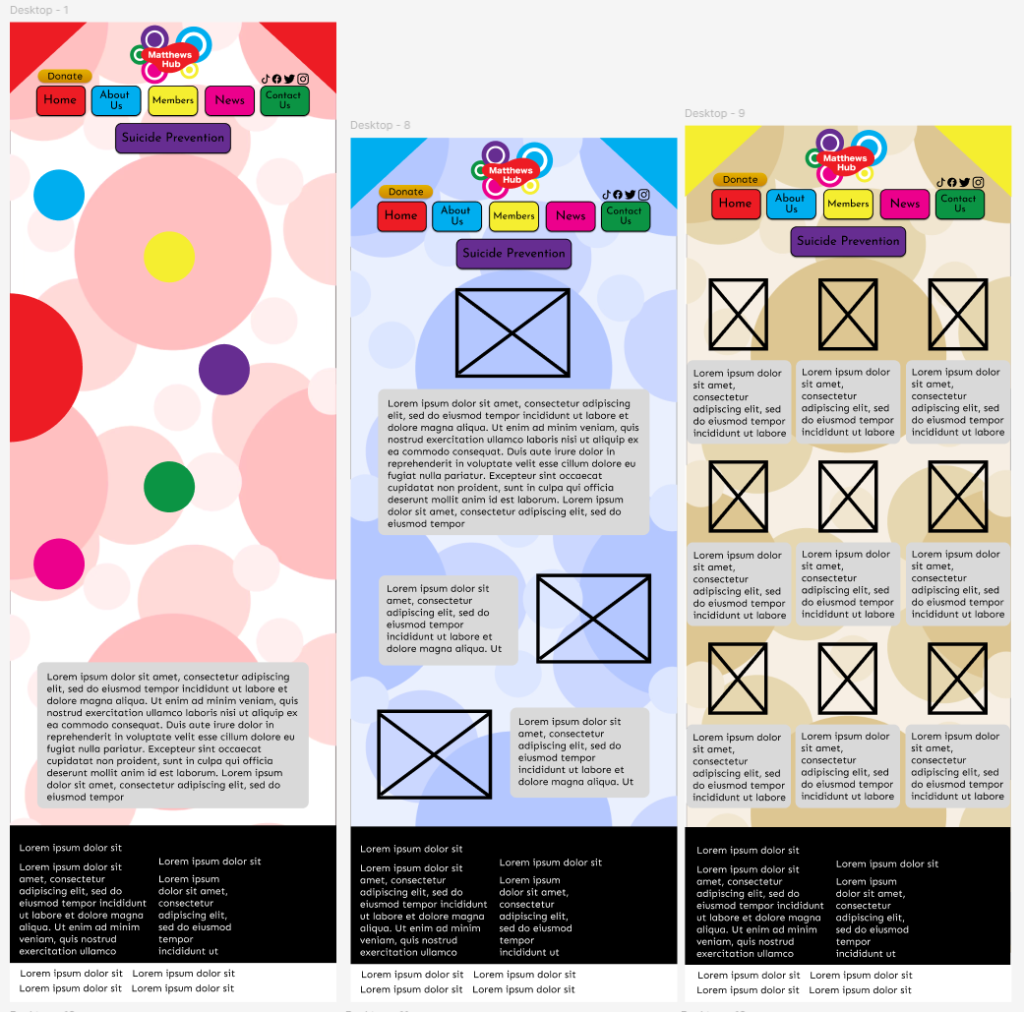
I started with creating the desktop version as it would help develop most of the features with a lot of freedom. If the phone was the first, the design would be more cramped overall and some features would have to be toned down or even removed. While this is still a possibility in the future, at least I have a visual on what the best site with all features looks like.
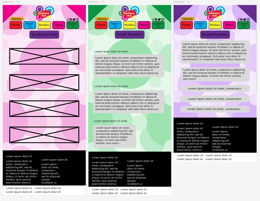
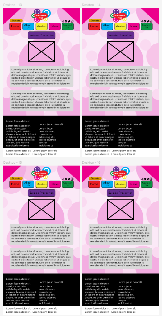
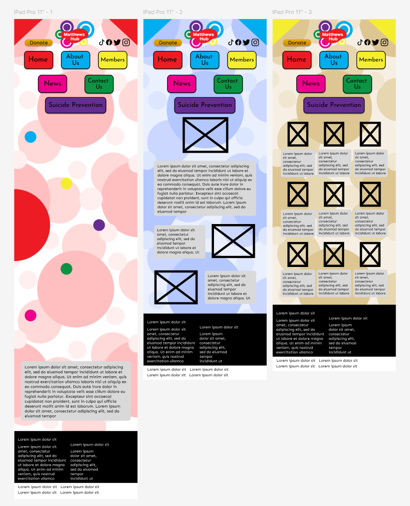
At first, I contemplated on whether to keep the different pages to a similar colour scheme. This idea was quickly shot down for the better idea of having each page be colour coded. This could then result in each page having its own identity, along with helping people understand where to go for what through colour. In retrospect, this feature would be lost to the colour blind, which is an issue to look into in the future, along with an appropriate way to tackle it.
This colour coding system was originally just gonna be present in the top of screen with the borders on each page, but after careful deliberation, I decided a background may be needed to add more to it. A background may also add a potential comforting feeling for people coming on to the website, also giving something for them to look at and be interested in. The downside however is it makes it a bit distracting, something else to keep note of for the future.
The typography is kept to a respectable sans serif, following from previous posts where I came to the conclusion that serif is too formal instead of comforting. The font used for the writing is Sen, which I believe mixes comforting with a slight formal feeling, giving a unique vibe with the usuals they’re paired with.
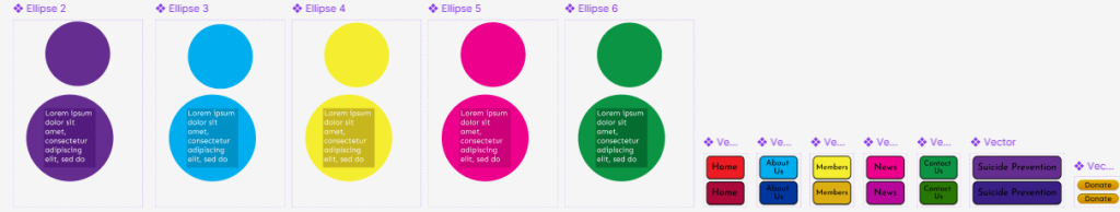
When it comes to elements you can interact with, I kept them mostly simple looking to keep the casual feeling of the site. Readability is the most important factor of the buttons and there’s no need to get more complicated than that.
When it comes to the orbs, I wanted to recreate an element from the original site but with a new unique purpose. On the original, the orbs only served as another way to menus on the top. While here, they would give information about each page.
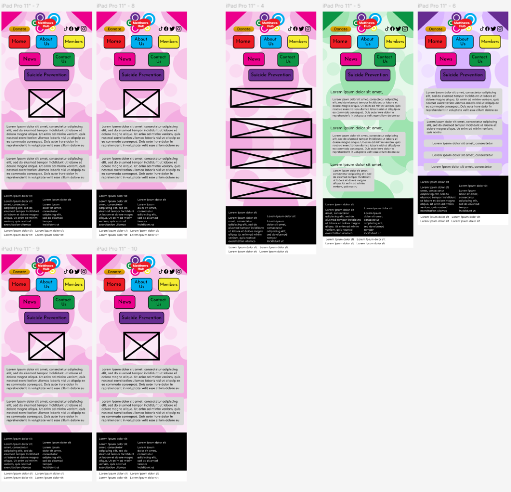
The tablet design was made with iPad in mind, as that is my personal tablet of choice, meaning I can work with something familiar. Most of the features and design elements survive the change and remain the same. The biggest difference is now the lack of space provided by the desktop layout. This means the composition of some elements needs changing around.
Along with this, thanks to this being on a tablet, everything now needs to be designed with touch screen controls in mind. This explains why the buttons on the top have a new layout on top, as the added space between each button should make it so people don’t accidentally click on a different page instead. However, on reflection, it’s probably best to find a different way around this issue, as the spacing may not be enough.
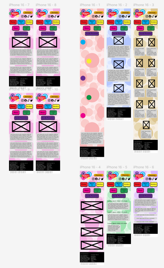
Lastly was the phone layout, designed after the iPhone specifications. This version had the most visible changes. Because of this the logo, donate and icons where moved to next to each other, as to keep them all the same size, as if the site was to actually exist, the donate symbol would have to be clickable, which would not be possible if decreased in size more.
The icons themselves remain in a similar layout to that of the iPad design, a choice that I personally feel might be in need of an even bigger change thanks to the space between buttons being less. However, I am unsure of this change, so will see the reaction and feedback first, before deciding on something entirely new.
The placement of some pages has also been altered to suit the new size more. The Home page now has each orb below the next, instead of in an orbital composition. This is to make sure the text in the orbs remains readable. As decreasing the size to keep the original design would compromise the readability. The Members page has also been changed from 3 members in a. line to two. To make them smaller for the original design would not help in recognising people or reading their story. Lastly, the text in areas has been centralised, as the spacing of the phone doesn’t allow for much space.