To begin with, most feedback on the website has provided good reviews and compliments, which provides a good sign in the path I have chosen to go.
Amongst the people shown, some people in the field of sewing where shown the design, as to get feedback from people in a different field of art. The reviews they provided were positive, except for one bit of criticism which was addressed and will be talked about in paragraphs below. One person replied with the background “feeling like a hug” and the “circles are soothing”. Lastly, the site overall was described as “welcoming”.
After, I decided to get the feedback of someone in illustration, and another person in textiles, two other fields of design. These people also fall upon the autistic spectrum. This helps get an idea of what people in the target audience think. After careful review, the two had no criticism to give and were overall quite happy with how the site looked. Even after a second ask, this time with the intention of stuff that could be improved only, the two had nothing to add on.
Lastly, when it comes to general good feedback with no criticism, I decided to show my mother thanks to also being on the spectrum, and being a current worker of Matthews Hub (as of December 2024). While bias is going to be a factor thanks to familial relations, she also had no criticism to give and was overall proud of the piece. She also said that in the future, she may help give me the chance to present this site to other Matthews Hub employees, including those in graphic design.
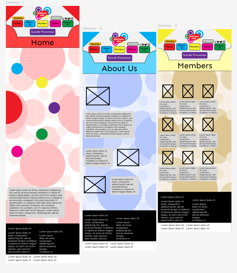
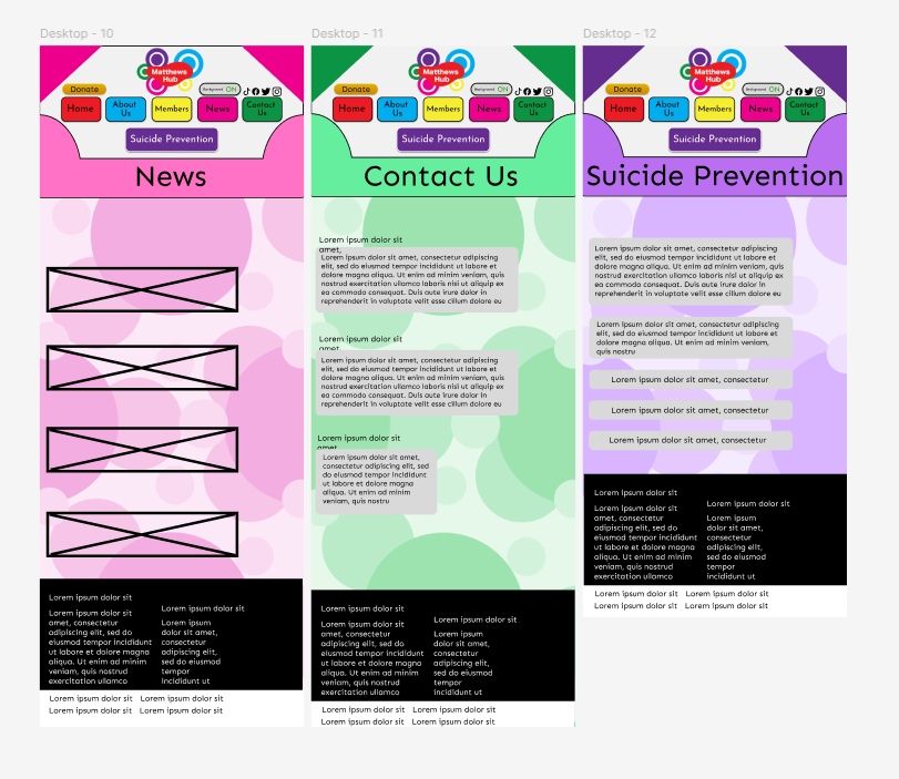
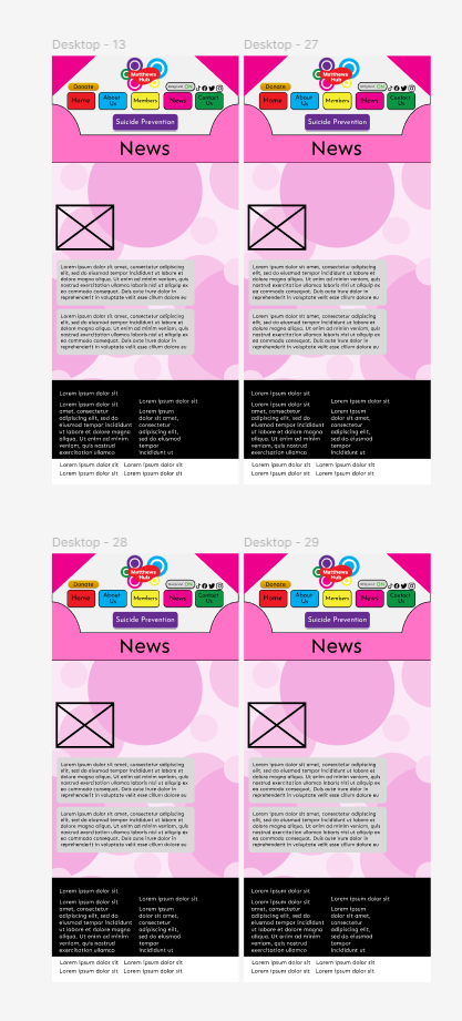
The first piece of criticism that was addressed was from fellow graphic designers, along with a lecturer in the field of graphic design. After looking at the original website, they said that the top of the screen was hard to see and read. Though the bigger concern was that it all seemed to blend with the background, giving the eyes too much to look at. To combat this issue, I made a border background behind the buttons and logo, so they could be seen better.
Along with this change, I decided upon reflection that there needs to be a word and title to each page, telling people what page they’re on. This decision was made after considering that colour blind people would be visiting my sight, which if I continued with the original design, it would be very easy for them to get lost. Also, the existence of the border has now made it easier to include such a title in the first place.
After judging against other peoples work and other autistic based websites, I also chose to make some of the text and pictures smaller and move them more to the left instead of being centralised. This is to consider where ads would be placed on a sight, specifically banner ads. Along with this, it gives the site itself more breathing room. Of course, this is still up for change, and the text may be made even smaller, once high fidelity is added on.
The only button to receive a change was the suicide prevention button, as someone replied with it being very hard to see the actual text. My answer to this problem was to change the text from the original black to white. This decision was chosen over changing the colour, as it makes it stand out more against the other buttons, signifying its importance.
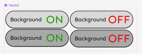
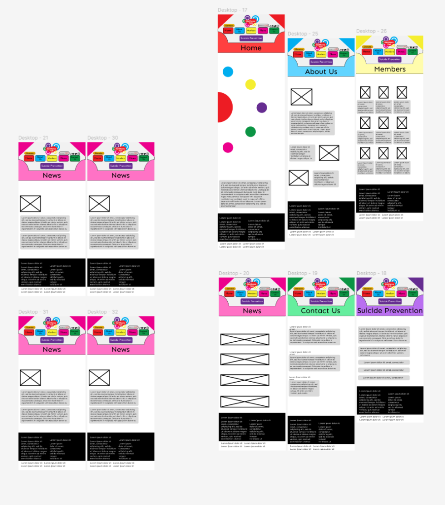
A big piece of criticism I had to consider was from the sewing group mentioned previously. After showing the site, a person added that the background itself hurt their eyes and was distracting. While originally the background would have been removed or changed, the existence of multiple other people showing their love and appreciation for the background made it a hard task. After careful deliberation, I decided on a choice that would benefit both parties, and added a button to turn off the background. Now if anyone found the background too distracting or even hurtful, they could press the button to turn it off.
The button itself was kept very simple and straight forward. This decision was not a random solution. I decided on making it very up front instead of a symbol as autistic people need stuff to be very straightforward, as that is part of their mindset. This itself is part of my own mindset, as I sometimes find it hard to understand explanations if not very simple. Another factor is the background button is incredibly important, so its best to make it the most obvious button for those who need it most.
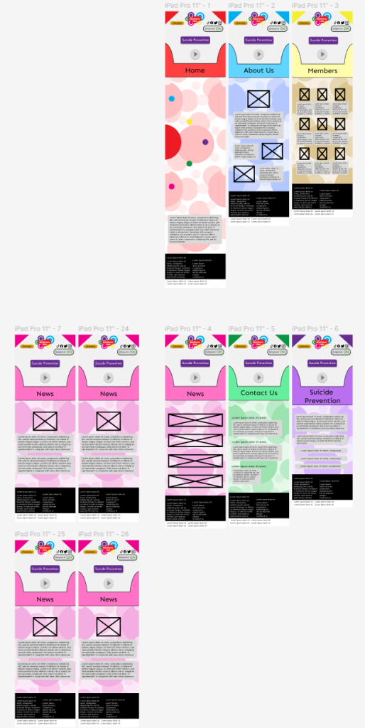
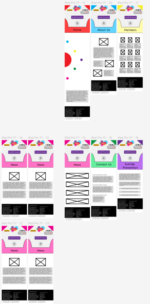
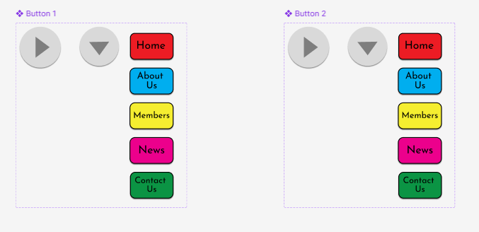
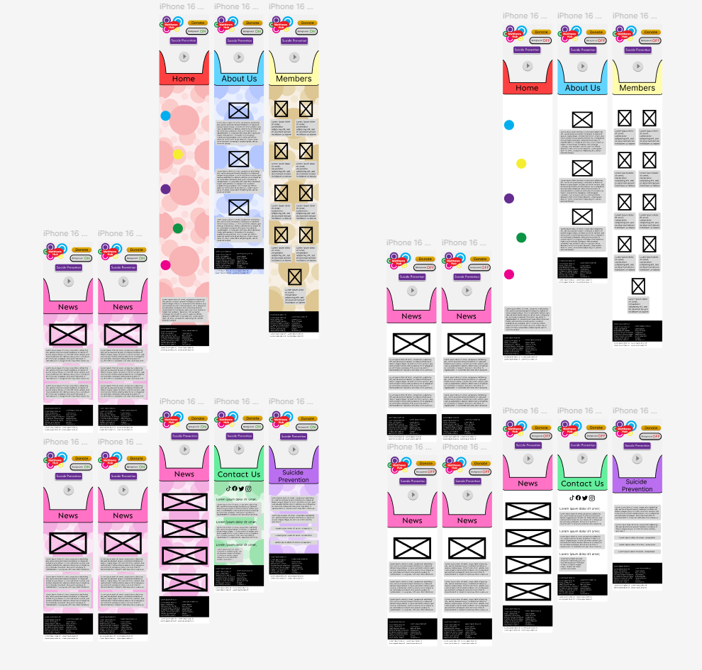
When it comes to phone and tablet, the changes remain mostly the same, with one major difference compared to its desktop alternative. A big piece of criticism was the fact that the button placement was very compact, which would then impact people clicking on certain menus. To combat this problem, I created a drop down menu, which once pressed will reveal all menus. While a very quick solution that could be revisited, I believe the execution is satisfactory and does its job perfectly.
The Suicide Prevention button was kept instead of adding to the drop down menu, as I decided that it was more important than every other button. If someone needed help or a quick way to find help, it is best to have the button out so it can immediately be seen and clicked for those in need.
The last noticeable change was the social media icons being moved to the contact us page on mobile. I personally decided on this change, as making them remain at the top would make it hard to click or interact with them in any way, and every other button on the top border has too much importance to size down in any way. Thus, they were moved to the contact us page, as the menu already serves as away to find them in other places.