When beginning my logo design work, I looked at all the imagery that was included in my mood board and decided what parts would work well together or create a very unique logo. Along with this, I can look at past taxi logos to compare against. Yet, I must also avoid making them look too similar.
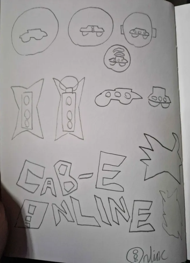
The first few logo concepts were simply just the imagery put together so I could see what I could design. While they are very simple and not well put together, they do a good job in showing what could be done and how the imagery can be combined together to make simple things stand out more as a whole.
The first true logo concept was this circular one. I wanted to try and make a circle type logo as there were a few in the taxi industry, and it was best to see what I could make. Of course, I decided to use my combined imagery instead of just a taxi, as I believe it would be something people can remember against other, similar logos. Because of the circle design however, I don’t have as much freedom as other logos yet to come.
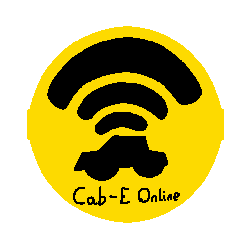
For this logo, the imagery I decided upon was the WIFI icon with a taxi, to get across the online part of the name. Other than that though, it is very simple and straight to the point. Overall, while it has potential, it is probably my least favourite out of all logos made. Along with that, it doesn’t achieve my overall goal of standing out and being its own thing.
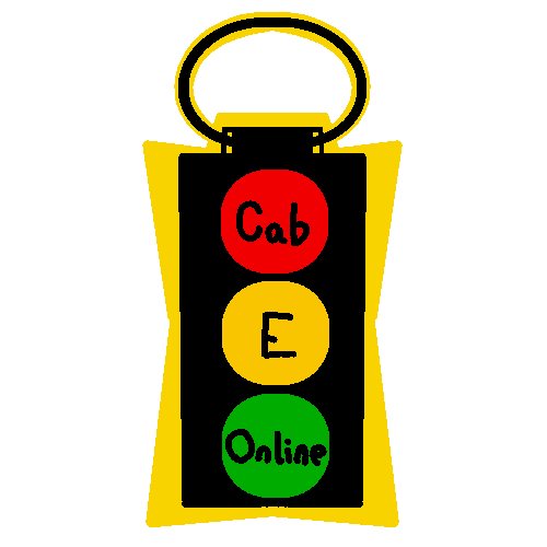
For this logo, I decided to incorporate a traffic light as I myself associate them with travel and roads. Then, I decided to combine it with the imagery of a stopwatch on top, as stopwatches are used for how fast something is. When using a taxi, you hope that the travel is fast and it arrives on time. Therefore, a stopwatch is a good visual que of something being fast.
I also believed that the 3 bits of text in the logo being paired with the 3 parts of a traffic light was good visually. However, in retrospect, they may be hard for people to see thanks to the size of them. If the logo was made smaller, the text would suffer, so if this logo was used, it would have to be changed.
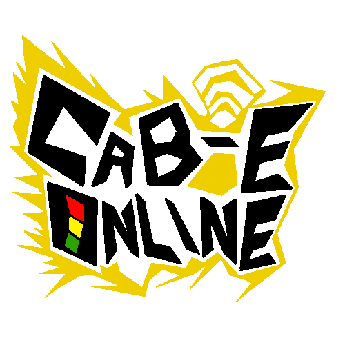

The last logo is the overall favourite of the three due to its unique graffiti/punk style and the imagery blending in naturally with the logo. I decided to go with the punk aesthetic as it could represent a more street/local style for people who prefer that with taxis, along with standing out from every other logo. Along with that, the text stands out very well against the colours used.
When it comes to the imagery, the speed lines are apart of the yellow back drop, also giving it a spiky edge to it. This is along with the WIFI logo being apart of the top with it, adding to the graffiti look. Then in the name itself, The O has been turned into a traffic light, which has the same meaning as the last logo, having street/traffic imagery.
Overall, this logo achieves what I wanted with a logo, and because of the style, future advertising can lean into punk imagery. I believe this is the right way to go as no other taxi company I’ve seen does this while it gets into the more local feeling look I want to achieve.