Before looking at other taxi sites, I thought it would be best to see what layout designs I can create first. I believe this would be good as it would give an uninfluenced and completely original design, which then could be added on top of inspirations.
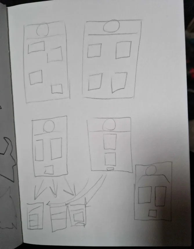
These first sketches where to give me a general look at what layouts I could design based on previous work. However, after consideration, along with then looking into other big taxi company apps, I decided to decrease the amount of buttons as there isn’t a need for as many menus as a regular website or app, and only needs menus for its functions.
In terms of design and placement for logo, I believe having a dynamic top for the logo would make it stand out more, despite how little it is as a design choice. It would also lean into the design decisions I’ve made for the logo with the style.
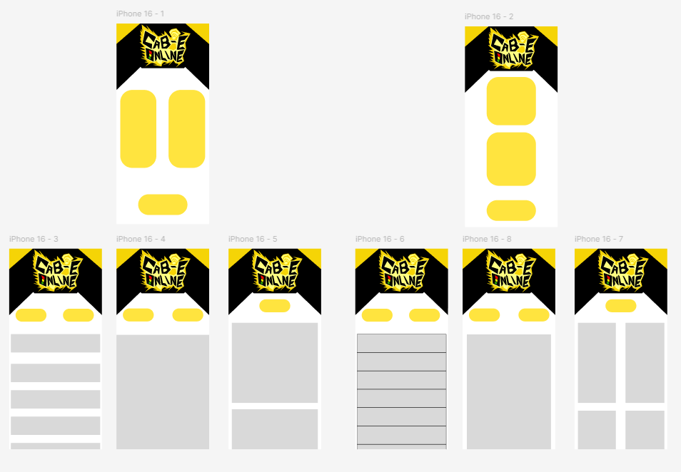
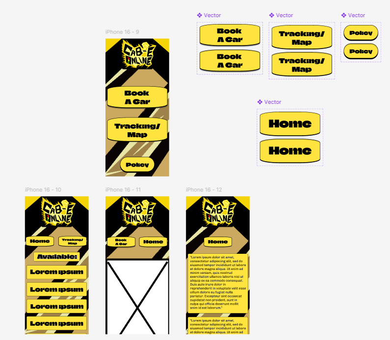
When creating the designs on figma, the two designs only shift in terms of layout. The first one is more inspired by the Uber layout, but without as much, thanks to how this company is local, unlike uber which is in multiple countries. Then the second design, while it also has influence, is more based on personal preferences.
The colour scheme stays the same as the logo as to keep the taxi theming. Along with this, is the top being more angular instead of a straight line, like in sketches. This is so the punk style is kept from the logo. However, the buttons and menus would be kept simplistic, as understanding them is the most important thing. To make up for this, in the future design the background would have a more stylistic look.
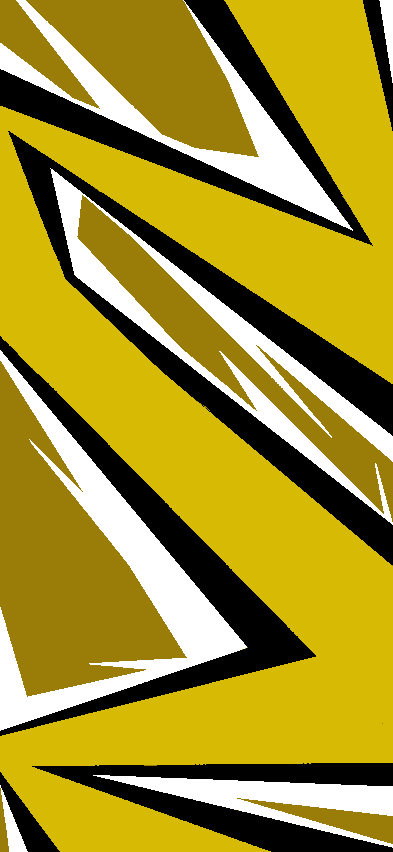
When coming up with the final design, I first decided to make a design to make for the background, as all the UI would then have to work around that and be readable, along with people being able to understand what’s a button. After creating the background, I decided to flip it, along with turning the colours and exposure down a bit, making the buttons and text stand out more.
Upon deciding on which layout to use overall, I combined the beginning home menu of the second concept, and then the menus being from the first concept. This is best option as it combines the best of both into an overall design.
Then, when it comes to the font, I decided to use Chivo as it fits both the punk aesthetic used in the logo, along with the general look used in taxis. Plus, it is sans-serif, helping with the more casual look I want for the company, as it attracts a larger crowd of people than a more serious serif font.
Overall, I am proud with what I was able to make in terms of mid-fidelity and if I was able to make a high fidelity version, there would be a few changes here and there most likely, however I believe what I made would go far.