When considering what to do when making banner designs, I already knew that I had to design them around the punk style and expand upon what I’ve already made. While I could reuse the background used for my taxi app idea, I believe the strengths of the graffiti design comes from it always being unique.
As long as the designs retain the same imagery and stylings, along with the colours and a similar type face, then the rest should fall into place.


When making the skyscraper banner ad, I already had an idea of what type of design to make, as the ratio was very similar to what I made for the app background. The biggest difference was the increase in the height and the thinner width. Despite this, I made a design that used the length to its advantage. Once the base lines were put in, I then added the brighter the yellow areas where the text would be.
After that, the font itself needed to be decided upon. The choice I made was Effra CC, as it fits with the style along with being formal enough for people to notice and read it. When coming to the placement, I wanted it to be very in your face.
Looking back at the design, while I personally believe the style choice is commendable and the imagery is very fitting, the execution in a few areas could be revisited and improved upon. However, the size of the banner itself is also something to consider in the future, thanks to the pixelation as it grows smaller, along with making some factors bigger and the background take up less space.


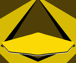
When making a mobile banner ad, I wanted the very spiky lines and composition to remain the same, yet be more mirrored as it would be more noticeable for an across banner than a skyscraper banner. Along with this, I believed that the text being more straightforward in placement fit the more limiting space.
The pixelation issue from the last one is a lot more noticeable in this ad, showcasing that the execution towards smaller designs can be a lot better executed overall. This may be an issue with the program used. Overall, the design itself could be changed as well, yet I believe the execution is much better than the last design in a few aspects, using the text space effectively.

Lastly there’s the rectangle banner ad. Out of all the designs this one is the calmest background. This decision was made as I believed this ad could be used as a more straightforward ad, getting the message across without a lot of the visuals of the previous ads. Despite this, the punk style still remains and is well made, just subdued compared to most other designs so far.
While this piece has the least pixelation, The spacing of the yellow space with the text is a bit more awkward in retrospect. While it works, it could be changed to a more suited look, perhaps giving the background more space.
Overall, I achieved making effective banner ads. While there are improvements to be made for future designs, I believe the imagery and composition was accomplished and the choice to have a punk aesthetic with graffiti design was the right decision for the taxi company.