When it came to creating information pages, I wanted to make the rough idea of what a website based around and how I would lay out the information, pictures, titles, etc. Before starting any of them, I styled out a very simple overlay at the top, and what the main icons and menus would be. In a real release, there would certainly be more than just these 5 options, however I thought these 5 covered a wide variety of options. When it came to colours, I thought a simple black and grey would suffice, as it helps achieve the mystery and horror aesthetic. As said by Stefan Gheorghe (2023), the CEO of Homedit.com, “Black’s concealing nature makes it best for symbolizing mystery and secrecy. In cinemas, black is often a costume of choice for assassins, spies, and other covert operatives.”
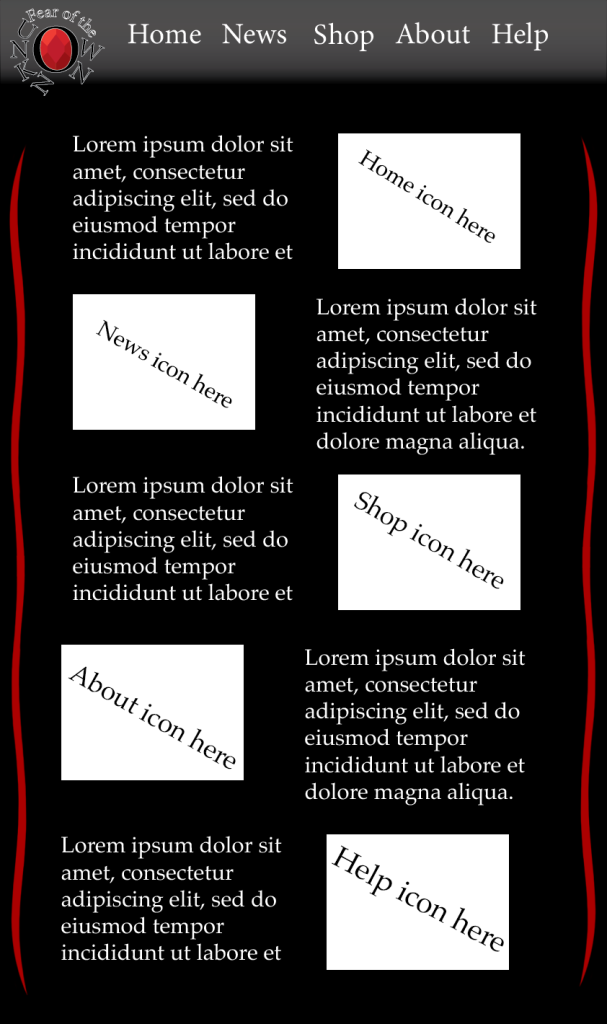
After sorting out a main overlay, I designed a Home Screen for the website. This Home Screen would include a description of what each area would offer and what it’s about. Along with this, it would include an icon to also get across each section. As a Home Screen, I believe it gets across most of what is needed. I included red lines on the side as to improve upon the formal feel, and to make it more interesting, rather than just a simple black background. These red lines appear on all pages so it keeps it interesting.
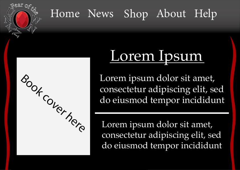
This menu idea is what shop would look like, specifically what a single item would look like, if it were to be bought. The product in question, usually a book, would be showcased on the left side of the screen, while the title, information, and price would be on the right side of the screen. This is because people from western countries have a tendency to look at the left side of something first, before the right side. The reason for this is put best by the website, Comicphonics.com, “The simple answer is that we read from left to right because we write from left to right. And why do we write from left to right? Written English is derived from Latin (written from left to right) which was derived from Greek (also written from left to right).”
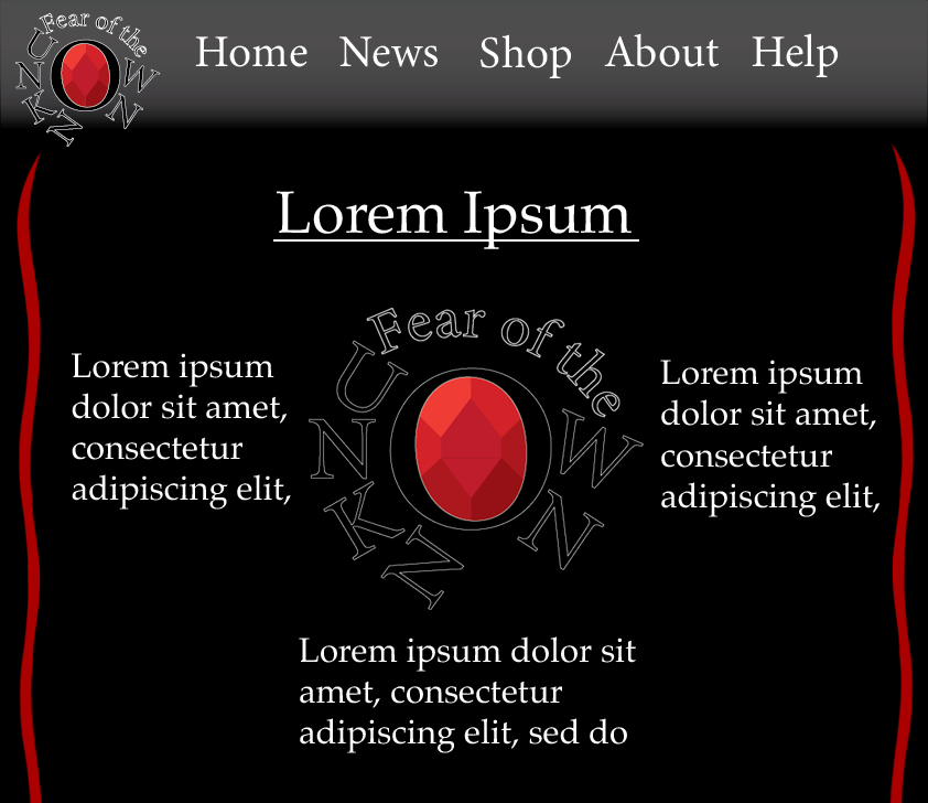
When it comes to an about page, I decided to go with this sort of layout. I wanted to make it readable yet unique. Having the information about the website, what it intends to do, and how to find them, all around the logo, yet keeping the left to right reading style utilised in other pages. While not much is shared on this page, it still helps to have a page dedicated to explaining the cause of a brand and what they want to achieve.
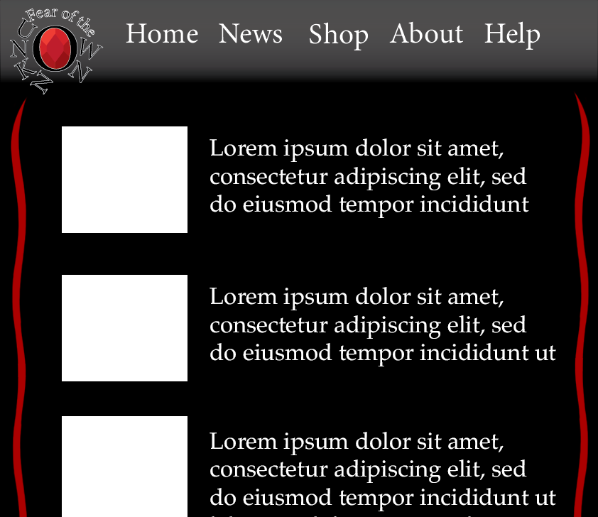
Lastly, I designed what a news page would look like on this website. On the left side, would be an accompanying image that would showcase what had happened, what was released, and other information around the website and community. On the left side would be a short descriptive piece, giving people a short overview of the news, while attracting them to read the full thing.
References
Gheroghe, S, Black Color Meaning: The Color Black Symbolizes Power and Mystery (2023), Available online: https://www.homedit.com/colors/meaning/black/ (accessed on 7/1/2024)
Why do we read in English from left to right? (2013), Available online: https://comicphonics.com/2013/05/01/why-do-we-read-in-english-from-left-to-right/ (Accessed on 7/1/2024)