When it came to designing the contents of the zine that my project is based around, I already had a good basis to work on. For a few years, I have been making drawings and character guides based on this universe as a personal project. So working on this for my final major project gave me a place to use them beyond just a personal small project. Along with this, it gave me a way to get professional advice on what I had already made on what could be improved upon.
When choosing what characters to include in the zine, I decided to choose the main 4 characters of the story, which also gave me 2 heroes and 2 villains to work with. This would help later when it came to the zine as I could theme sections on both the heroes and the villains seperately, along with referencing in the design the rivalries between the characters.
However, when I looked at the old character guides I drew, I decided that the style didn’t work with my current drawings, and they didn’t work well as full guides. So I decided to go back to the drawing board and redesigning the guides, along with editing the character designs here and there if needed.
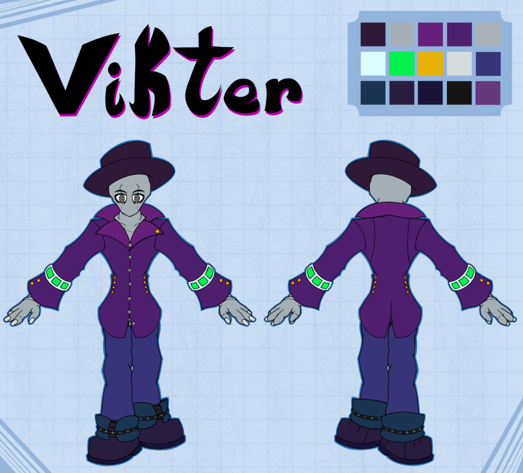
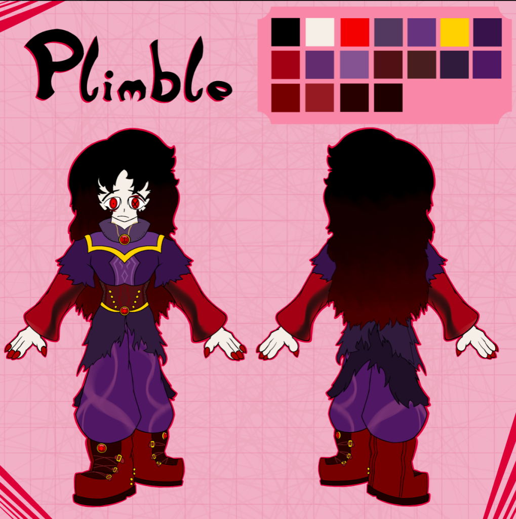
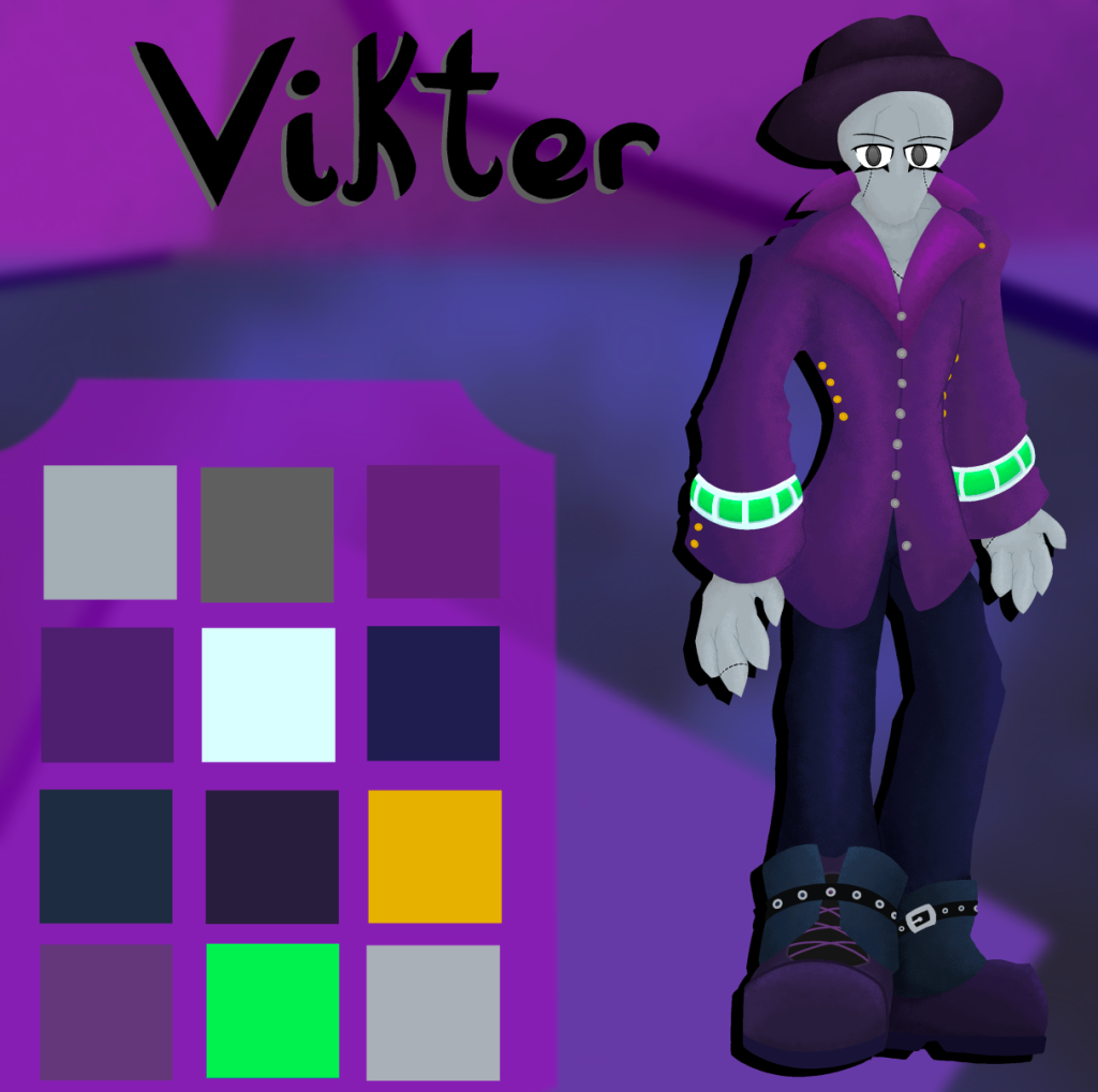
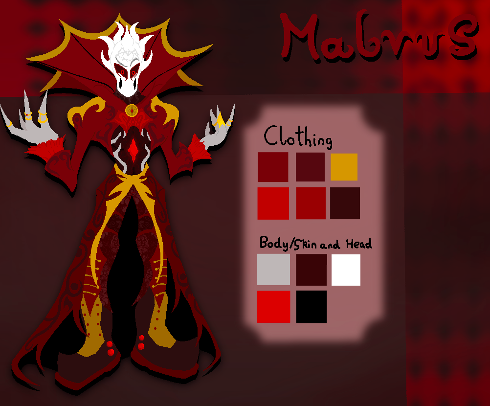
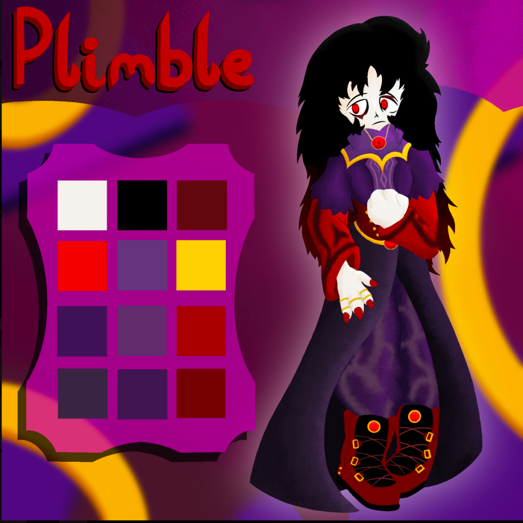
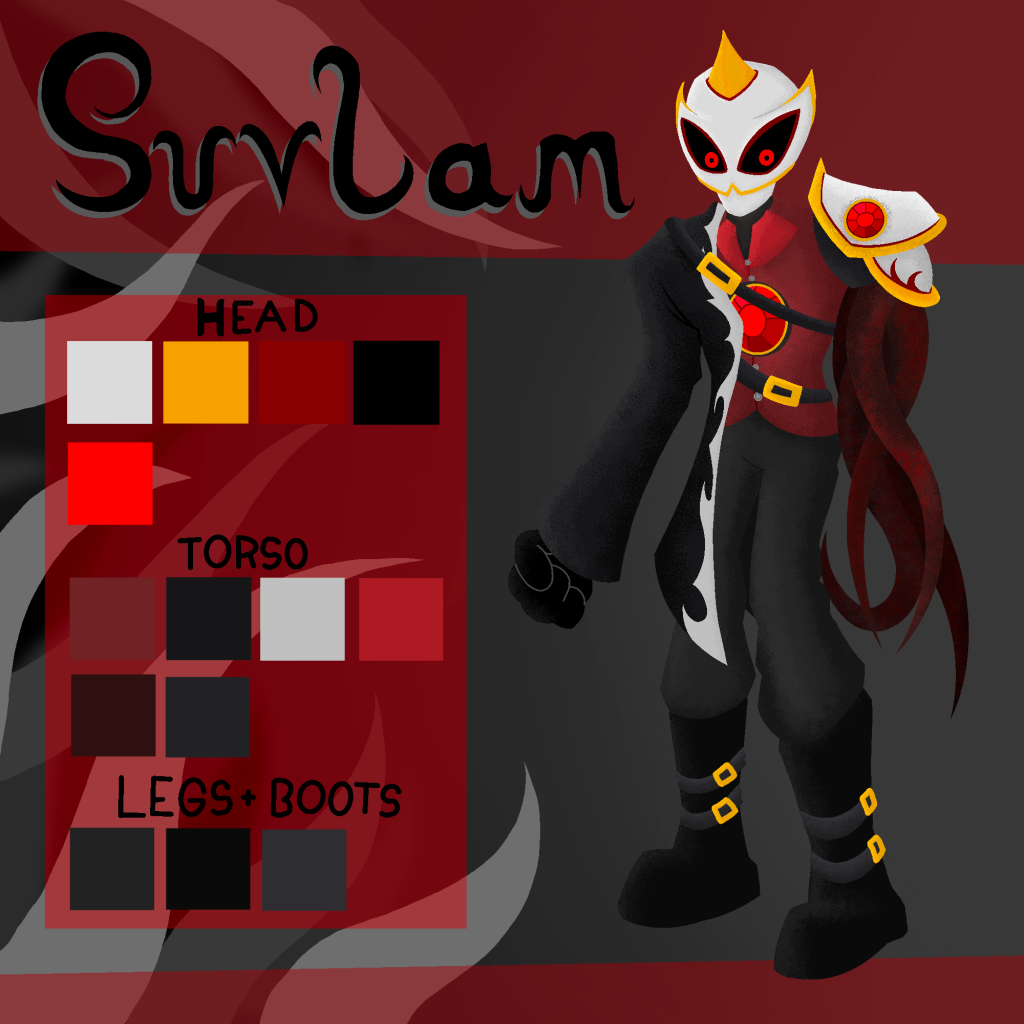
Most of the character designs stayed the same, with only a few changes made here and there to make them simpler on repeat drawings. The character Plimble had to have a bigger change in design as the previous design no longer fit the personality I wanted to convey in the story anymore. Along with this, the behinds of all the charactes have now been visualised to help with future drawings, along with helping others visualise as well.
These character guides would be the first part of each character’s individual part of the zine, while the rest of it would be specific character drawings, either putting them into a scenario, or showcasing a part of their own personal story arc. I feel the guides are a good introduction piece for the characters, showing their name, overall design, and colours, before showing off drawings that become a bit more abstract.
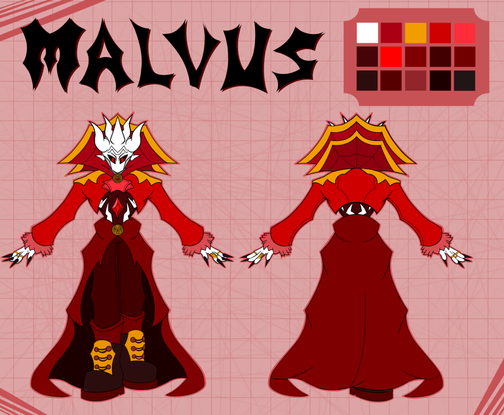
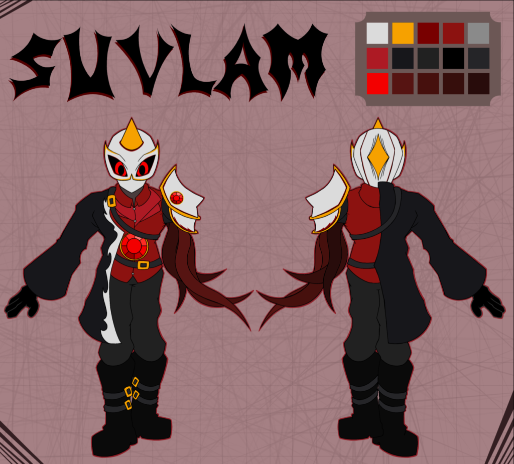
When it came to the character desigsns themselves, each character was made to have an aspect of them that would tell you something about either themselves or the world. All of the characters were given very varied silhouettes, to make sure they all stood out from each other and looked unique.
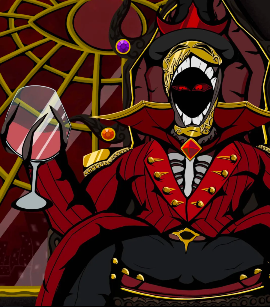
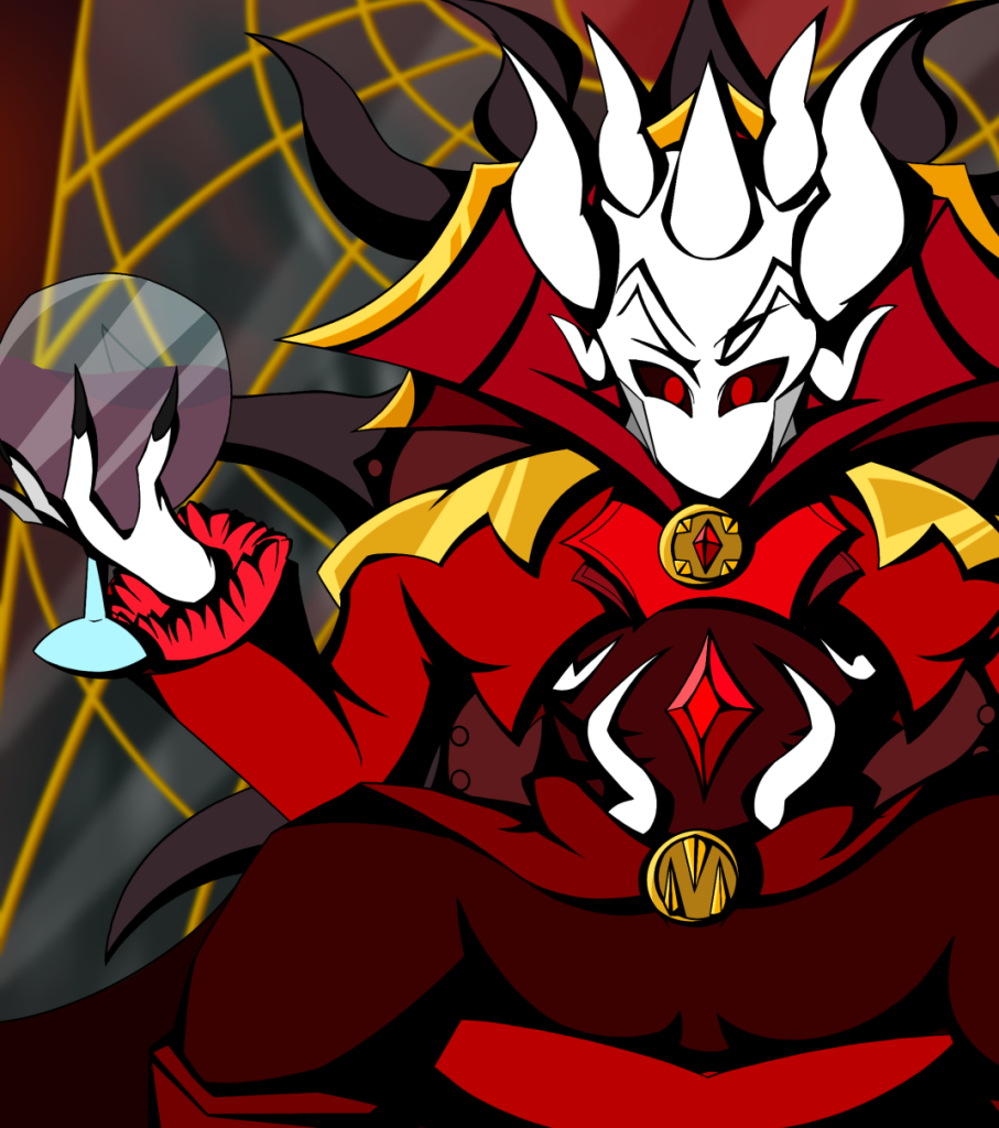
To start with, Vikter has no colour red in his design, as the colour red is heavily associated with the main villain of the story, Malvus. Alternatively, Malvus was designed with primarily red to showcase this contrast. Along with this, Malvus is designed to invoke imagery of the devil, adding on to him being the main villain. Plimble uses a lot of purple, similar to Vikter to showcase that they’re on the same side. However, the red parts of the design were included to show how they have been corrupted by Malvus. Lastly, Suvlam was designed with very similar design aspects to Malvus, presenting him as a villain alongside Mlavus, but not as important.
All of this was made to showcase how character design alone can show a lot of the story without telling a person anything. This shows a level of respect to the person interacting with what you’ve made, as you trust them to figure out parts of the story without having to spell it out to them.
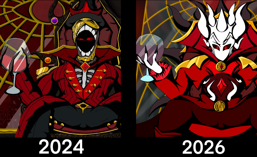
When conceptualising the specific character pieces, I wanted each one to be in a different style, to showcase the different ways the world and series could be visualised. This would also be able to show my competencies as a graphic designer and artist In terms of the zine, this could be changed later after getting some feedback from others, depending on what style they like most. However, I wanted to return to another old piece that was made 2 years back. This was made when the story I wanted to tell was very different, thus the characters designs were different as a result. Despite this, I still wanted to keep the comic styled shading, along with showcasing my improved art skills over 2 years.
This resulted in a fully redrawn character piece for Malvus, keeping the same style while using his new design. The colours were also made more vibrant as I believed they all blended together too much in the original. I also think this works as a good character piece for the character of Malvus, showcasing his self importance and status as a character.
From this point, all of the pieces made were completely new. Because of Malvus piece experimenting with a different style, I wanted the other ones to showcase different talents as well. However, if people have a style they prefer a certain styles to the others once the zine is first showcased, then these pieces could be included at the end of a zine, still giving them a purpose in the end product.
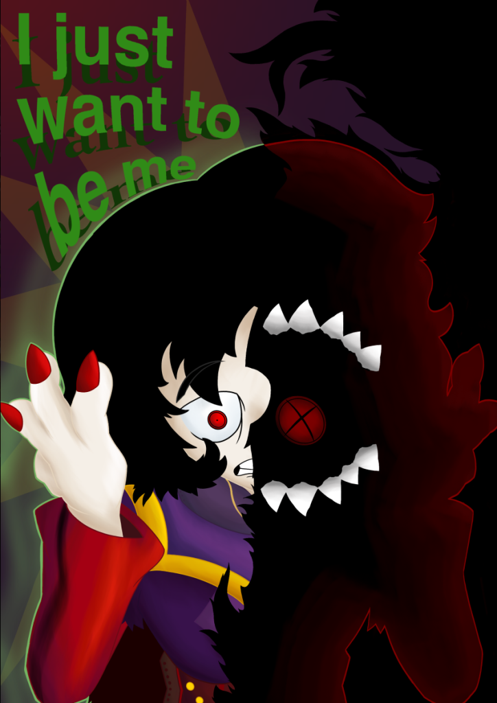
For the Plimble character piece, I wanted to get a bit abstract with the piece and showcase their character as well. The art itself has realistic/natural tone work compared to the comic styled tone work used in the Malvus piece. The piece itself showcases how the character Plimble is divided in two, and that their overall character arc is about finding themselves and who they are, which I believe is a message a lot of people need to hear, and also comfort those who have already been through that.
The Vikter piece was a limited palette piece. Using a randomiser, I chose the colours carefully to represent certain parts of his design, along with which parts would be the tone work. This art piece showcases my skill with limited colours, and how despite the limited palette, I can still make a visually interesting piece with a character.
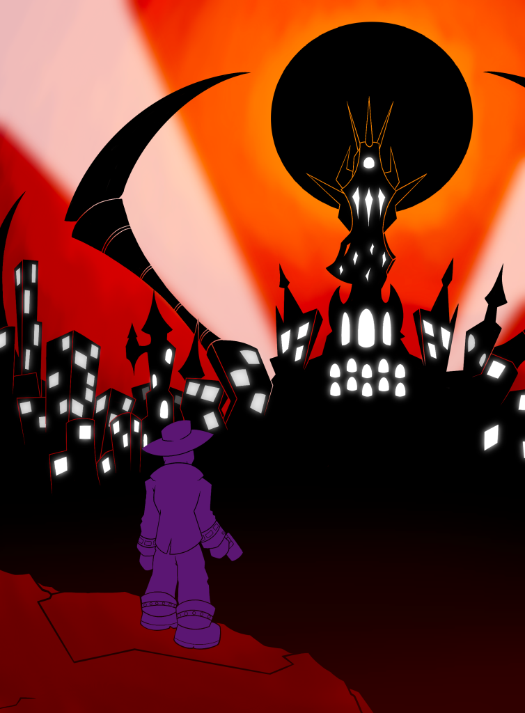
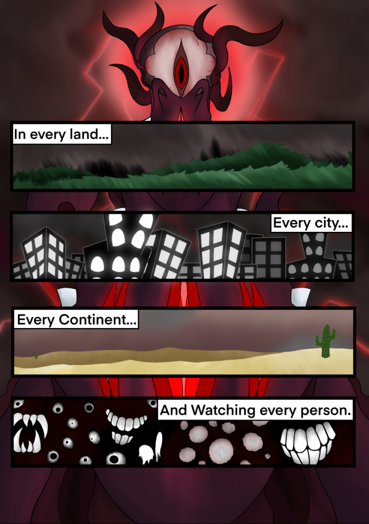
Lastly was the environmental drawings, meant to represent parts of the world. One piece was another piece with limited colours, while the other showcased how this story could be made into a comic book. The world itself was made to have an oppressive atmosphere and disturbing presence, giving weight to the story itself. This was to showcase how world design itself plays into the feel of the story, and how it helps immerse people.
Summary
While I had a headstart with the creation of the zine, thanks to years of developing this project in my own time, I believed all the designs should be drawn again. This is because I now have a more established art style. Along with this, they’d stand out against all the new drawings. From this, I created the character guides with an understanding of how the colours and design elements play into the characters personalities and role.
Afterwards, I made a focused art piece for nearly all of the characters, represented by a different art style. This was to showcase a wide variety of my skills within the zine, along with showcasing how different styles fit different characters. All of these pieces were also made to give an idea of the personality of each character, beyond a simple description of them.
Lastly, I made two final pieces, to help people visualise the world that the story is set in. These were also made in two different styles, with one being a comic panel, showcasing how this series can be made into multiple different mediums.
This specific phase of the zine creation process showcased a lot of my skills which I am proud of. Some of these specific skills are:
- How to design characters and make them memorable
- Making a world unique and interesting
- Improving upon old skills with a new understanding
- Showcasing a wide variety of art styles