When showcasing the work I had made and the prototype zine, the biggest feedback I got was to fix the layout of the story, and add more to help people understand it. This would help the story and characters be more impactful than just showing off the characters and one art piece each.
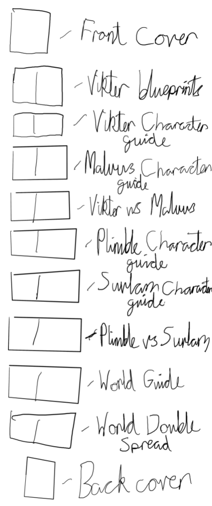
I began by making a sketch of what the zine had, and filled in the spots where a more story focused double spread could go. This helped me with visualising how much needed to be made, and what they could be focused on.
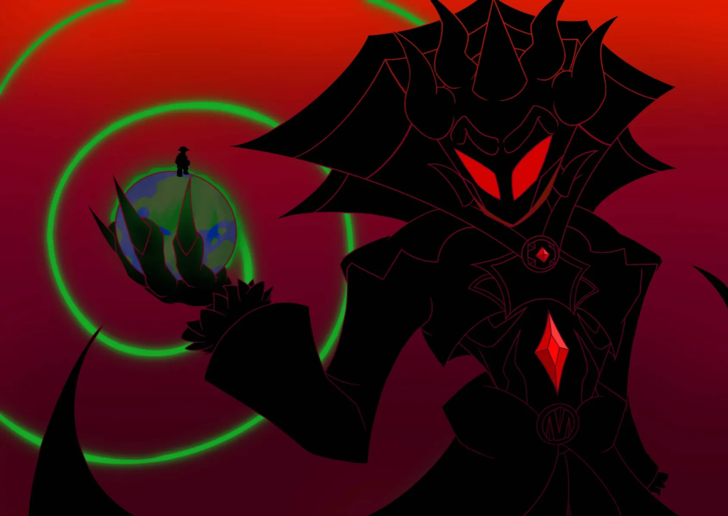
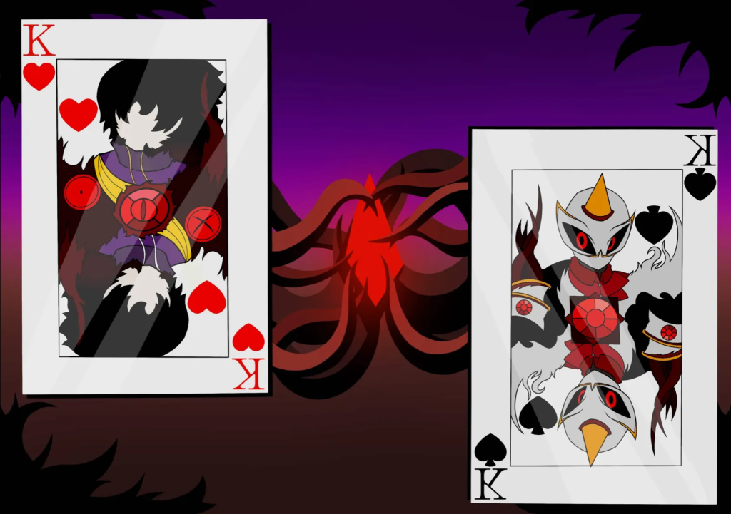
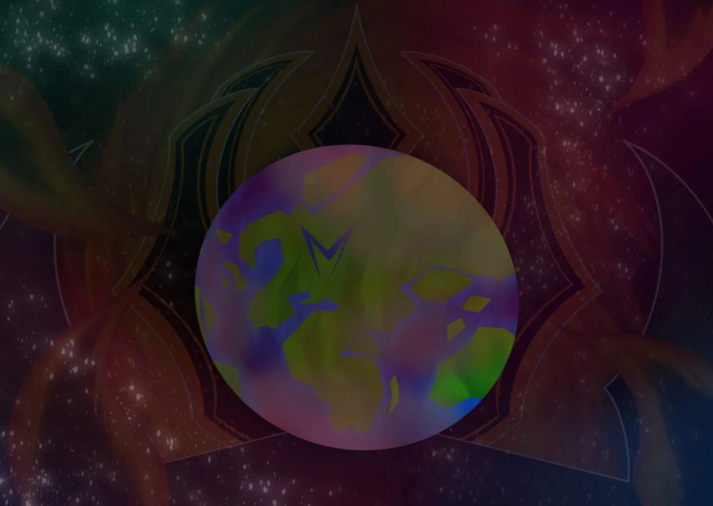
Four double spreads were made to be added to the zine. One at the beginning, introducing the reader to the world, one after the first two character pages, diving more into Malvus’s backstory, another after the last two character guides, diving into Plimble and Suvlam’s history and one last one as a cliffhanger for people interested. The style of all these pages was decided after asking people to vote on which style they liked most from the previous pages, with the comic book shading and limited palette winning.
These would help people become interested in the world itself, along with being more upfront about the message of the story, being about fascism, what happens if you leave it be, and standing up to it.
This section of the project helped with a lot of my skills, and added on to them. This includes:
- Responding to feedback
- Visualising a story and how to represent it
- The placement of pages within a zine