Using what people have told me, I began creating prototypes of the full zine and realising it in three different ways. This would make sure that everyone has a chance to read it.
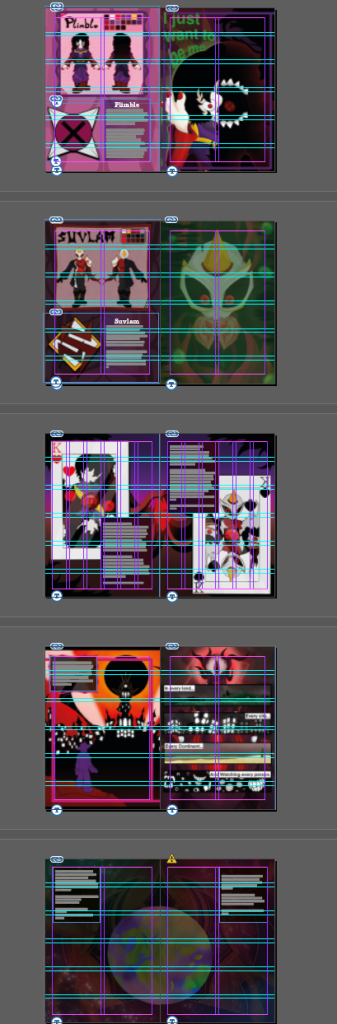
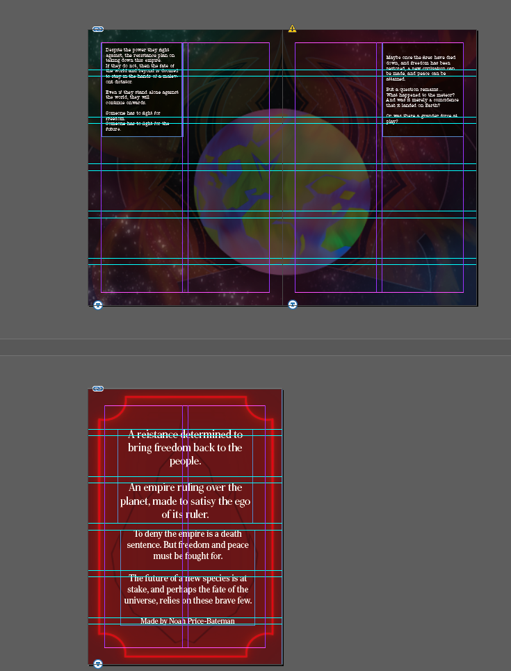
Using Adobe Indesign, I began the process of laying everything out. Using the guides and margins, I laid out each page next to each other, and began adding the text in places where the readability was best. This also required picking a font that was readable. I landed on the font: American Typewriter ITC Pro. This was kept after experimentation with other fonts, as it kept the feel of the story while remaining readable.
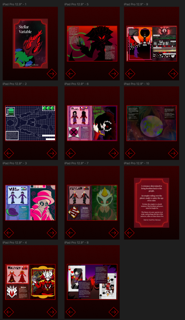
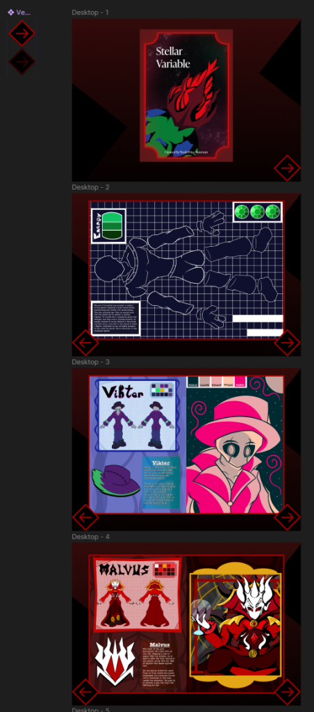
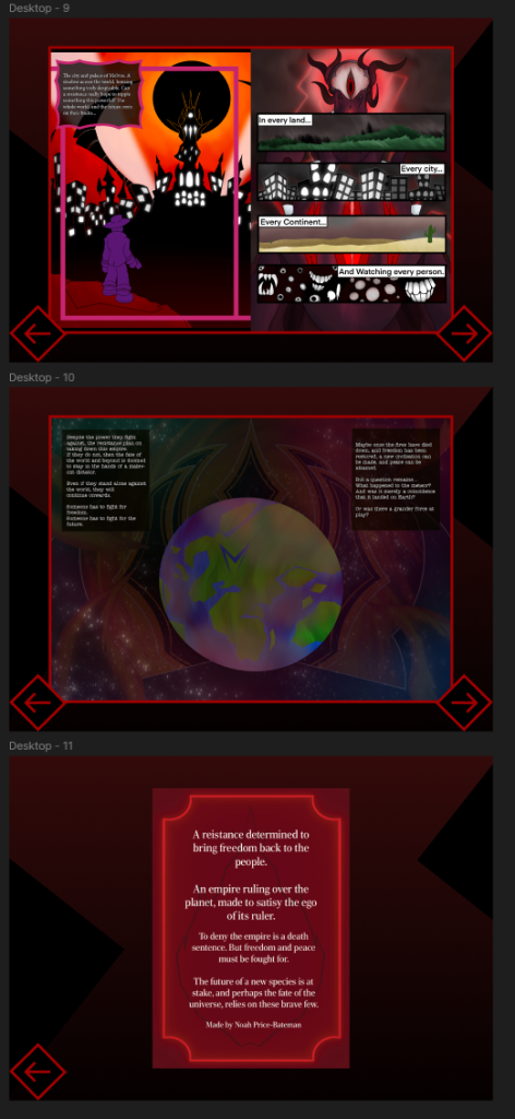
Once the PDF of the zine was satisfactory, I moved over to Figma, where the digital version would be made. Using the placement from InDesign, I made the text in similar positions to where it is in the PDF. Arrow assets were made in the same style all the zine, along with a background.
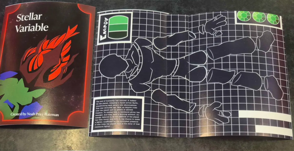
Lastly, a few prototypes of the zine were tested and printed out. This was made to showcase how it would look as a physical product, as most people preferred if the zine was physical. After a lot of printing and practice around different layouts, one was finally made.
I am happy to present the zine in multiple different formats so everyone has a chance to read it. This increases the amount of people who might take the story to heart, improving their health and the environment around them.