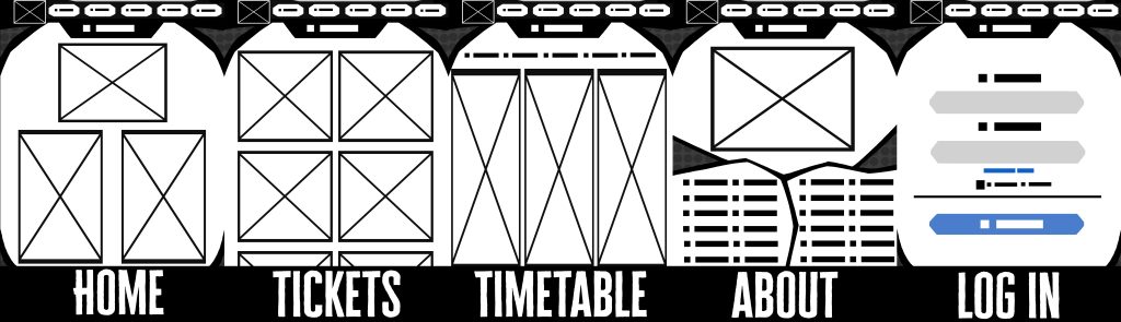
When coming up with a Mid Fidelity layout, the layout was kept fairly simple so each screen stands out on its own by layout alone. Most pages needed to be fairly simple in layout but have a good idea of what should go where, so people got the information they want quickly and efficiently.
With the About page alone, it was decided that it should have the most personality and embrace the comic book look the most, as it is about the place itself. The opposite can be said about the Log In page. Thanks to it being having very important information and being very vital to the website, it is best to keep it as straight forward as possible so there is no confusion or trouble.
When coming up with the home menu, the first thing that will be seen is pictures of the events. If someone was to scroll down, they would more information, but the events and when and where they are should be the very first thing. The ticket page is one of the busiest yet smallest page. It would have all of they the available days, starting with the weekend tickets, then the separate days. And on the timetable page, it is best to make use of the space given, putting all 3 day timetables next to each other.
Upon showing to other people across social media, one person said that in the about page, there should be more space for the text. Along with this, a colleague has also said to space things out more. This will be taken into consideration for future designs.
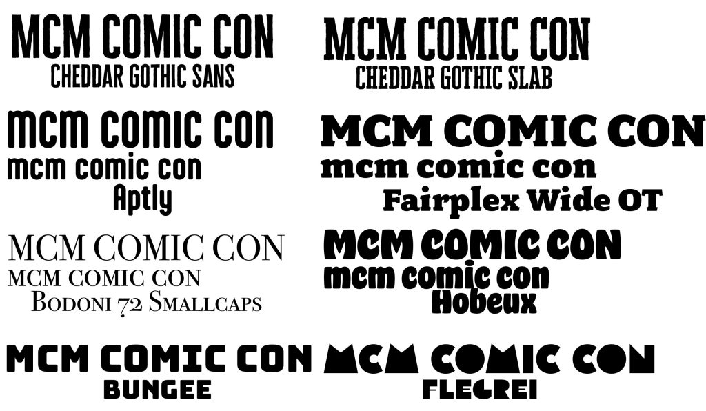
When deciding upon a font, there was many options to decide between. Early on, it was decided that serif would most likely not fit a comic con. Comic cons are social events that are very casual and friendly, so it needs a font that can fit with the theme.
When deciding between all of the sans serif fonts, it took a lot of time deciding, specifically when it came to picking one that was casual enough, yet still had a somewhat orderly and easy to understand font. While this may change in future designs, it is best to start with something that works. While fonts like, Fairplex Wide OT, Cheddar Gothic Slab, while being very casual, are still serif, so wouldn’t fit as well.
When coming down to it, while Aptly, Hobeux and Bungee are very nice and fit the casual theme, they don’t carry enough of a formal feel that would be nice. A good balance of formal and casual would be the best thing for a website. Flegrei was also considered, as while it isn’t formal, it would fit and comic book and creative theme of comic con. However, it is best to start with something simple and effective to see if the layout is effective first.
This is why if a font was to be picked, Cheddar Gothic Sans would be the best fit. Out of all the options, it fits the comic con theming the best. However, if there is feedback to make it more unique and creative, then it may be replaced.