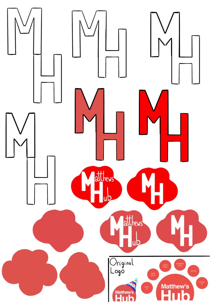
The first thing I did digitally was making the logo. I began with making the typography. While in the future I would use an actual font, I wanted to get a quick and simple idea out there first. Then I tried to make a shape that I would be happy with. This took a few attempts before coming upon one I was content with. After that came combing the two in various different ways. This resulted in a version trying to replicate the original with the full name, along with a unique interpretation of just the first letters, each with their own benefits in certain areas. Of course, these are just the beginning ideas and are subject to change depending on the marketing campaign itself and website. But it is also just as likely to be improved upon itself, rather than being replaced. Of course, the addition of fonts and more shape experimentation will make it much more professional. This in itself can also result in so many experiments and different versions to consider.
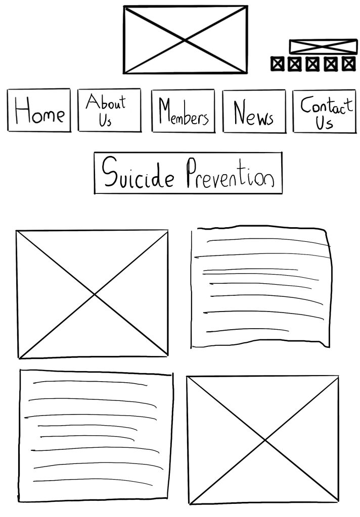
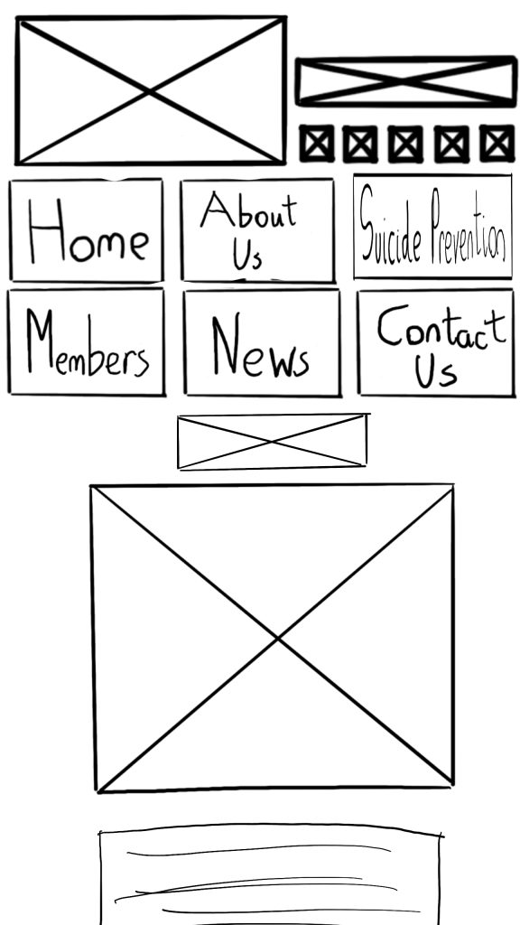
After the logos, I decided to digitise the website low-fidelity prototypes. These consist of one design for a iPad website build, and a design that would be used on the mobile version, with it hopefully being responsive to sizing. However, this is a feature that would be implemented upon the creation of high fidelity and a more finalised design. Personally, I prefer the first of the two thanks to better spacing, however this is due to a bigger screen size, which is something that would be further expanded upon in a pc design. Along with that, I believe the suicide prevention button should always have a bigger presence, as it is more important to those with mental health, and could be the difference for those who need help.
Once transferred onto a program that can create websites such as Figma, Images and text will be added. Though that won’t be enough for the next stage. Gridlines will be a main factor in the next stage of designs, as placement will add to the general style. However, despite these low fidelity existing, it would be a good choice to also experiment more. This would include going back to the original website that inspired everything, and trying to add the improvements of my design with some of the design choices of the classic, as I believe their main menu has the potential for something better instead of being a simple menu.