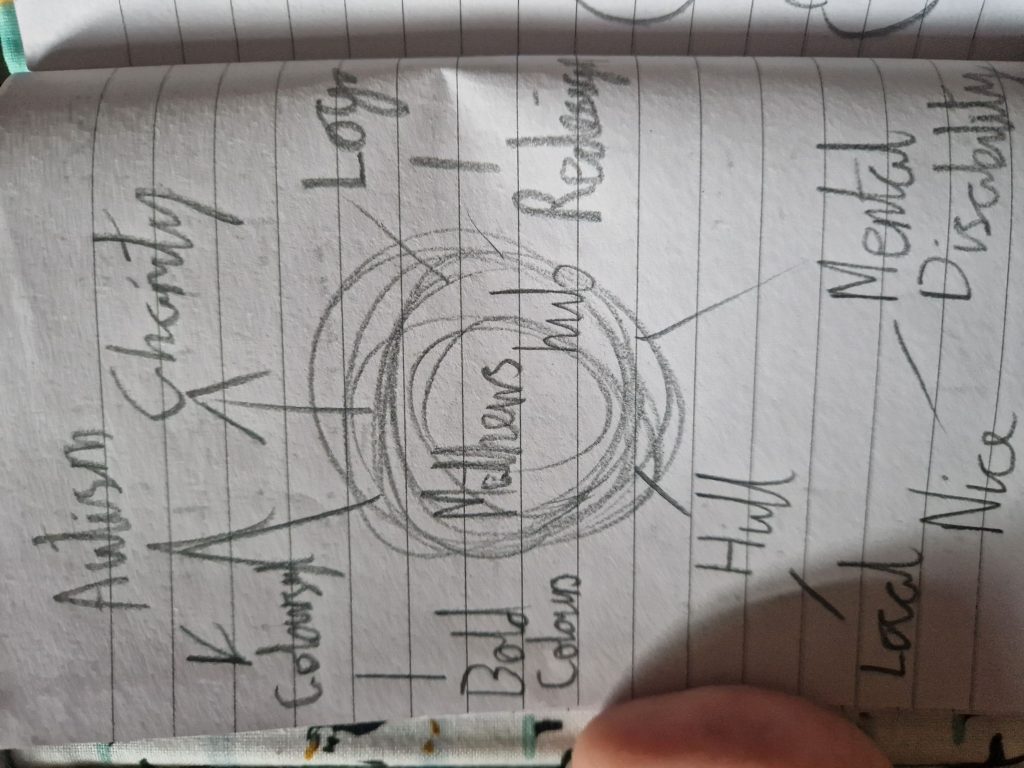
Before looking at how to analyse and remake the old design, I decided it was best to design a mood board. This would allow me to look at the goal for Matthews Hub and what it is meant to achieve. Along with this, it gives me places to start at and how to expand upon them. However, I will not know what ideas will properly bare fruit until I dive into them. While this may lead to some designs aspects going unused, it is better to see them through. This mood board also gave me the realisation that I could focus on the local aspects of Matthews Hub, which then means I can lead into aspects of design that are in Hull. But at the same time, I want Matthews Hub to expand past that Hull level in aspects so it can succeed in helping more people.
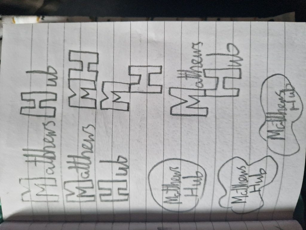
When redesigning the logos, I started with looking at the letters and figuring out ways to transform themselves into a logo itself. Either they would become the logo, or a major contributing part, rather than just being the name itself put onto a circle. While simplicity is great, it doesn’t capture the uniqueness and creativity that people with autistic, ADHD, etc, showcase and bring into the world. I began with the concept of an art splatter shape, as I believe it to be an adequate representation, thanks to its relation to the arts, along with its unique and mouldable state. The next step would be to combine the two concepts together or combining aspects of both into another logo type. The addition of colour and experimentation in that field would also add other factors to the process.
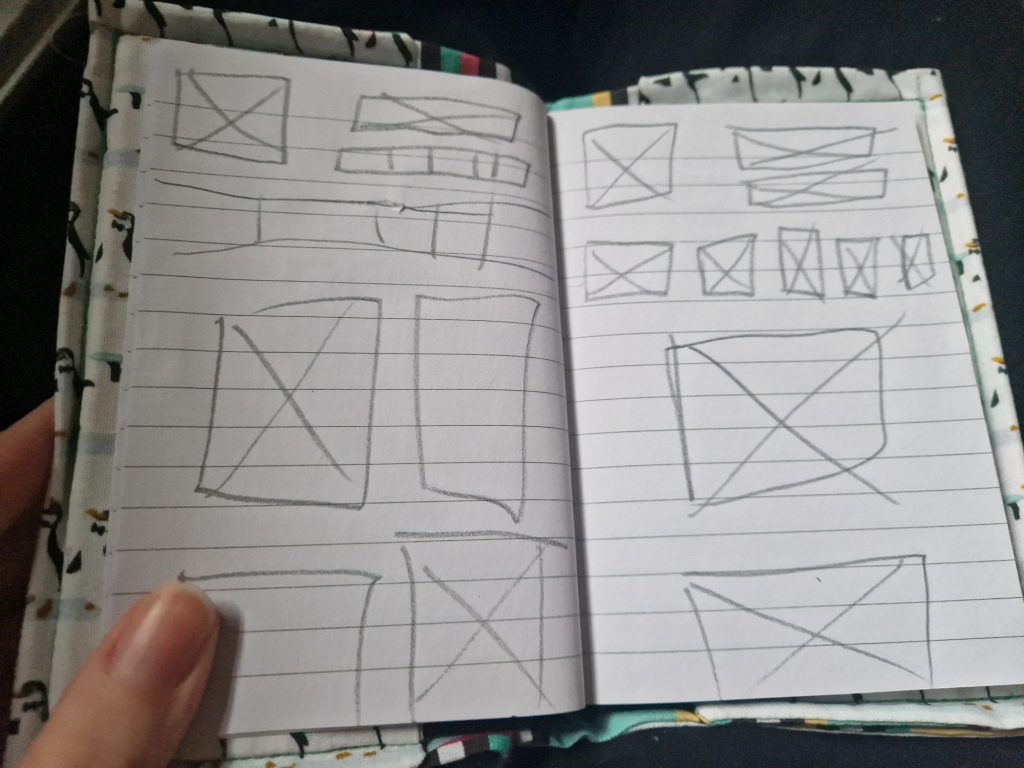
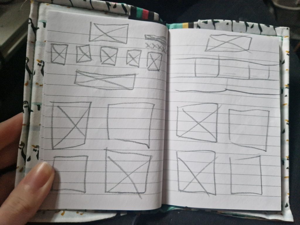
Last on the list of sketches was to see what layouts I could visualize and jot down for a website layout. After a quick glimpse at the website itself, I started sketching down more preferable layouts with various different concepts. When transferring to digital, a lot of these designs have parts of them that are interchangeable. But, I thought it best to have a bunch of base low-fidelity layouts to go off first, so when transferring to a digital setting, I can make them, and then start experimenting. When guidelines get introduced as well, the placement will then get further perfected. I also have to remember the original site design as one of the ideas for future designs.