After creating enough art pieces and guides to fill up the zine, it came time to start putting together the zine itself, along with the layout. Each character would have a double spread including a guide, an art piece, and an insignia or a close up of the character. The guide would showcase my skills, such as: making a professional character design and guide, my skills with different art styles and composition, and my skills when making logos/icons. The layout itself would also showcase what I have learnt about making products and how stuff should be laid out upon a page.
For the very beginning, I made a very simple layout on Photoshop, giving myself a prototype to work upon. I was originally going to do most of the layout on Photoshop, but after some experimenting, I decided to work on borders and backgrounds on Procreate instead, as I believed it would be a better platform to make more interesting and creative designs.
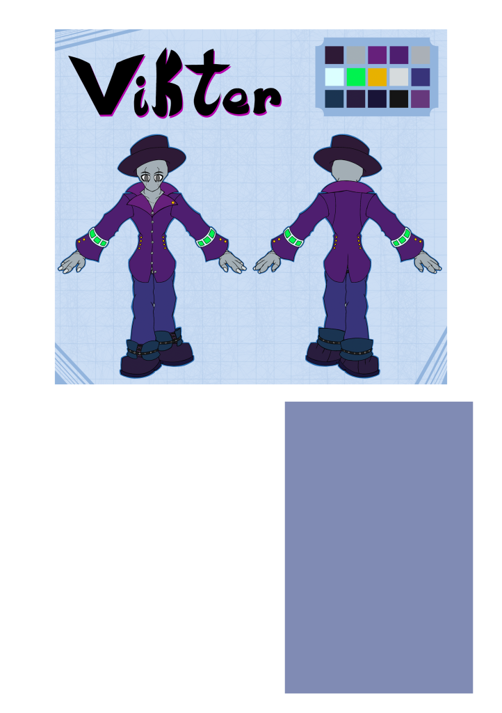
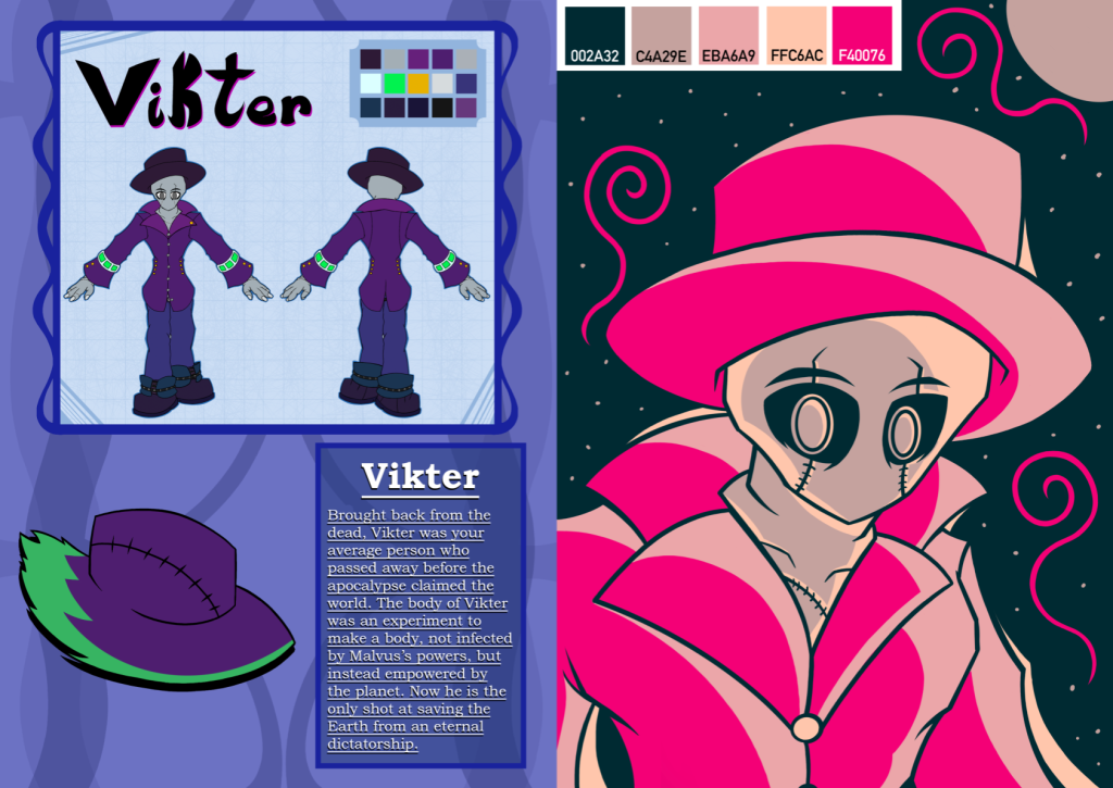
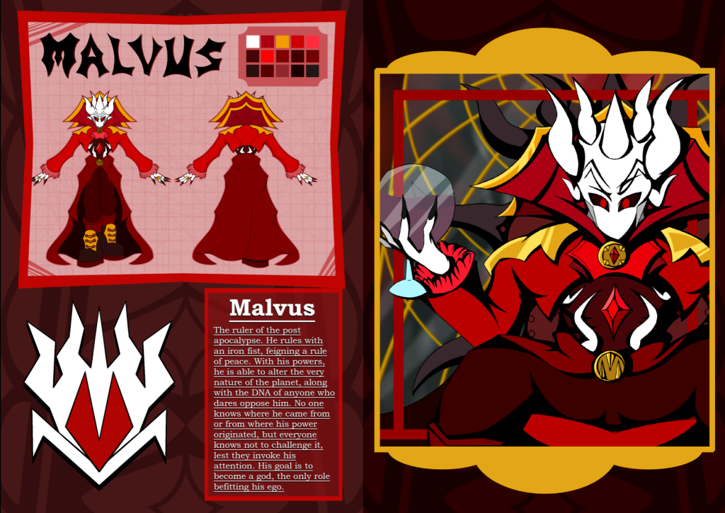
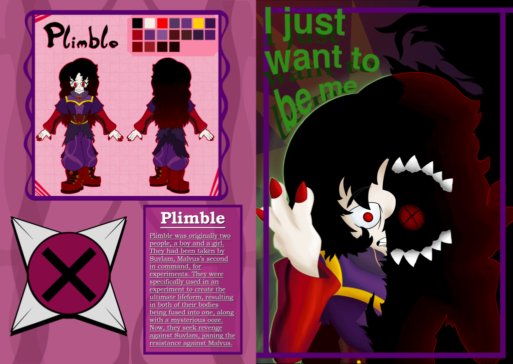
While Photoshop didn’t do as much as originally planned for the start, it still helped with the layout and composition of the page itself. This ended with the character guide at the top, a description to the bottom right of the page and then a blank space at the bottom left for either a character close up or an insignia. The block were the text would be was also made slight opaque, which would help it blend in with the other elements of the page. I decided to make the layout the same on all pages, as consistency on a page meant for information is important. People may not prefer continuously looking around if they prefer a specific part of the pages, such as the descriptions or the guide.
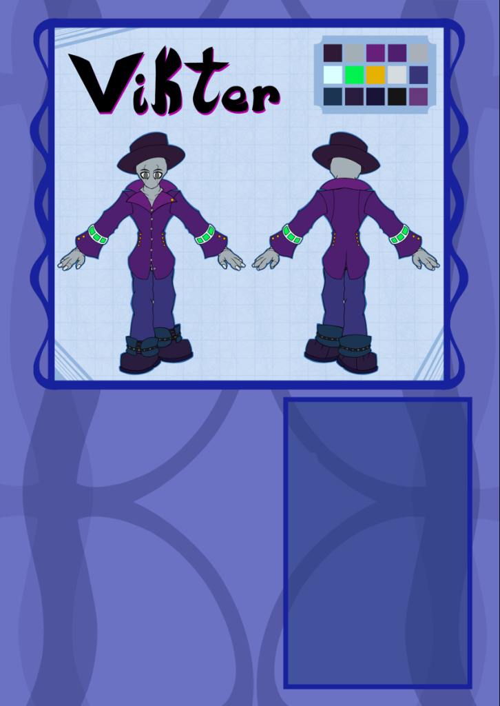
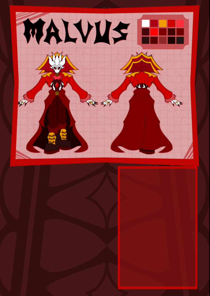
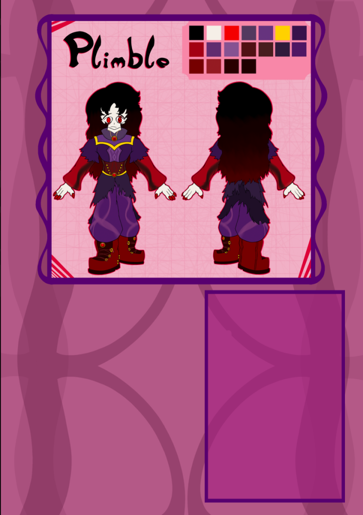
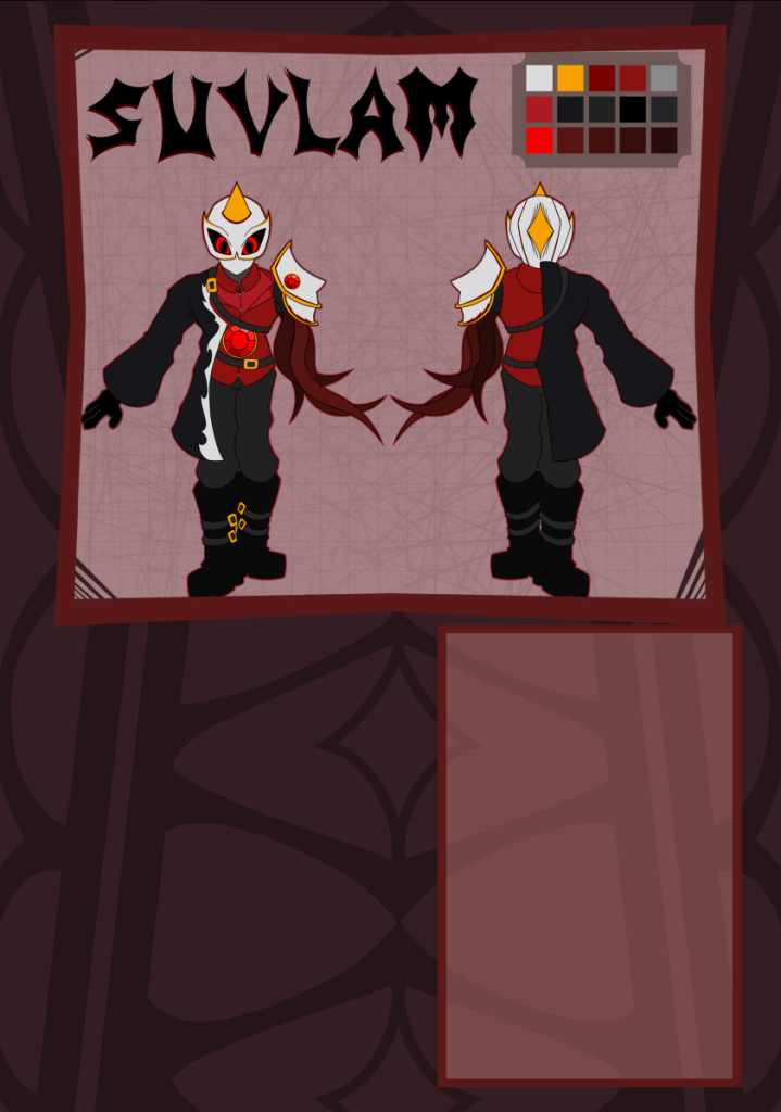
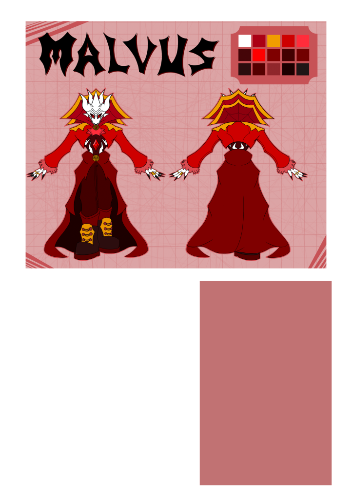
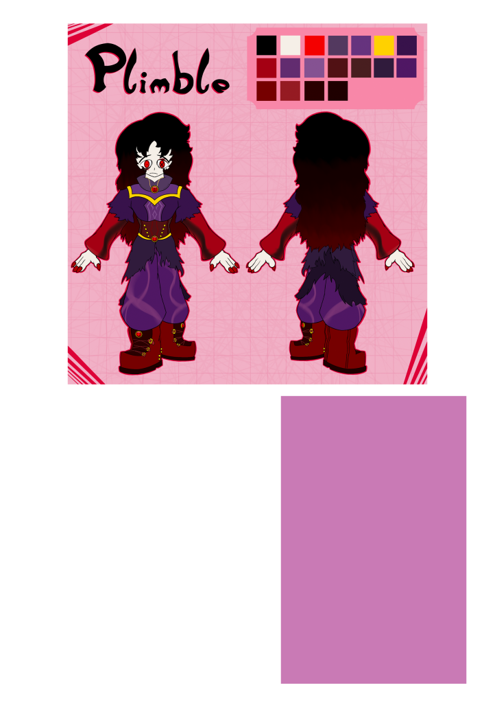
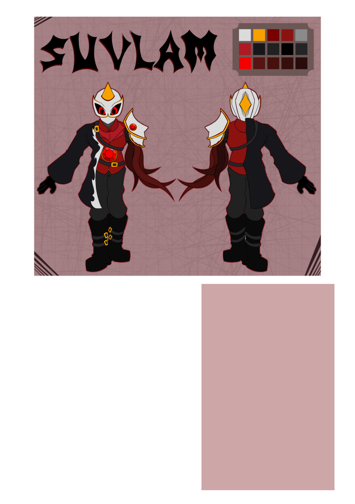
The prototypes were ported over to Procreate, were the more artistic parts of the page were added. Each page was first given their respective colours, to help differentiate them from each other. The colours were also chose to represent them personally. Blue was chosen as it is used as a sign of calm and good, along with being an opposite to red in media. Red itself can be used to showcase danger, and in media is the main colour of evil. The last two colours, pink and a very dull red, represent the characters themselves more than the vague idea of good and evil. The pink represents, in the story, that the character is trying to seperate themselves from the villains, which is showcased by pink being next to red on a colour wheel. And the dull red showcases how the character is less bold than the main villain.
I then started adding elements that differentiated the protagonists from the antagonists. For example, The borders for the protagonists were made curvy and rounded, while the antagonists borders were a bit more bold and sharp. The borders for the text boxes was kept simple however, as the text is the main part of that section.
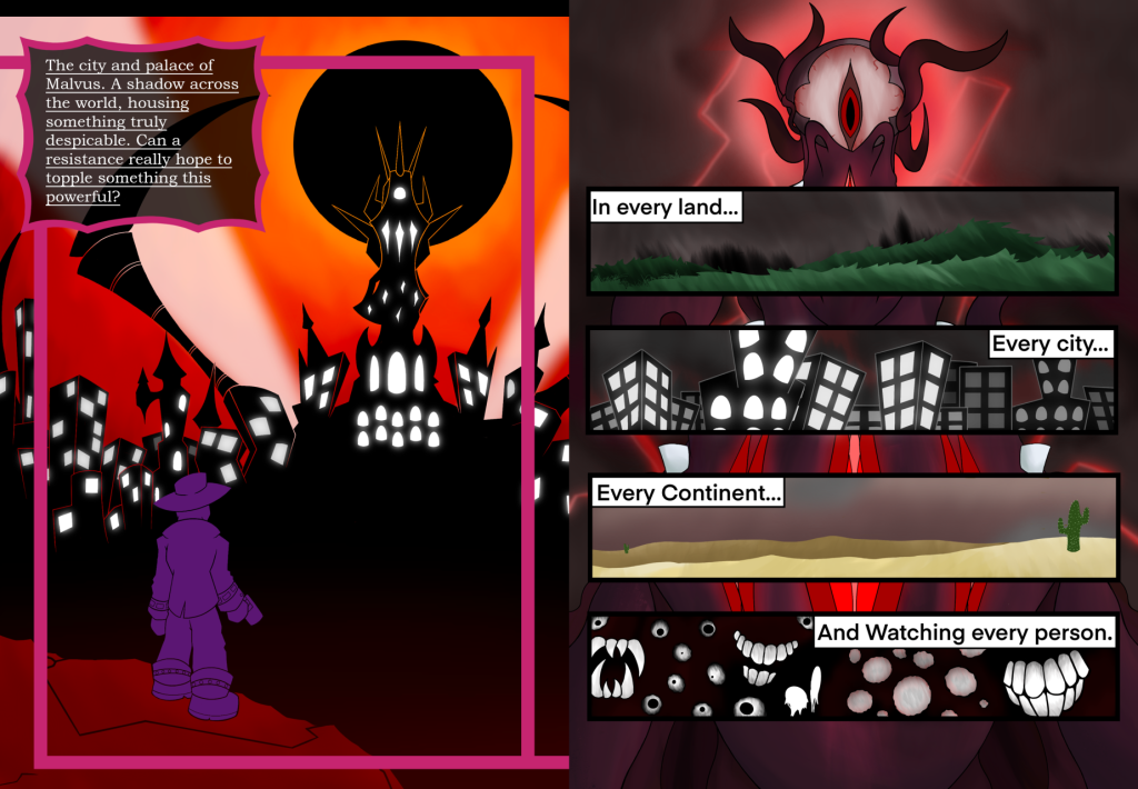
This idea was shown through the background as well. Just like the borders, the protagonists backgrounds were once again very rounded, having more natural curves. Meanwhile the antagonists were given a background a bit more complex. Not only is it sharp again, but also has the imagery of eyes baked into it. This is because the villains represent an authoritarian government, which eyeballs have been associated with in various parts of media.
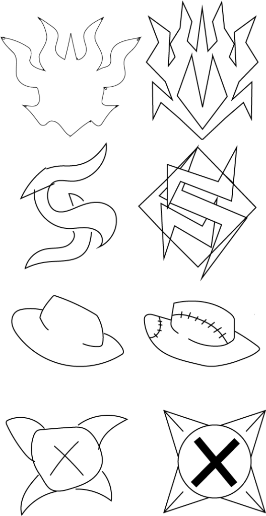
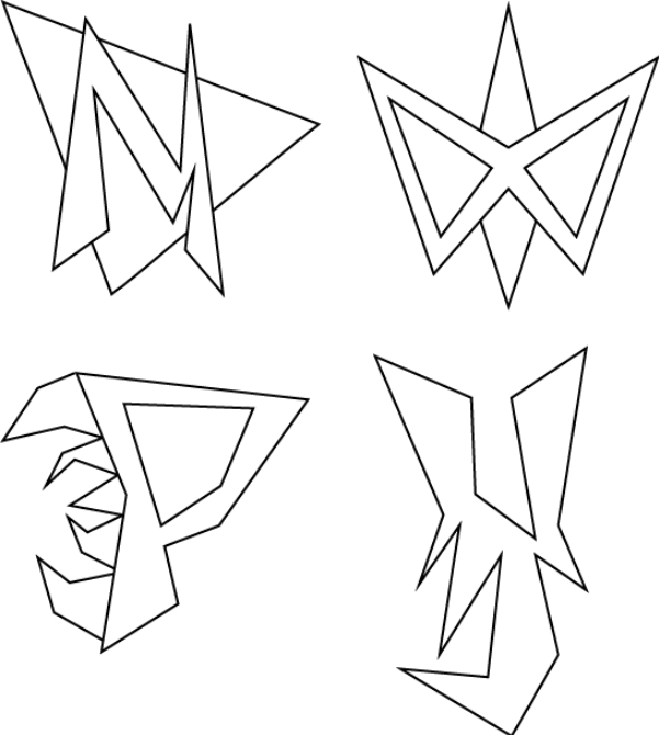
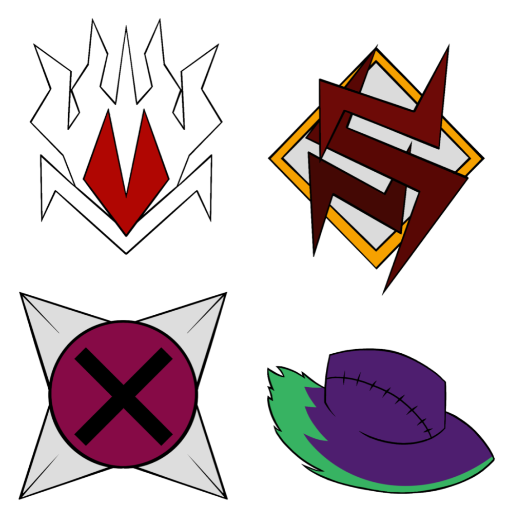
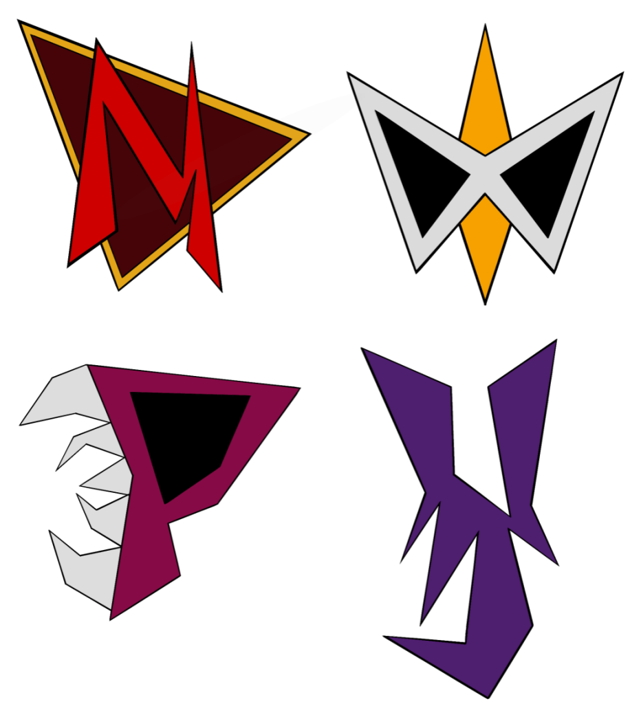
After thinking over what to fill the bottom left area of the page with, I decided on creating an insignia for each respective character. I chose this, as it would showcase a wider variety of my skills in Graphic Design, rather than another showcase of a character. I opened Illustrator and begin working, eventually ending up with two sets of insignias for each character. These were made by first coming up with the general image with a pen tool, and then making a higher quality version with the line tool and merging the points. The logos were then ported over to Procreate to be added to the pages, and given colour, which were taken from the characters themselves.
In the first set of logos, The insignia for Malvus is his head. This was to showcase how lost in his own ego he is. However, a lot of the parts also represent an M, the first letter of his name. This is best shown at the bottom and in the middle. For Suvlam, The insignia was a letter S made up of free parts, just like his infected arm, with a background to help it stand out. Plimble’s insignia was made as an eye with teeth on each edge, showcasing less of their normal design and more of a hint at what lies beneath the surface. Lastly, Vikter’s was his hat along with a burning green energy, two parts of his character design that stand out.
In the second set of logos, all the insignias were made to be more simple, mostly boiling down to the first letter of their name, except with an element of their personality or design sewn into it. This is except of Suvlam, who’s insignia represents his mask.
Overall, I personally prefer the first set, as I believe it represents them as characters much better than the second set does. Still, this could be changed depending on other peoples opinions.
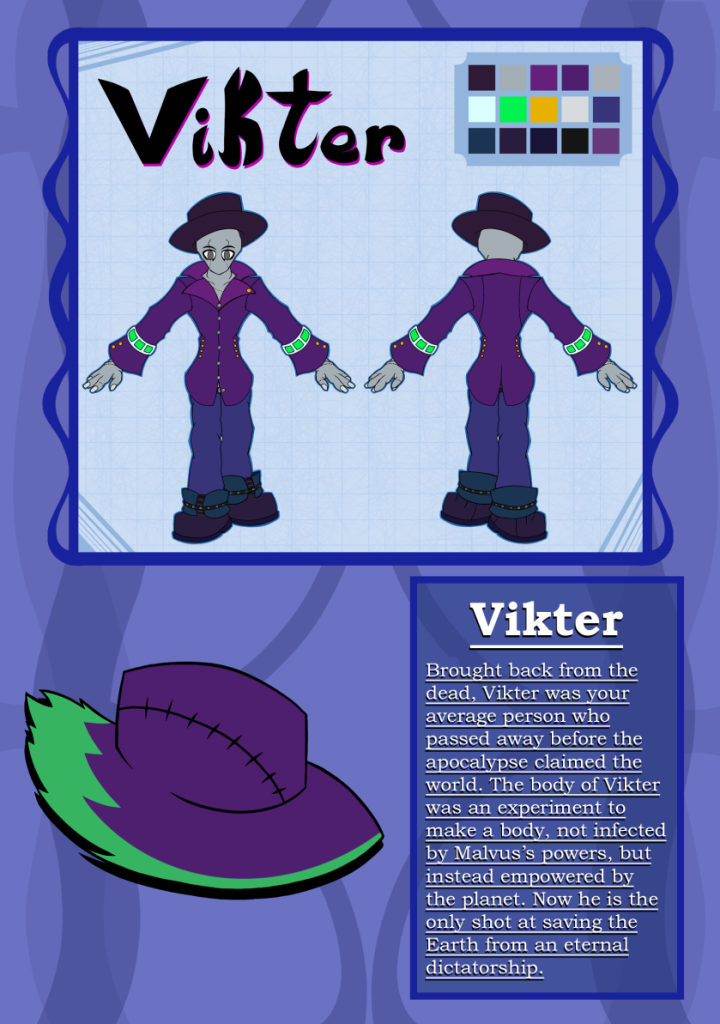
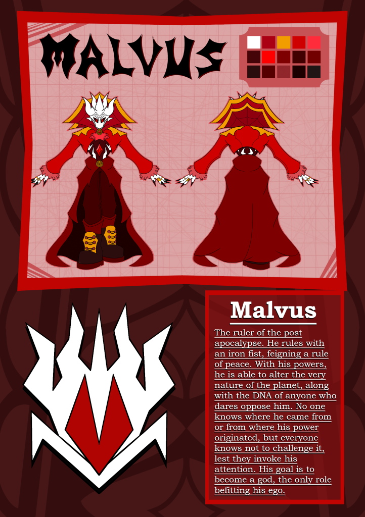
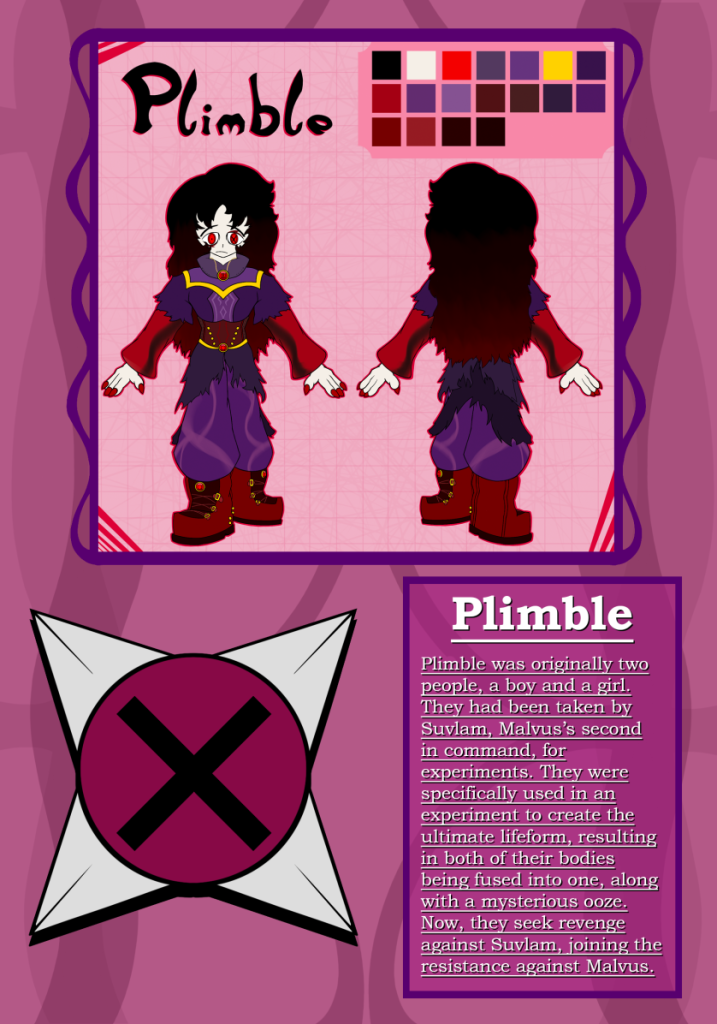
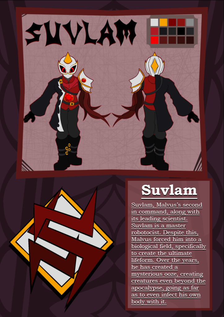
After the insignias were finished, they were added onto the pages, and the descriptions were added onto the piece once they were ported to Photoshop. I personally chose a serif font, as I want to showcase this zine as a project a bit more serious and dark, which would suit the young adult demographic I am aiming for. The exact font used was Bookman Old Style, which provided a serif font that stood out with everything and was very readable.
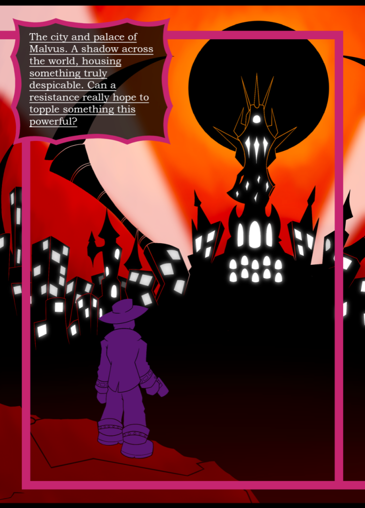
Lastly, a visual of what each double spread would look like in the zine was put together. These were made to help people visualise what the final product would look like. Overall, I am quite proud of the product up to this point, and am fascinated in what people will think of it after getting some public opinions.
Summary
After the creation of the art pieces, I switched between Procreate and Photoshop, adding elements to each page slowly between each program. Procreate helped make the background and borders, while Photoshop was used for the placement of each element, along with the text and fonts used. The combination of these two programs, along with the skills I have, resulted into pages that worked as great introductions of each character, while also being visually satisfying.
Illustrator was used to showcase another skillset I had learnt, which leaned into Graphic Design. Insignias/Logos were made for each character, to be showcased on their page. They began as sketches, before becoming realised designs, and being coloured on Procreate. Each insignia was made to represent the character, along with being a simple visual that would be recogniseable from a distance.
Lastly, the introduction pages and the art pieces of the characters were put next to each other, visualising what each characters double spread would look like in the finished product. Along with this, each character was placed very specifically, going from the simpler characters at the beginning, to the more complex ones, as the audience gets a better understanding of the story.
This phase of the zine creation process showcased a lot of skills I had learnt over my Graphic Design journey:
- Composition on a page
- Typography that works with your design
- An understanding of the project
- A realisation of the ideas needing to be presented
- Iconography and Logo Design