When making designs for both website and phone, it was important to make designs that while were related to each other, served their purposes differently. While just making the website design again for the app, or just making it adapt to a phone is possible, it would complicate things, as both need to serve different goals. For example, a website is used for more long form research and to get a deeper understanding. While phones need to be faster and snappier with information and how it gives it to a user.
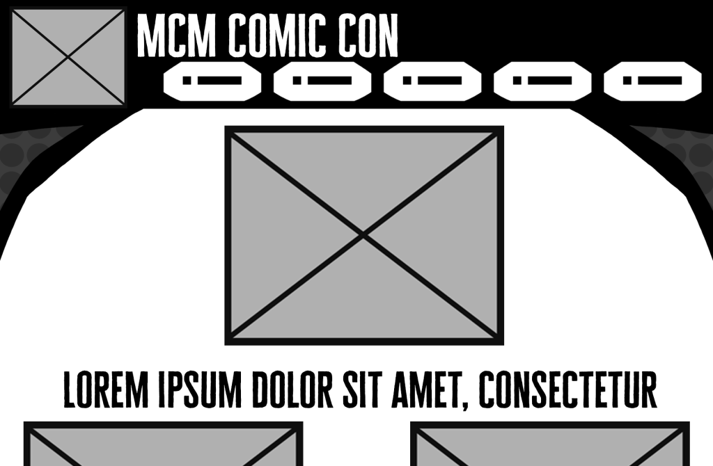
When it came to the website, it was best to stick to a design that has consistently worked for everything, whether it be concerts, events, shopping websites, etc. While information needs to be up front, everything can be spaced out more, allowing for more breathing room when looking at the screen.
Along with this, the icons to get from somewhere to another are also a lot smaller in comparison to an app. This is because people can take more time on a website, and it frees up space for more information on the screen.
If someone where to open the website on their phone, instead of getting the app, the website would change to fit on that screen, however, the layout of information and where everything is would remain the same. This is because the website itself is designed to have all the information, while the app is there to give more basic information and focuses more on when at the event itself, rather than using it outside of one.
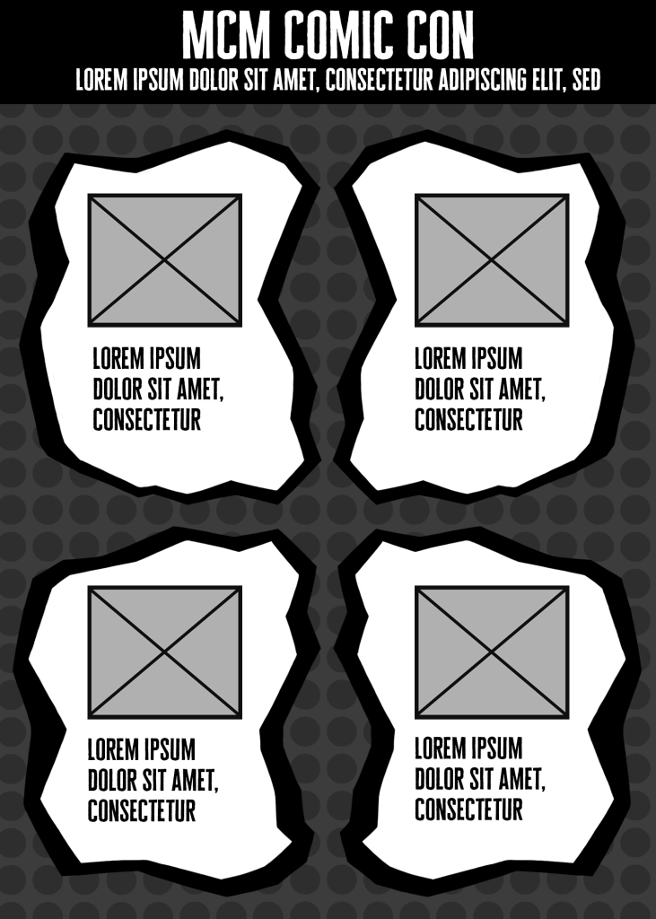
On the app, the screen is taken up entirely by icons. These icons would take you to a page that displays information needed quickly and efficiently. For example, if you needed the timetable, you can click on the icon and it’s immediately there.
In terms of style, thanks to a need for less information and the simplicity of an app, the design is able to lean even more into the comic book aesthetic than a website. Not only that, but it helps the interact-able parts of the app more obvious at a glance.
Along with this, the design itself helps separate itself from the website. While the website is cleaner and stricter in layout, the app can lean more into a chaotic and creative style, without getting in the way of information or being distracting. On the actual pages presented, information will be displayed clearly, yet will also have the unique design of the startup screen.